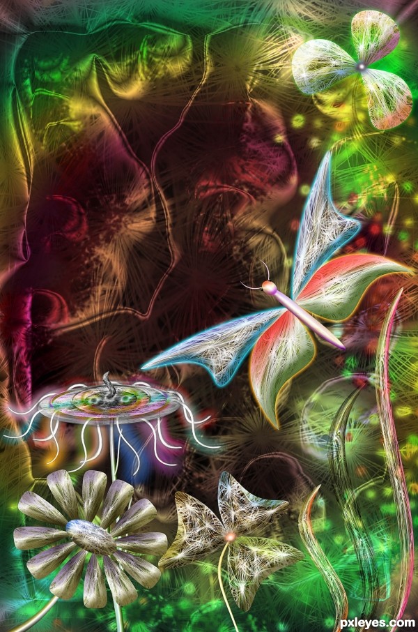
Used the source image and photoshop (5 years and 2852 days ago)
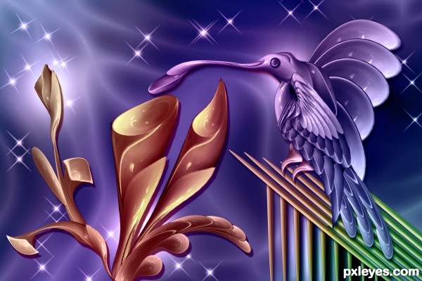
(5 years and 2901 days ago)
Spoon Bill Hummingbird? how cool is that  good luck
Good imagination, but would be better without the drop shadows...objects don't cast shadows on empty space. GL author. 
Very cool
Howdie stranger!
If you want to rate this picture or participate in this contest, just:
LOGIN HERE or REGISTER FOR FREE
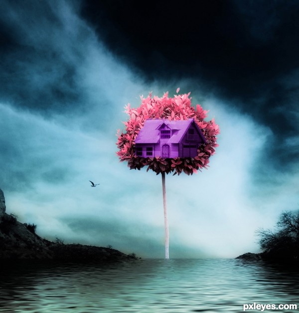
the rain its coming... (5 years and 3092 days ago)
hmmm.. this contest is so hard.. do you think a slight burn along the base of the building might help (just thinking about it looking more inside the tree instead of on the outside edge).. oh hell.. I have no Idea how to do this kind of stuff.. it just seams the back ground is very Mono... and the tree is very saturated.. but that could be what you where going for.. anywho... good entry for this contest.. and good luck all in IMHO
Hey whats up!!
and yes this was a bit hard contest..
im gonna work on your suggestions,maybe a little more burn fx,
about the color.. I chose to make it that sat,little exagerated to do
a much contrast between the house and the tree,i didnt mess around a lot
with the sky cause i did not want to lose focus on the middle..
but yeap pretty hard hehe..
Thanks for your suggestions Drivenslush !!
I appreciate it.
living on high trees, nice surrealism, good luck
a good seen like it.. 
Howdie stranger!
If you want to rate this picture or participate in this contest, just:
LOGIN HERE or REGISTER FOR FREE
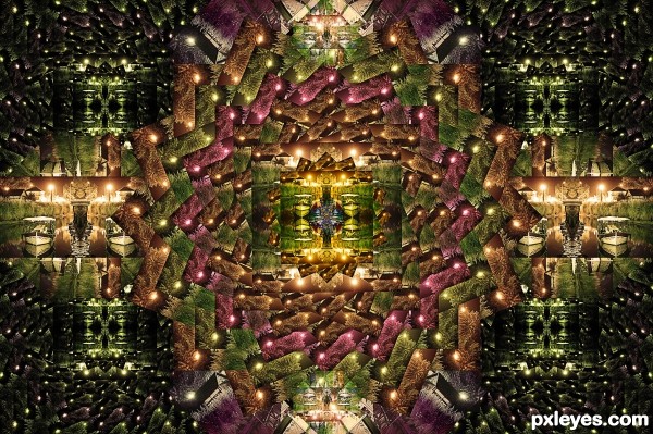
source image by Mqtrf: http://www.pxleyes.com/images/users/m/mqtrf/3169/fullsize/4dc327b0358ae.jpg (5 years and 3106 days ago)
Beautiful result. Nice blendings... gl author.
Looks like a galaxy in some way :P
Thank you Akassa and George 
Howdie stranger!
If you want to rate this picture or participate in this contest, just:
LOGIN HERE or REGISTER FOR FREE
(5 years and 3120 days ago)
Looks very good, great composition.
this is awesome
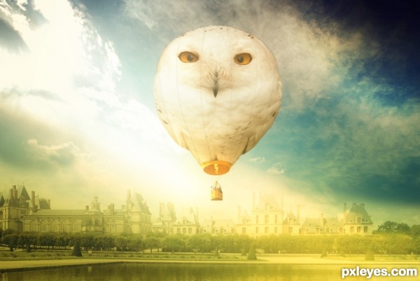
Beautiful concept, but the yellow buildings are a bit too saturated and sickly looking with too much of a green tone. Perhaps a bit more of a pale brownish color to make them less dominant, so that the balloon can remain the focal point.
Appealing tones, but the balloon could stand out a bit more. A Rule-of-Thirds composition might have more impact (perhaps a brighter balloon moved to the left to contrast with the dark blue in the upper right). The opening at the bottom of the balloon does not match the perspective of the gondola or the owl. BTW what is attaching the gondola to the balloon?
very nice job 
nice work..!!
amazing work author gl
amazing work author gl
very beautiful colors nice mood good blending and awesome work author
good luck
high vote and fav for you
Howdie stranger!
If you want to rate this picture or participate in this contest, just:
LOGIN HERE or REGISTER FOR FREE
Too Pretty, and TOO WELL DONE!!! Whoop! Whoop! Whoop!
Good use of the source... like the blendings and the colors. GL......
bravo
Amazing use of the source! Very creative. GL
Congrats
congratulations!
Congrats!
Congrats for second my friend.
Congrats!!
Howdie stranger!
If you want to rate this picture or participate in this contest, just:
LOGIN HERE or REGISTER FOR FREE