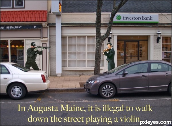
Street shot is my photo.
Link to stupid law:
http://www.stupidlaws.com/it-is-illegal-to-walk-down-the-street-playing-a-violin/ (5 years and 3009 days ago)
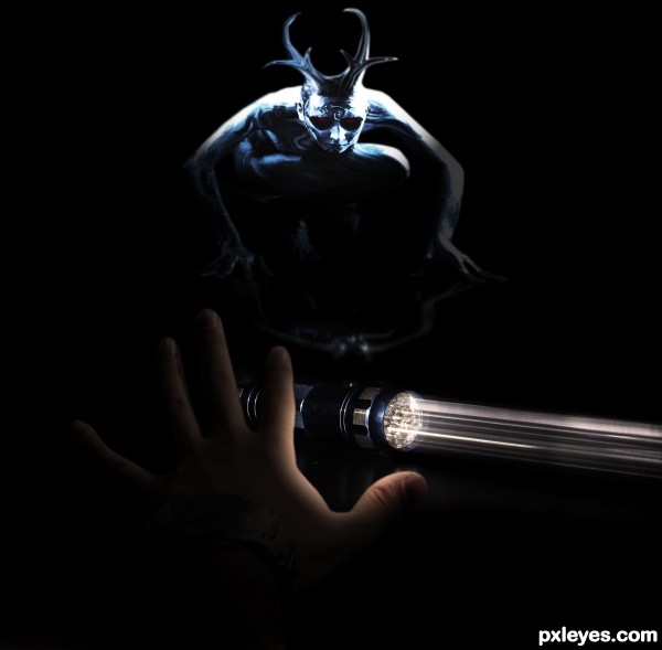
And never run back upstairs! (5 years and 3025 days ago)
Howdie stranger!
If you want to rate this picture or participate in this contest, just:
LOGIN HERE or REGISTER FOR FREE
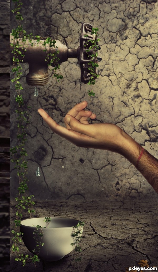
Save Water...Don't let such a moment ever come in our life.......!!!!
The hand is my own image provided in the sbs...
hope you like it friends...god bless all (5 years and 3383 days ago)
i like it author, the only thing not really sitting with me is the vines on the tap and in the bowl, yet there is no sign of vines on the walls or floor. Maybe add a few coming down the wall or something 
A really cool entry. But it needs some improvements... Firstly the tap seems to be directed to the right and not pointing straight down.And secondly the bowl doesn't seem to be sitting down correctly... To my eye it is just a tiny bit off to the right and seems to be not floating on the ground but just distorted.. Finally but just IMO you should get rid of that wall that the tap is stuck to. To me it just doesn't look nice and you should just have the tap stuck to the left end of the image if you know what I mean.. Try it out because I think this creation has potential if improved. 
 GL!
GL!
I also see a couple of things that could be tweaked: notice the difference in size between the vine leaves and the golden leaf to the right? Seems the vine leaves are way too small. Also, in the original photo of the tap, the drop of water is translucent - in this, the water drops are blue and not translucent at all, try lowering the opacity and maybe the blueness. Also, maybe blur slightly the background wall. Good luck, overall this has a nice feel. 
Excellent idea and well executed.
Love your creation author very much, its original with great mood...IMHO u should made stone block at the left just a bit softer,now creates small distraction...and this is my only nit pick...everything else is amazing...well done
This is very nice work! I just love all the imagination 
I personally would've used a more feminine hand to create a sense of softness, but you did a brilliant job here. The vines looks great and the background is well crafted. Good luck 
Good idea, but the leaves are not proportional to the rest of the image.
Nice entry with a great mood.
However i got a few things that u might want to concider changing.
I am not completely sure about the left wall it's perspective.
Seeing only the edge of the wall while the tap has a different perspective.
Also the hand has shadow on top of it, so i think the light comes from front top side.
And for the tap thel ight comes more from the right top side possitioned a little behind the tap.
Same problem with shadows for the leaves.
For example the leaves on the bowl it's left bottom side should not have a shadow to the right side. Also i think the leaves on the ground should also be darker.
Also IMO the light in your image has different colors. (leaves, tap, hand (tap and bowl seems to be matching)).
Also i think the middle finger might need some work.
Still it's a great image.
And i just see all these things cause i like to look at the image.
So thats possitive. And all of this is just to help you to improve the image.
Finaly i have to say that all of these things is what in my eyes should be changed,
this does not mean that all of those things are wrong.
Good luck.
Awesome, author, my fav in this contest so far. 
Excellent use of the source and combined sources. Definitely one of the best entries! GL! 
very nice work!
Very beautiful scene.
Awesome work and so true - each drop does count =)
And ALL OF UR's VOTES , FAVOURITES AND PRICELESS SUGGESTIONS AND COMMENTS DOES COUNT TOoooooooo...THANX TO EACH AND EVERYONE FOR UR SUPPORT AND APPRECIATION...THANK YOU ALL...LOVE U and GOD BLESS...
Congratulations! Great message, we really have to protect and keep our water sources! Water is life. 
Congrats on 2nd! Great work!
congrats ...
Congratulations!
congrats 
Congrats!!
wow congrats
Howdie stranger!
If you want to rate this picture or participate in this contest, just:
LOGIN HERE or REGISTER FOR FREE

yeah..minimal use of brushes...however,i won't deny that i used some. thanks to the artists out there making decay brushes for this sort of application.
some hand painting and overlay...really quite simple manip.
(5 years and 3400 days ago)
It's well blended.
This is really great! 
mmmmm she be purdy!!! in a rotting corpse kinda way 
Creeeepppppyyy! Yikes!
See ya in the crypt 
SPOOKY!!!! Nice work...Best of Luck
cool work author...totally in your style...gl
Gorgeous eyes 
Look at you ... 1st and 4th ... not bad for a night dweller!
Howdie stranger!
If you want to rate this picture or participate in this contest, just:
LOGIN HERE or REGISTER FOR FREE
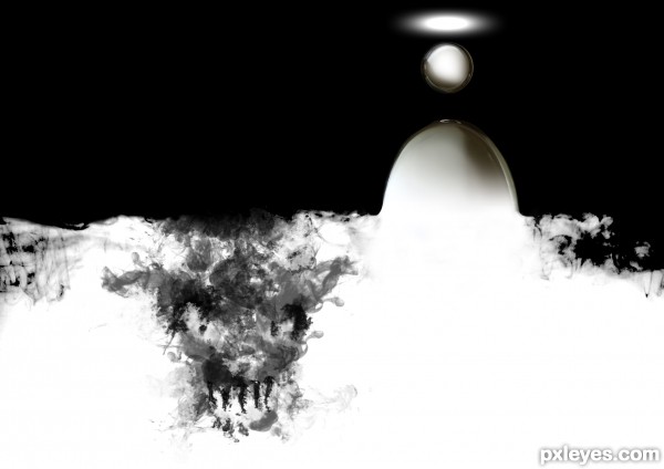
there is a line between the Evil and Good lands. If the Evil tempt to invade the Good space, the Good will find a way to escape. (5 years and 3412 days ago)
this image evokes a lot of question, including...
huh?
I like it. You can clearly see a devils face bottom left and top right an abstractisation of a head with an aura. Chaos & order, perfection(sphere) vs imperfection, up/down - you have all kind of symbols which should be obvious even for a redneck. 
thanks Greymval. Finaly somebody who have got my point 
Too much symbolism, too vague, too high contrast with not enough detail or shape definition.
I think Mircea's interpretation is spot on.
Well yeah Mossy, we all agree that boob is usually a good thing. 
It is really abstract, but has good concept.
idea is perfect author...but u could use a bit more obvious elements to show your creation...gl
Howdie stranger!
If you want to rate this picture or participate in this contest, just:
LOGIN HERE or REGISTER FOR FREE
haha, i love how the guy is all refined and stuff, as hes playing his violin illegally. Very funny entry!
I think this would be a great law. LOL. Nice work here.
Don't know what happened to my previous comment but I still think you should tone down the brightness of the violinist .
Thanks for your input Loyd.
your welcome Bob
Howdie stranger!
If you want to rate this picture or participate in this contest, just:
LOGIN HERE or REGISTER FOR FREE