Thanks to Andreyutzu, Fotfreak, Djeyewater, Hortongrou & linder6580 for the very nice stock images :) (5 years and 3808 days ago)

(5 years and 3943 days ago)
great job!! very realistic
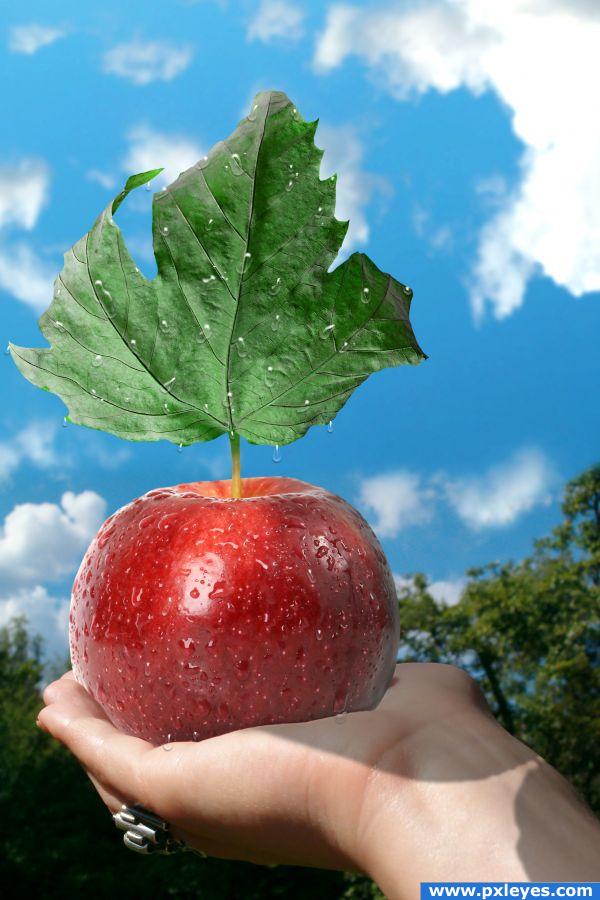
(whisper) psst: the shadow on the arm shows only the stem of the apple, the leaf is missing...  (whisper)
(whisper) tnx  still I think the shadow crosers over the arm, that's why I didn't place it :P
ssssssshhhhh shadow is truncated - 
kk, you won, I have fixed it 
Shhh...sshhhhh....everyone is too loud. Stop it!
*whisper* I don't want to be the only person who speaks with a normal voice here  I'd eat this one for sure. Doesn't matter if it is wrong or not
  You did a good job with the water droplets on the leaf! Good luck! *walking quietly away*
(yelling NOT BAD! APPLE FITS..eh...fits pretty good in the hand. Maybe a little detail: some of the drops are kinda hanging in the air under the leaf. Still, they produce a shadow behind the drop, like it's added on a surface. But then that's not possible, because there's air as background. Good luck!
Bah, you are right, that shadow shouldn't be there on those hanging rain drops and I didn't even notice. Tnx for the notice wazowsky. And thank you Lelaina, you can have the apple if you want to eat it 
Oh really? Thanks! It looks so delicious! But I'll wait till sunday when the contests are closed. I don't want to ruin your picture with the imprint of my teeth 
Now the apple is mine! *grab it* Congrats for being in the top 7!
Hey Thank You! I would really like to see that bite on the apple. I think it would make it more interesting 
Congratulations 
I fear, that there won't be that much apple left, as soon as start to eat it 
Howdie stranger!
If you want to rate this picture or participate in this contest, just:
LOGIN HERE or REGISTER FOR FREE

my first try for this type, let me know what i can fix :) (5 years and 4032 days ago)
very cute interpretation... excellent.. I like it a LOT
nice! gl
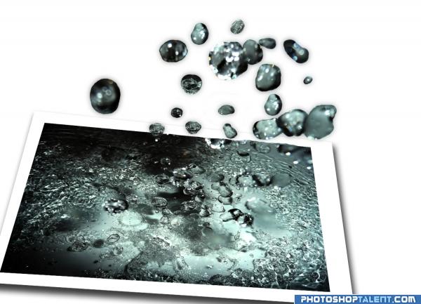
if i could do anything in photoshop, that is something i would have done with the source image, because it's great itself and you added dimension trying to come out from frames and that playfulness and freedom i like a lot  maybe you could try to give some more vivdeness to waterdrops (colors, blending, reflection). good luck!
I like this. For your first time this is really good.
you did a really good job. I like this. It is very well done. Good luck. 
Very Cool Effect...Would love to see the high res...Best of Luck 
i added the high resolution for you 
good thought, avoid shadow of drops.
nice ideia very original
simple but very good for first

I like this. There are three droplets that look like little skulls of some type. I would clone away the features of two of them so they don't look so obviously cloned. Also, if you used one of the tutorials that show how to do this, its good to give them credit for that. All being said, really nice first effort! 
i didnt use any tutorial for this, thanx for the comments 
Creative use of source. I'm a sucker for these kind of images...
you did very well
Howdie stranger!
If you want to rate this picture or participate in this contest, just:
LOGIN HERE or REGISTER FOR FREE

Wanted to make something different........here it is. (5 years and 4048 days ago)
great idea.. wondering if you should incorporate the arms of the glasses..but I bet you tried it and they were to big.. good luck
tears? sad...  good luck!
ha ha ha ...by the title this is not glasses....and then ...just imagine.....anyway....this entry...is good!!!
i prefer one glass
Nice idea good luck!
Nice work, good luck 
cool 
gl
lol very good 
Not bad, maybe a bit too much distance between the two words. In fact it almost loses the function of logo this way. Good luck!
If one or many logos are close or together, it doesnt mean that the others have to also be the same. Be imaginative, be different. 
GL!
The glasses aren't clear...thought they were two soaps! Nice droplets tho!
Howdie stranger!
If you want to rate this picture or participate in this contest, just:
LOGIN HERE or REGISTER FOR FREE
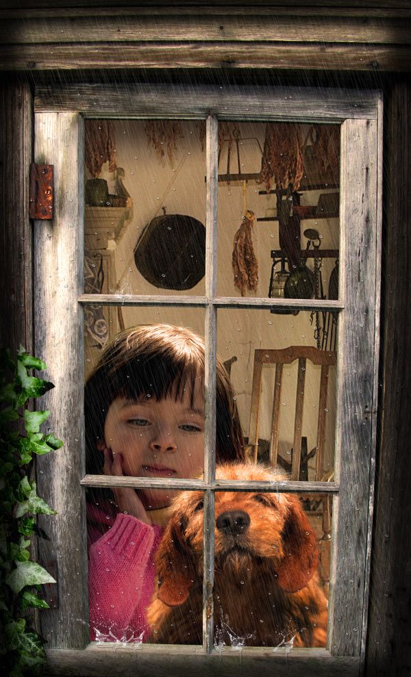
Nice work except for the raindrops appearing to go in all directions rather than down...still, it's well done.
Great job... very nice work
Beautiful!!!! There's no other word to describe it...
I will try to do something about the raindrops
I would personally think of the colours a little more. If it's raining and dark(ish?) outside, the dog is quite well lid - and so is the girl.. but this is very good work, beatiful picture.
I personally think the girl and dog are huge considering the size of the window.
It's a really small log cabin :-b
Great work!
a very warm, soothing image
Fantastic
Size of the girl and the dog are a bit undigestable....but other than that the work is really nice...
thanks for so many nice comments. I changed the size of the girl and dog, and also made them a little darker. Hope it is better now.
Fantastic work...love this so much...
Nice blend.
better
Congrats on 1st plaaaaaaaaaaaace!!!
Congrats for your first place, Clinge! I really love this one
Thanks on congrats
Congrantulations...well deserved
Congrats
Howdie stranger!
If you want to rate this picture or participate in this contest, just:
LOGIN HERE or REGISTER FOR FREE