Credits to :
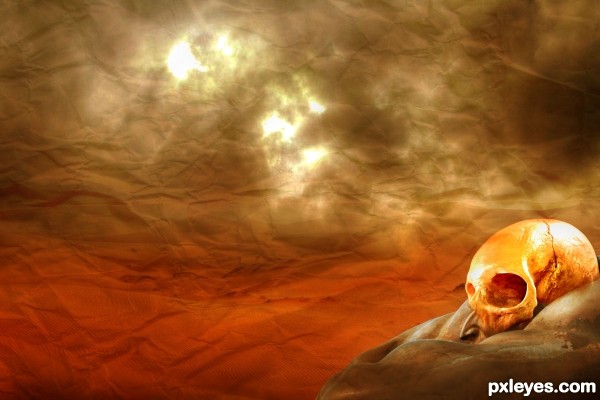
Skull - JeremyWhat
Sky - =night-fate-stock
Paper - ~Spiteful-Pie-Stock
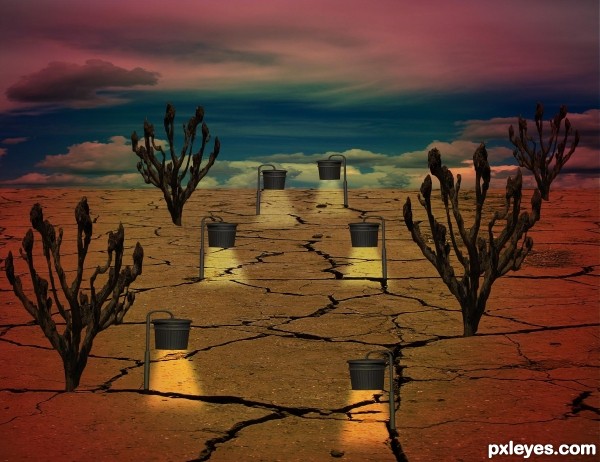
Dunes - ~darkw0lf09stock (5 years and 3488 days ago)

(5 years and 3505 days ago)
I think you should add a worn path between the lights. Good luck!
good work
Good idea, but perspective is off...foreground lights should be bigger, those in the background smaller.
Howdie stranger!
If you want to rate this picture or participate in this contest, just:
LOGIN HERE or REGISTER FOR FREE
great colors...
The nose doesn't look right on the skull. Being soft tissue, it would have been the first thing to deteriorate...
Nice work -- like the background blending the paper and sky -- seems to be a bit of the skull showing at the rear just below the edge of the source
@mossy b

 anyone


agree with the nose part
but let `em b sometimes (if not all the time)
i mean this is creativity
y go logical on certain aspects ??!!!!
except for any realistic creation we can n shud go on n on ... no limits
this particular one`s rather abstract so waive out reasonin here
as for me i can view the skull as a mask of some-sort ...
i hope this is not offendin
apologies if it does
@author
support me author
GL
I love the colors, and the texture on the background gives the touch on the image.
Howdie stranger!
If you want to rate this picture or participate in this contest, just:
LOGIN HERE or REGISTER FOR FREE