Photoshop Pictures: Dutch


results 1 - 4 of 4

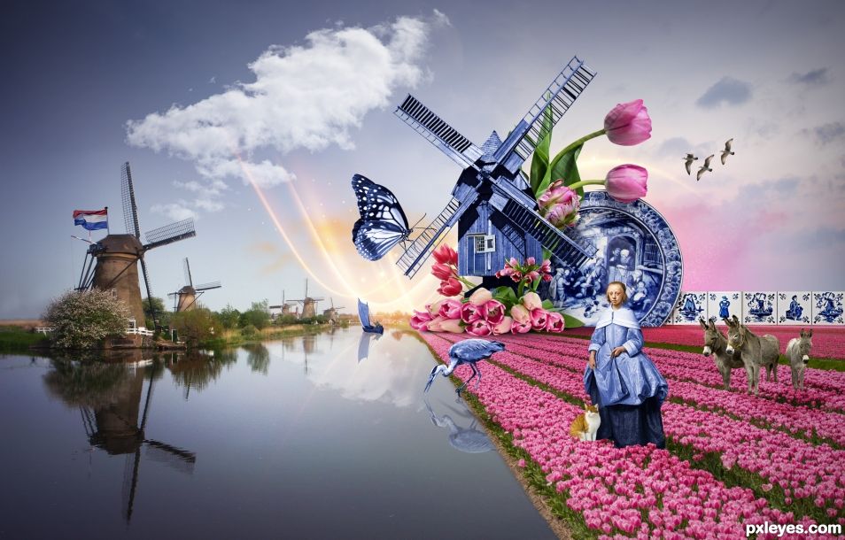
Dutch spring - created by sandrine77


Dutch spring
Favs: 0SBS: n/aHi-resRank: 8/12Score: 53.9% (0)12661 views

Inspired by the traditional blue and white delftware (potteries made in Delft, Netherlands from the 16th century).

More sources:
Tulips:
https://pixabay.com/fr/fleur-plantes-tulipe-nature-3084624/
https://pixabay.com/fr/fleurs-tulipes-pays-bas-printemps-1843720/
https://pixabay.com/fr/tulipes-fleurs-abricot-rose-nature-2152975/
https://www.freepik.com/free-photo/two-purple-tulips_1106923.htm#term=two%20purple%20tulips
Gulls:
https://pixabay.com/fr/go%C3%A9lands-mouche-isol%C3%A9-mouette-bird-2722093/ (5 years and 644 days ago)

10 Sources:

avatar BWR
BWR says:

That Great Blue Heron is one of my favorite birds. Lots of work put into this Chop.

Moderator says:

Please fix your links, they are not opening.

author says:

Fixed! Thank you for your comment. I didn't notice it wasn't working

(5 years and 636 days ago)


avatar still26
still26 says:

Good gracious this looks like a lot of hard work. It is here with a busy message and a split in time and mood....very creative.

BWR says:

I agree.

(5 years and 622 days ago)


author says:

Thank you for your comments

Howdie stranger!
If you want to rate this picture or participate in this contest, just:

LOGIN HERE or REGISTER FOR FREE


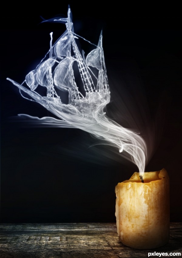
The Flying Dutch - created by yoguy108


The Flying Dutch
Favs: 25SBS: 13Hi-resRank: 1/12Score: 69.7% (40)17146 views

(5 years and 3127 days ago)

5 Sources:

no avatar
dem90 says:

This is simply stunning! You have done an amazing job here!

avatar lchappell
lchappell says:

Very good job, sbs is very informative.

no avatar
XxBWxX says:

GORGEOUS!!! Terrific job. Well, done.

avatar nanaris
nanaris says:

lovely!

avatar trim49
trim49 says:

Wonderfully done.

avatar phen
phen says:

wow,, great jo! GL

avatar ibmaxed
ibmaxed says:

Awesome job..my only nit pick is the sharp edge of the smoke on the wick in high res

no avatar
olga says:

Good work! Great idea!!! GL

avatar layerstack

Stunning my friend..GL

avatar EmiK
EmiK says:

Wonderful work, I really like this one = )

avatar pixelkid
pixelkid says:

Wonderful work! Candle is perfect touch! Perhaps fade out towards the ship more...still be able to see it but less obvious than closer to the candle...does that makes sense?

avatar Androla
Androla says:

good execution! amazing creativity!

avatar loopyluv
loopyluv says:

Very cool!!!!

avatar spaceranger

Very well done, good concept and execution!

no avatar
Keiley22 says:

looks fantastic author.... going into favs for sure

author says:

thanks all

no avatar
Hacked [banned] says:

OMG ! AWESOME CLEAR WINNER NO DOUBT CHEERS MATE GL

avatar hazem
hazem says:

very good work ,good luck

avatar madamemonty


beautifully done

avatar enblanco
enblanco says:

great! GL!

avatar DanielaOwergoor

Fantastic!!!! Fav!

avatar erathion
erathion says:

Perfect work author...This is with any doubt your best work here...High marks and instant fav from me...best of luck

avatar pearlie
pearlie says:

Very clever, great work (and sbs) on the ship especially.

no avatar

Amazingly awesome.....Best of Luck Author.

avatar nanaris
nanaris says:

congratulation!

avatar madamemonty

Congrats, absolutely stunning

avatar spaceranger

Congrats!!

author says:

thanks all

avatar Androla
Androla says:

congratulations!!!

avatar mazanda
mazanda says:

Congratulations for your fist place.
Nice work!
Great job, saw the SBS. Is not for anyone!

I do not find words to express my admiration!

avatar Chuck
Chuck says:

Nice Job Congrats on first Place Win

Howdie stranger!
If you want to rate this picture or participate in this contest, just:

LOGIN HERE or REGISTER FOR FREE


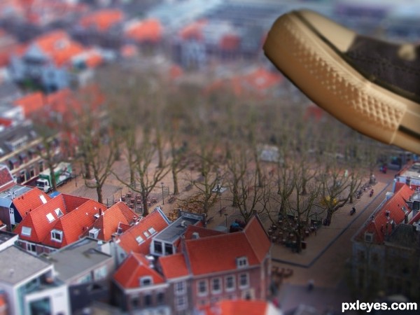
Steppin on Delft - created by Floortje1973


Steppin on Delft
Favs: 3SBS: n/aHi-resRank: 1/12Score: 57.9% (35)23253 views

A view of the one of the most beautiful squares in Holland, de Beestenmarkt in Delft.

There is a story in this picture, it so happends to be that I lived in one of those cute houses and met my husband and now own two cafe's on this square. Our Belgian Beer Cafe is situated on the corner in the bottom (middle) of the image, the flat roof is my office and the house next to that, with the three windows in the roof is my old house.. The House next to that one is our Italian Restaurant..
(5 years and 3229 days ago)

2 Sources:

avatar Nickk
Nickk says:

hah I've been there a lot a pity if it would be crushed by a giant shoe ..
Great work !!

avatar wazowski
wazowski says:

Nooo, dont let Delft be crushed by that shoe!! Delft is too nice for that!
Convincing work, btw, nice result. Good luck!

author says:

When I get my hands on that person! Thank you for your comments!

avatar erikuri
erikuri says:

Very convincent! Nice work!

avatar sanjugs
sanjugs says:

very good shadow.....

avatar erathion
erathion says:

great job author...very nice thinking...gl

author says:

Thank you for all the nice comments!

avatar CorneliaMladenova

Congratulations!

avatar RichieMB
RichieMB says:

Congrats for 1st

avatar erathion
erathion says:

Congrats...

avatar Palaekman
Palaekman says:

Congrats on first place

author says:

Woo thank you so much all! !

Howdie stranger!
If you want to rate this picture or participate in this contest, just:

LOGIN HERE or REGISTER FOR FREE


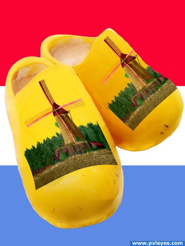
Really Dutch - created by vosya


Really Dutch
Favs: 1SBS: n/aHi-resRank: 12/12Score: 51.6% (0)5228 views

(5 years and 3684 days ago)

1 Source:

avatar sparklen
sparklen says:

I had some of these when I was a child! Love it!

no avatar

Awesome! Really creative. There are some highlights on the left shoe that disappear behind the pic and the left side of that pic is curved a little weird. I would bow it out the other way to fit more with the contour of the shoe.

avatar pixelkid
pixelkid says:

Whoa! What a change of pace! Thanks for doing something really different!

avatar Chuck
Chuck says:

nice

avatar RayTedwell

What a great idea - love to see people think differently but still not lose the point of the theme post. I would adjust the left corner of the pic and dodge in some ligter spots for the highlights though. Oh and consider lightly smudging or blurring the edges just a little, no printing on a clog is going to be quite that precise. Cheers

avatar Siminho90
Siminho90 says:

nice idea!

avatar wazowski
wazowski says:

Nice idea, would be even better if the blue was darker (now it's the flag of Luxembourg ). Good luck!

no avatar

great Klompen, the "molen llook fantastic.

avatar youri2323
youri2323 says:

really super splendidly, you go win hear! I cant make that!

avatar greymval
greymval says:

I have to admit, it's an original idea.

Howdie stranger!
If you want to rate this picture or participate in this contest, just:

LOGIN HERE or REGISTER FOR FREE