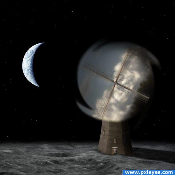
I have changed the source for the mill - source upgraded.
I have upgraded also the link for earth - the picture I have used is no 95 in the galley (5 years and 3820 days ago)
- 1: earth and moon
- 2: mill

I have changed the source for the mill - source upgraded.
I have upgraded also the link for earth - the picture I have used is no 95 in the galley (5 years and 3820 days ago)
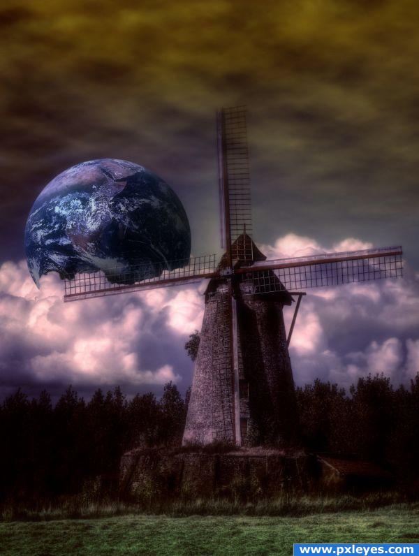
Fantasy Art
Earth Source(under the Creative Commons-licensed content):
http://www.flickr.com/photos/wwworks/2222548359/
(by woodleywonderworks on Flickr) (5 years and 3823 days ago)
nice idea but the cloud effect you have done on the B/G goes behind the planet ,try and place it in front of the planet .. just an idea  g/l.
g/l.
The planet was meant to be in front of the clouds. Not in space. This is what makes it unique.
nice
Howdie stranger!
If you want to rate this picture or participate in this contest, just:
LOGIN HERE or REGISTER FOR FREE
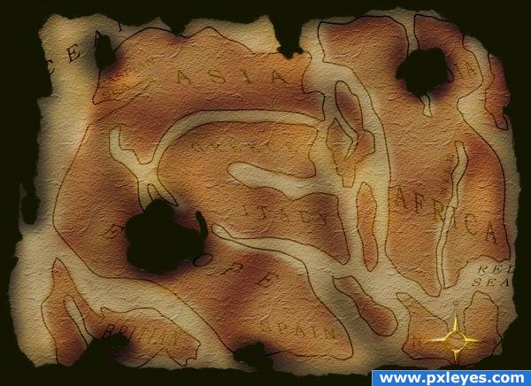
As per the rules this is a concept of what a VERY old map would have been like, if the world had been flat.
NO outside images used (with the exception of a sketch I uploaded - found in beginning of sbs.) (5 years and 3827 days ago)
Fits the theme perfectly. Well done.
Very nice!
You mean the world isn't flat?
Howdie stranger!
If you want to rate this picture or participate in this contest, just:
LOGIN HERE or REGISTER FOR FREE
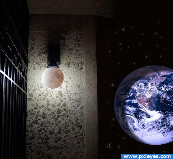
Starry night, a good light, what more can you ask for? (Maybe a good book, or Photoshop CS4.... ;) ) (5 years and 3833 days ago)
Good thinking! 

good use of texture.
Very creative. Simple but yet unique.
Thanks!
Howdie stranger!
If you want to rate this picture or participate in this contest, just:
LOGIN HERE or REGISTER FOR FREE
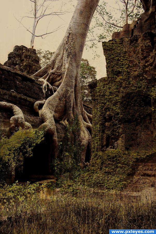
Nobody left, just overgrowth everywhere. Nobody around even to take this image.
I went for a grungy effect since it is pretty much the end of mankind.
Textures from CGTextures:
Rust Scratches 0010
Concrete Worn Paint 0013 (5 years and 3845 days ago)
This is so pretty!
nice idea...
nice combo! maybe less sepia and more green, but probably no need 
A good blend of different sources. Good luck!
This sepia effect is not so good
nice
I love the sepia! It adds a very special feeling to it. And you blended all the sources very good! Good luck 
You should make a Gallup pool, who like and who dont like sepia  . I vote for sepia, good luck.
I like how the mood of the sky and the mood of the rest match in this one.
congrats Solkee!!! 
Congrats for your second place, Solkee!
Congratulations for 2nd
Congrats!
congrats
Congrats!! Nice one mate!
congrats solkee
Howdie stranger!
If you want to rate this picture or participate in this contest, just:
LOGIN HERE or REGISTER FOR FREE
splendid
Howdie stranger!
If you want to rate this picture or participate in this contest, just:
LOGIN HERE or REGISTER FOR FREE