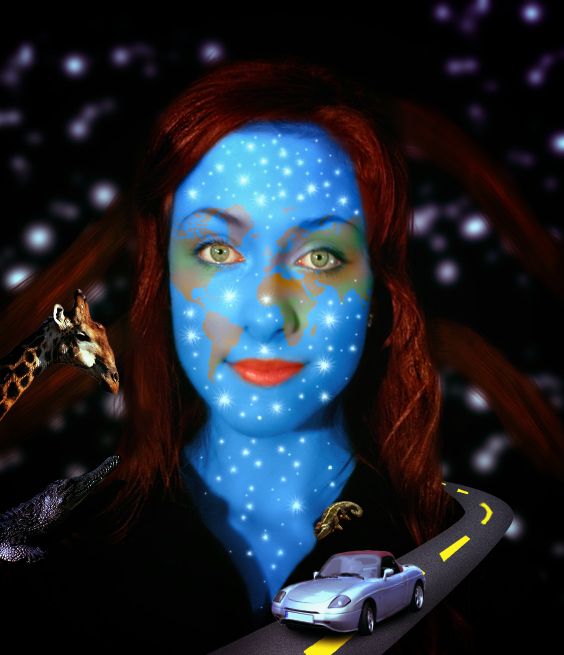
thnks to nightmareccs (5 years and 3264 days ago)
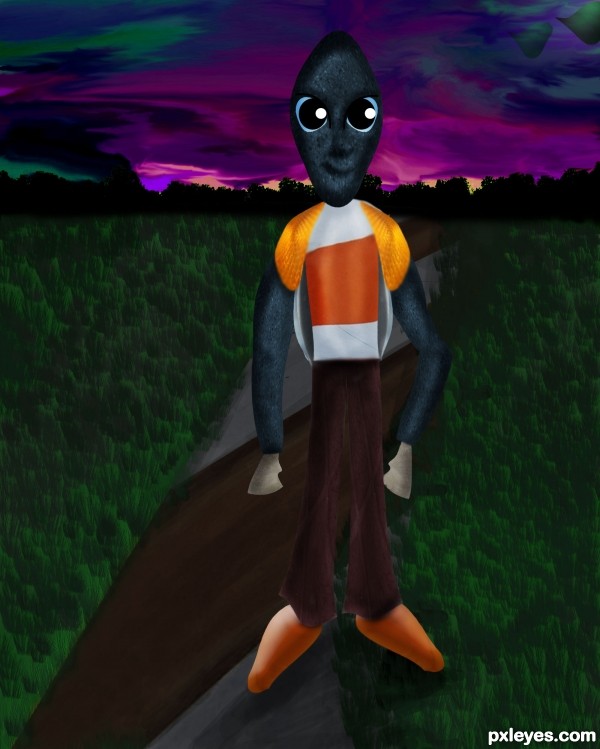
everything is painted in photoshop including the sky and grass....
color balance,hue saturation layers are used for the sky and grass color effects
and thanks to
osidiandawn.com for the grass brush... (5 years and 3341 days ago)
very cute!! good luck author
 GL author!
thank you 
Great job on the sky!
Good job
very very nice work author...best of luck
Cool cartoon look 
Howdie stranger!
If you want to rate this picture or participate in this contest, just:
LOGIN HERE or REGISTER FOR FREE
(5 years and 3345 days ago)
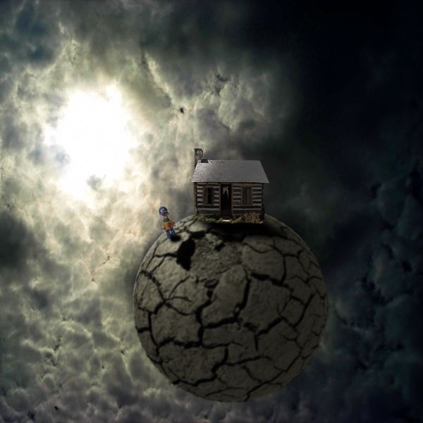
very nice work and good usage of the source image...Small nit pick,its to big difference in the sharpness of the planet and the other elements...if u could solve that problem that would be great...any how i like the final product...best of luck
Wow ... GoooD WorK
i agree with erathion. the consistancy of focus isn't working for me. but, you've got time to work on that a bit. 
Thanx For Your Operations 
Cool composition and color. Would have really liked a high res version of this.
Howdie stranger!
If you want to rate this picture or participate in this contest, just:
LOGIN HERE or REGISTER FOR FREE
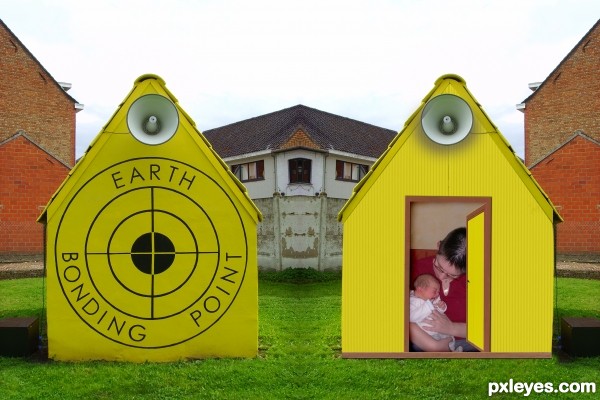
For this concept I used the source file and 2 of my own pictures.
The picture inside the yellow house is one of my little niece,
only 3 days after she was borne. My first chance to bond with her. (5 years and 3356 days ago)
I can see where you were going with this author.. try to add some shadows under the speakers.. darken the edges of the the baby picture and it will give the illusion of depth (some burn will help with the overall image  ... (but remember.. it is YOUR vision.. and what I suggest is IMHO) good luck (and sweet sweet baby... now wait for the drooling LOL)
nice work author...create some shadows under the megaphone...best of luck
I made some little changes, added some shadow and burn as suggested.
Thank you erathion and Drivenslush for your comment.
You should have made a window out of the doors frame, so that they won't look out of scale and half burried.
Rule of composition: repeating an element lowers it's value (2 yellow houses).
But it's a try, keep improving.
Howdie stranger!
If you want to rate this picture or participate in this contest, just:
LOGIN HERE or REGISTER FOR FREE
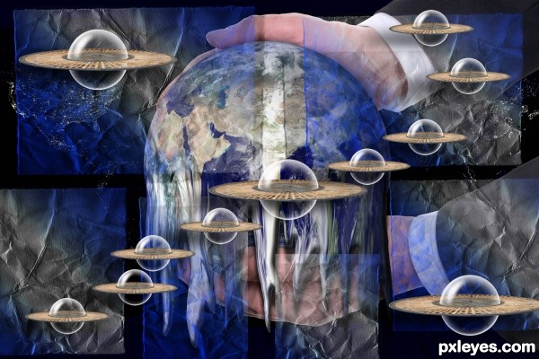
source and Bubble and Heavy Paper Brushes and my Photos (5 years and 3377 days ago)
THis to me is very awesome. It's got a lot of eye focusing areas 
Such an interesting composition. LOVE what you did with the chair and bubble! 
Um, what is 'sluing'???
Sluing is spinning on ones axis hehehe
For heavens sake, I'm a natural-born American and never heard that word, nor did Mr. Webster. Luckily, Mr. Google has. And somehow, it's so appropriate! 
Howdie stranger!
If you want to rate this picture or participate in this contest, just:
LOGIN HERE or REGISTER FOR FREE
Really well done. My only suggestion would be to remove the redness around her eyes (make a selection around the eyes, and use Image>Adustments>Hue and Saturation, Reds to reduce the saturation and lighten it a bit)...
Howdie stranger!
If you want to rate this picture or participate in this contest, just:
LOGIN HERE or REGISTER FOR FREE