Photoshop Pictures: Easy (page 2)


results 6 - 10 of 10

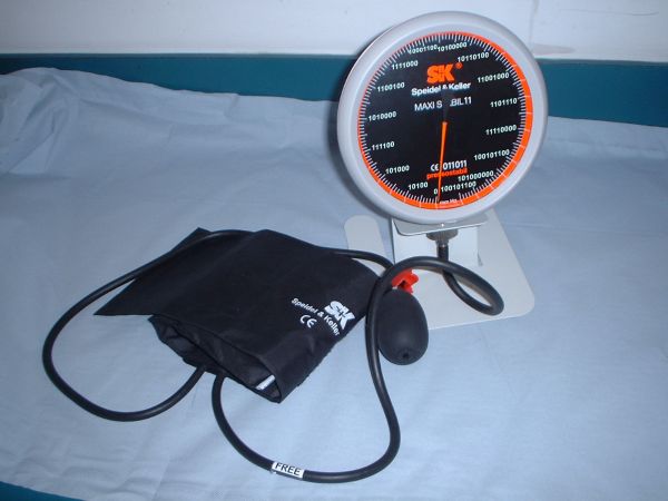
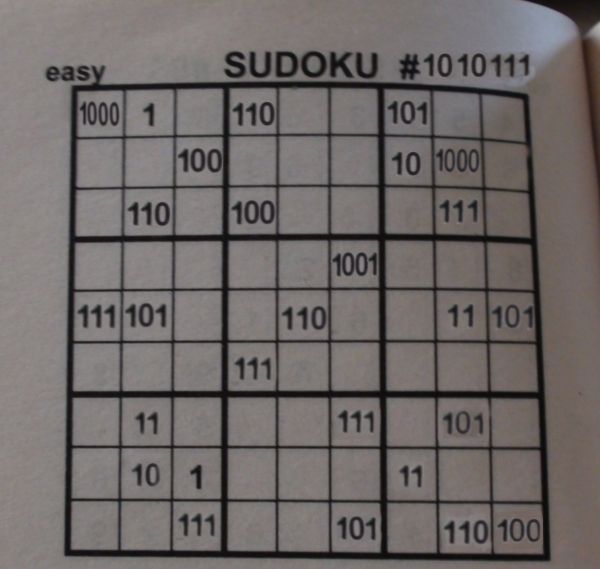
How is This Easy? - created by ChristianTheMagician


How is This Easy?
Favs: 0SBS: 1Hi-resRank: 14/15Score: 51.6% (0)10058 views

a sodoku puzzle from a book. i got the 0 from the page number. i can't put another pic of the original but i can tell the numbers.
8, 1, 6, 5 on first row
4, 2, 8 on second row
6, 4, 7 on third row
9 on fourthrow
7, 9, 6, 3, 5, on fifth row
7 on sixthrow
3, 7, 5 on seventh row
2, 1, 3 on eighth
7, 5, 6, 4 on last row (5 years and 3517 days ago)

avatar sunzet
sunzet says:

I suck at regular sudoku - this must would kill me....aaahhh....very clever GL

avatar iquraishi
iquraishi says:

you need to work on some numbers there.. they got white color in '0's and some show a background.. use stamp tool to clear the old numbers and write the new ones and then play with blending modes to make them look natural... then it'll look good..

avatar iquraishi
iquraishi says:

and yes.. this would be the toughest sudoku of all times..

avatar erikuri
erikuri says:

I love sudoku, but I don't know about this one...
The number after # needs more warping, and I agree with Iquraishi about white color behind the changed numbers.

avatar JPDesigns
JPDesigns says:

Clever idea, I would have never thought about that. I like this one, but I agree with the background of the numbers, maybe if you had cut out the numbers and then used color selection to get rid of the white it would look better. And with the 111 at the top of the page, underneath you can tell where you covered up the numbers, maybe try using the clone stamp and going in a straight line from the top of the page down over the numbers to give it a better blend. But like I said, love the concept and I do like this entry

Howdie stranger!
If you want to rate this picture or participate in this contest, just:

LOGIN HERE or REGISTER FOR FREE


Not easy for the doc - created by Savitha


Not easy for the doc
Favs: 0SBS: n/aHi-resRank: 8/15Score: 55.5% (0)7283 views

clone stampstool
text tool
rectangle marquee
pen and paper for conversion to binary (5 years and 3518 days ago)

1 Source:

avatar iquraishi
iquraishi says:

aaannddd.. what's that?

avatar iquraishi
iquraishi says:

alright.. got it.. so r u done with the rework?

author says:

i am new to pyxleyes.. how do i send in my rework

avatar nasirkhan
nasirkhan says:

Welcome to site.

You can edit your entry by clicking on "MY Stuff", then "my contest", where your current entries are listed. Click EDIT button to edit entry and upload corrected version using browse button

author says:

thanks nasirkhan. And bye the waty u r one super artist. am a fan of yours. Just took this oppurtunity to let u know.

avatar nasirkhan
nasirkhan says:

Thanks author for your nice comment. Wish you success here and enjoy chopping. Good Luck.

avatar iquraishi
iquraishi says:

good luck author.. and welcome aboard.. hope to see cool entries from you..

avatar erathion
erathion says:

Welcome to PXLeyes...your work is very nice...good clean crop...good luck

avatar erikuri
erikuri says:

Welcome, new member of Pxleyes! And if you didn't say the flaw, nobody would notice it... it's binary!

Howdie stranger!
If you want to rate this picture or participate in this contest, just:

LOGIN HERE or REGISTER FOR FREE


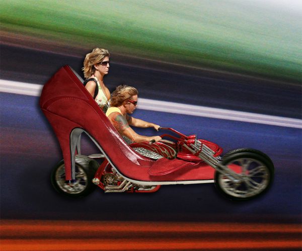
EASY RIDER HEEL - created by DigitalPro


EASY RIDER HEEL
Favs: 0SBS: n/aHi-resRank: 14/15Score: 50.2% (0)9692 views

(5 years and 3582 days ago)

4 Sources:

avatar demi
demi says:

very goed

avatar loopyluv
loopyluv says:

Heehee

avatar cterraza
cterraza says:

its a great idea and looks goos, but needs more work, the back wheel has a different perspective. the front wheels look s

avatar cterraza
cterraza says:

sorry I couldnt finish. as I was saying, the front wheels looks like they both are on the right side of the shoe. the background has a blur motion, but the wheels arent moving, maybe if you make a layer with the wheels and put a motion blur. you still have time. its a good entry. good luck

Howdie stranger!
If you want to rate this picture or participate in this contest, just:

LOGIN HERE or REGISTER FOR FREE


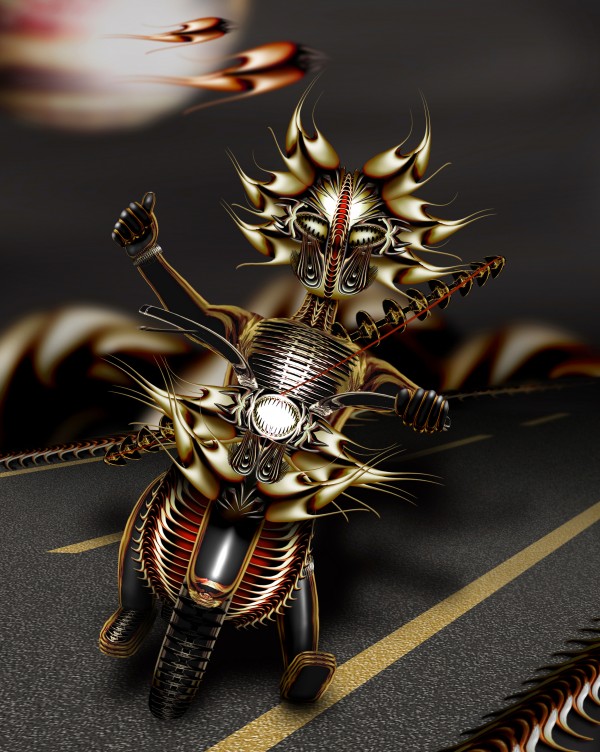
easy rider - created by Verikakis


easy rider
Favs: 7SBS: 12Hi-resRank: 1/15Score: 66.9% (37)12224 views

Only the source image used for this entry (5 years and 3627 days ago)

no avatar

Too cool.

avatar nishagandhi

COOL

no avatar

Creative........Great work Author..........G/L.

avatar ponti55
ponti55 says:

Great detail! Really nice job.. the shadow seems wrong to me, perhaps fade the opacity with a gradient as it gets further from the light. Good luck!

avatar erathion
erathion says:

Very very nice work...great imagination and details...good luck author.

avatar Clinge
Clinge says:

Very very nice indeed Tops!

avatar jawshoewhah
jawshoewhah [banned] says:

Great use of the imagination. Personally I would have tried to incorperate the original glass a little bit more as far as it's original look but still a very imaginative.

avatar jaskier
jaskier says:

Cool one.

avatar PhilNit
PhilNit says:

Superb!!!

no avatar

yea! GO THE BIKERS. love this artistic and creative image. lots of work but it has paid off.

avatar RichieMB
RichieMB says:

Congratulations for 1st

avatar Lelaina
Lelaina says:

Congrats for your first place, Verikakis!

avatar jawshoewhah
jawshoewhah [banned] says:

Congrats on your 1st!

avatar cabldawg71

Great chop! congratulations

avatar nasirkhan
nasirkhan says:

congrats! for 1st place. Awesome

author says:

Thanks to all for the comments and favs

avatar demi
demi says:

Congrats for your first place

avatar artgirl1935

Great work! Congratulations!

avatar shaunpreece

Seriously great work! Loads of effort went into this and by damn its worth it!!

Howdie stranger!
If you want to rate this picture or participate in this contest, just:

LOGIN HERE or REGISTER FOR FREE


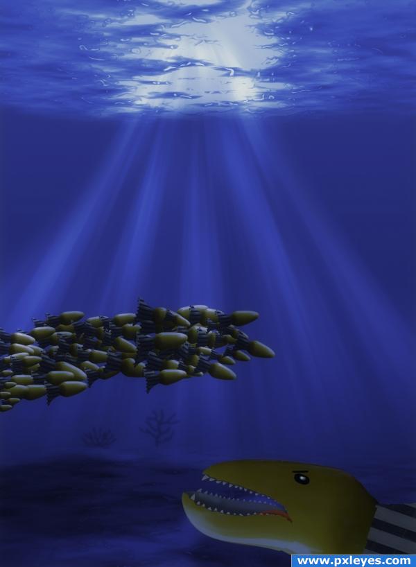
Easy pickings - created by ponti55


Easy pickings
Favs: 0SBS: 37Hi-resRank: 9/15Score: 54.5% (0)4469 views

The big bad fish is after the swarm of... erm... lights with tails!

Edit:
Thanks GolemAura!

My 37 step guide is to make up for 21 shoddy or unfinished ones xD (5 years and 3768 days ago)

avatar Tuckinator

hahha cooooooooool!

avatar GolemAura
GolemAura says:

High marks and wonderful SBS.. you might want to add a gradient inner jaw.. just draw an oval behind the jaw of the big one and fill it with a gradient (dark to light coming from throat.. not necessary, but you did so much work I figure a bit more wouldn't hurt LOL) It's fine just the way it is, but I was thinking of the neat effects you worked on.. )

EDIT: Grrrrrrrrrrreat fix... good luck author

author says:

Haha, thanks GolemAura, i'll get right to it!

Edit: There you go..voila

avatar robvdn
robvdn says:

You should also post the tutorial you used to make this.

Howdie stranger!
If you want to rate this picture or participate in this contest, just:

LOGIN HERE or REGISTER FOR FREE