(5 years and 3965 days ago)

(5 years and 3967 days ago)
hehehehe (love the eyes)
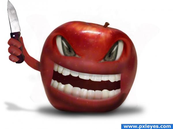
just a nasty apple  good work
Haha! Very nice! I really like the depth you created in the eyes.. i suggest cleaning up the edges around his fingers, but other than that it's a great image!!!
haha very nice 
Great image! The shadow should curve around the upper teeth instead of being a straight line...
the cut out on the apple is really looking odd, the eyes look nice the hand looks copy pasted, theres a apple shadow but its shadow has no hand with knife and i personally would of done more with the inside of the mouth, keep working on it its a nice idea, you could soften the edges a lil with a soft blur btw that makes it blend in better with the back ground and softens the cutout..
thanks for tip CMYK46 but in upper lip shadow what i did was just drop shadow it suppose 2 match if u look good is not a straight line ,thanks Eladine shadow of hand with knife is already there, thanks for tips
looks better now author  he rly has the look in his eyes saying: " make my day " XD
Nice work. This apple really doesn't want to be eaten, hehe 
The shadow on the upper teeth is still wrong...look at the lower teeth.
he is striking back alright!
OMG this is so wicked and what a coincidence i have an apple cut right in front of me now..now i am scared to eat the apple LOL

the fingers look cut and paste
Right on theme. But Ive seen this kind of image a lot, letting a face come through the object. Thats ok, but you could have perfected it a bit. For example he doesnt have lips or eyelashes or a tongue...
nice perspective!
thanks for comments, and Sander this is a cartoon ,thanks
Congrats for your second place, with this "lovely" apple 
Congratulations for 2nd
Congrats!
thanks for congrats
Congrats!
Congrats! 
Congrats! 
Howdie stranger!
If you want to rate this picture or participate in this contest, just:
LOGIN HERE or REGISTER FOR FREE

one outer source used.
Thanks to www.sxc.hu
and
Author: Sias van Schalkwyk (doc)
(5 years and 4010 days ago)
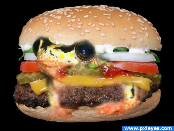
a see through frog?
frog not fixed propperly
blury
The effect really doesn't sell. Try watching or reading some blending and masking tutorials. Good luck!
I know what you trying to do and it wuold work but the way you have done it is just not working sorry 
its a little blurred
The frog looks a bit "fuzzy" (especially around the eyes). Also, he doesn't seem to actually be a part of the sandwich but rather floating in front of it. I would take the frog's head and blend it in to the piece of hamburger meat, changing the color of either appropriately. Maybe you could even stick a frog leg or two in there. Great start, and once you get some more polish on this it will be a great (and funny) piece!
Yummy!!!!
too alive for me to eat... 
Howdie stranger!
If you want to rate this picture or participate in this contest, just:
LOGIN HERE or REGISTER FOR FREE

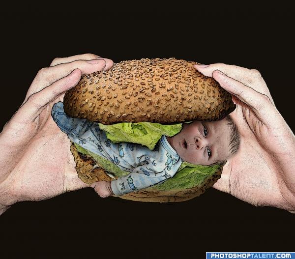
I had fun making this one, just the thought of it made me laugh.
Baby in a bun, yummy :-p
Sources for the bun, baby and lettuce.
The hands going in a SBS from my own collection.
Edit: For the Benefit of those asking about filter, I have added to the SBS and with and without filter, I think its much better with the filter. (5 years and 4041 days ago)
Please check out in High Res, comment and stuff like that 
Nice idea good luck!
noooo..not the baby  very funnny i like it nice work though
imo, it would look better without the filter in this case  Though nice idea xD
Oooh noo, 
 Perfect sources, an the expression on baby's face is just right for what is about to happen!
Damn , they do??
OMG don't eat him!!! 

ummmm... yum??? lmao, good work author 
haha very funny, i want one with extra babies
eww...lololol.. good job
Please don't eat innocent babies. Too much filter work.
Funny! But I agree that the filter should be eliminated (makes it look dirty).
For the Benefit of those asking about filter, I have added to the SBS and with and without filter, I think its much better with the filter.
good
I like it better without the filter  gl
gl
gl
Funny! 
Nice idea!!!
Not the right filter...
Nice idea. Two small things though. The knuckles seem cut off on his hand, and thetop of his head should have a line around it similar to the other shapes in the picture....good luck author.
nice job 
NOO! Not the baby! Funny idea!  haha! yummy!?
  Well done!
well, you made an entry, but oh my, this is unbearable.
Oh my GOSH! Creapy stuff! I really like drawing effect. I would probably add giant open mouth with thousands of teeth! GL
nice entry
Howdie stranger!
If you want to rate this picture or participate in this contest, just:
LOGIN HERE or REGISTER FOR FREE
ewe
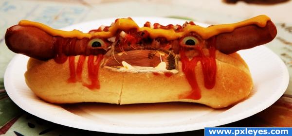
hm, I was planning to eat hot dogs today. Guess I'll stick with pizza or something
Dont want to eat that!
lol
nice!
Cute.
oh lawdy, this is twisted. Good job! lol
Howdie stranger!
If you want to rate this picture or participate in this contest, just:
LOGIN HERE or REGISTER FOR FREE