(5 years and 3702 days ago)
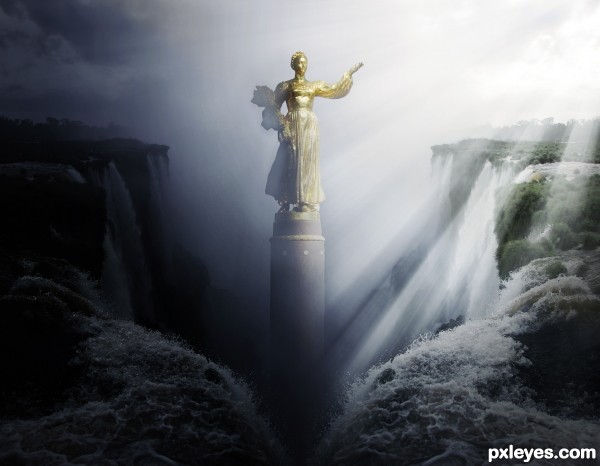
- 1: Statue

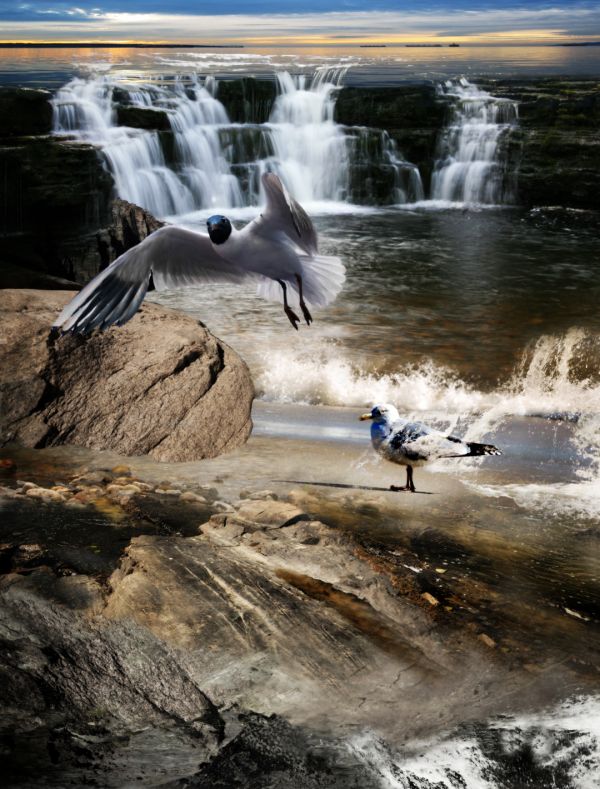
Just a huge amount of handwork, with blending all the layers and finding a way to make them match each others. Tried to do a clean cut with the bird (seagull) and give it a better coloring too.
I gave some colours for the bird(s) and spend a lot of time altering the colours for different source pictures, as the colour palette was very different in each.
Tools used: layer blending, masking tools, warping tool, perspective tool. Hue/saturation and colour balance tool+channel mixer. Clone tool and render/lightning effect.
A slight gaussian blur added finally with some colour tweaking, to remove excess colour from the lower part of the image (mostly red). (5 years and 3805 days ago)
nice done
Good work, but maybe make the flying seagull a tad bigger, for depth...coz at the moment the gull on the ground looks like it is the same size...GL 
this looks great in high res....nice work!
I love the work you've done. Colors and blending are great! It seems that the horizon over the falls is far too high for the angle of the source bird. I would like it with just what you've added in the foreground. GL to you.
good work, but the bird thats on the ground is huuuuuge
I think some of you guys are seeing the lower part of the image as some kind of mountains or something.. it tries to be just some bedrock under the water/sea. It's true, the horizon doesn't really match perfectly with the original bird view, but the flying bird is very close to the original bird in my idea, as well the original is close to the viewpoint.. So it's not some sort of freakish giant bird really  But thanks for the comments, I can see you problem here. I think if I would have cut off the very lower part, the perspective would have been more 'realistic' looking for you.
Good one.....
very nice 
Howdie stranger!
If you want to rate this picture or participate in this contest, just:
LOGIN HERE or REGISTER FOR FREE

(5 years and 4029 days ago)
Very AWESOME result.. good luck
HIGH RES PEEPS DON'T MISS OUT!!!!
Neat. And Creative.. Good Luck..
Nice job of working with a mostly blurry source pic! 
very nice! 
very very nice....high marks from me....good use of source image......very well done....
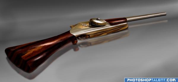
Now that's really cutting edge rifle... Good title and great image...
Neat and clean chop. Well done author 

Great job!

well done author, this is great and high res is even better. high vote. good luck
nice job, good final result
very nice. good job! 
haha cool, nice play on words in the title.
great imagination

I must say that I just love this. I keep coming back to look at it. Now I want to got duck hunting.
wow!!
very creative and nice g.l.
Creative!
Great idea, creative  and it looks real
great work! 

nice blend!!!
thanks for so many great comments, it means a lot to me 
good creation
good
very nice job author  .... GOOD LUCK
great 
Wow this is impressive! GL
Congratulations for 1st
Congrats! Very well done.
Congrats, nice work 
Congratulations
congrats!!
congraaaaaaaaaaaaaaaaaatsssssssssssssss!!!!!!!!!!!!!!!!!!!!
Congrats for 1st 
Congrats!
Howdie stranger!
If you want to rate this picture or participate in this contest, just:
LOGIN HERE or REGISTER FOR FREE

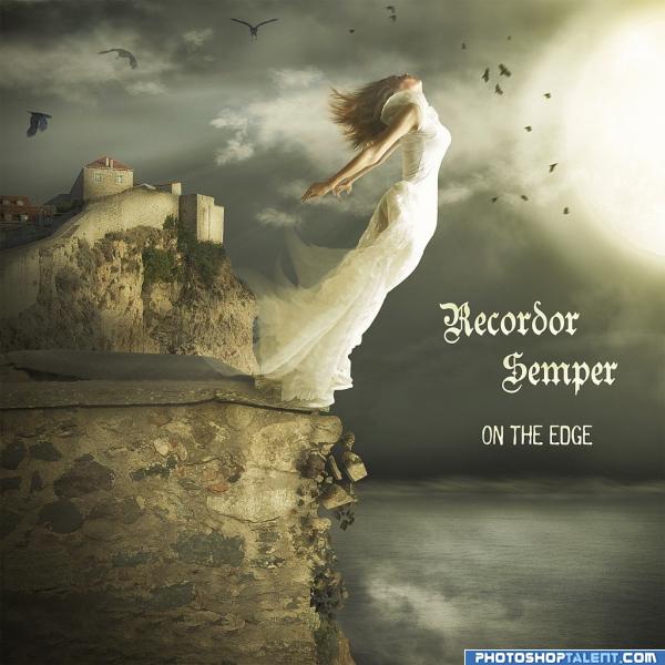
Cover to the album of imaginary band. (5 years and 4036 days ago)
nice colors
Nice! The bird in the left corner is supposed to be behind the clouds, I think, but he just looks transparent. recommend bringing him infront of the clouds (my apologies to the bird if it's a girl)
nice work author 
nice mood
Very nice scene great colours & composition but & there is always a but the text is spoiling it where it is try the top & bottom just to see how it looks...
My absolute favourite!
supa! i like this one very much! the motion is well rendered, i can picture her falling down!!!!
very nice -- I'd buy it just for the cover
look very good! good job 
Beautiful chop!
Nice work, good one, Good Luck 
very nice colors and concept
lose the type it takes from the drama otherwise i like it very much
Very nice!
Love the mood, good job.
Nice result. Colors are nice indeed and those crumbled stones are a nice touch. In case you wanna keep the text (for this time ai can understand as part of the album cover), you may want to try to put the band name above the horizonline (lets say where the title is now) and the title under the horizonline. At least a bit more down, right now there's happening quite a lot there above (but it's also just my opinion of course). Good luck!
Very nice image! Personally I would like it better without the type, it detracts from the nicely done image.
Great feel to this...imo...remove the writing..................GL 
nice. Looks good. Good luck
very realistic... DONT JUMP!!!!!
Thanks for Your comments and votes.
Howdie stranger!
If you want to rate this picture or participate in this contest, just:
LOGIN HERE or REGISTER FOR FREE
Got a feeling i know who's this is, nice take on the source i've created something similar to this before =)
EDIT: oh, how did i know :P
nice ....
Really nice entry! The only critique would be to put back the shadows on the statue. It looks like you were going for a fog effect, but when I look at your image my eyes travel from the top right then move toward the statue. Once there all I can see is the shadows, its hard to look away.
Since light beams come from our right, the cliffs at left would be lit, not in shadow.
GL to you
good luck..nice
Howdie stranger!
If you want to rate this picture or participate in this contest, just:
LOGIN HERE or REGISTER FOR FREE