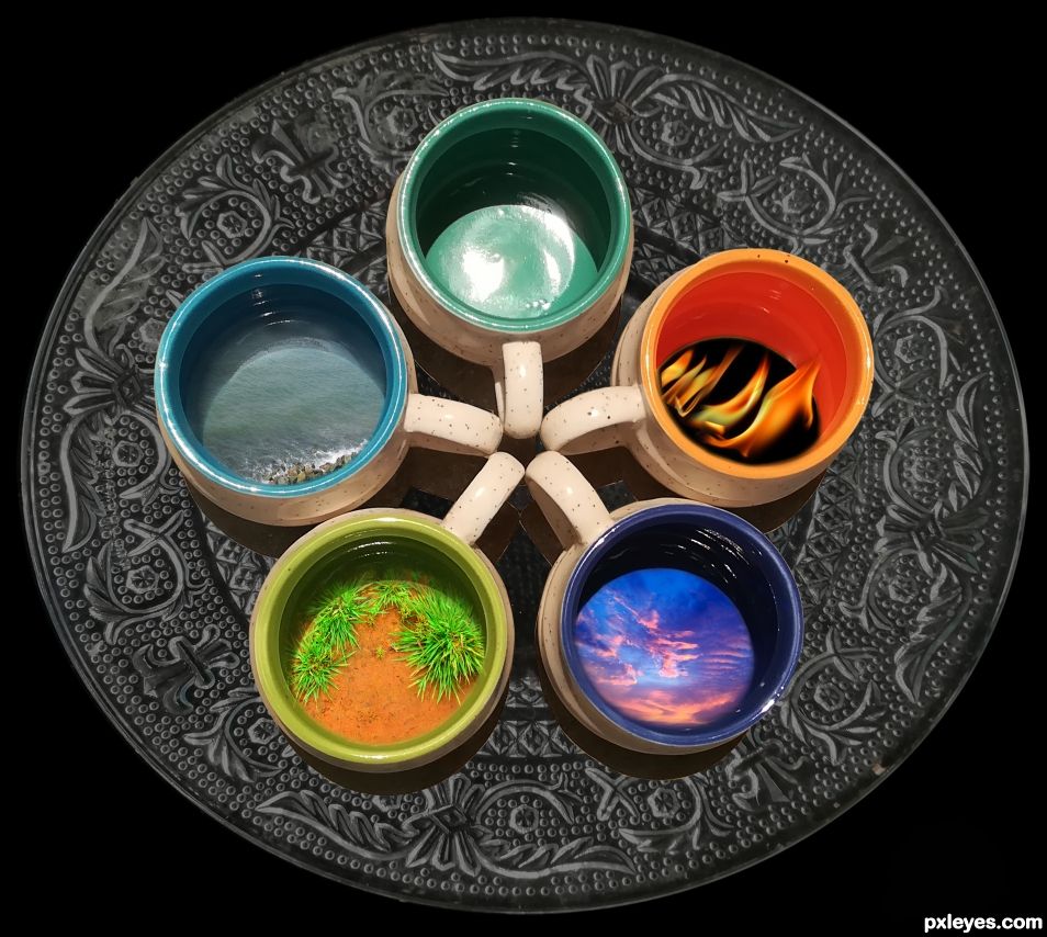
Five elements.Fire ,earth,water,sky and air. (5 years and 743 days ago)
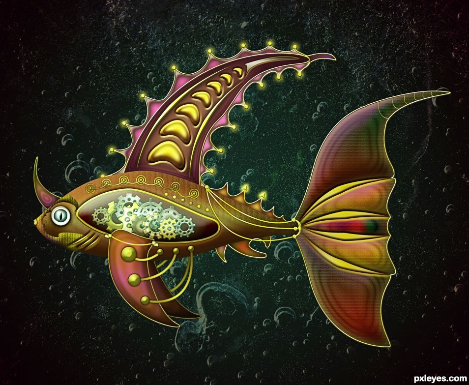
Created in Photoshop. Used my own photo of frost texture to blend it with the Background Gradient :) (5 years and 1609 days ago)
Just love the background as well.. GREAT JOB!
Really AWESOME!!!! Great Job  Congrats!
Just beautiful.... congrats.
Congrats once again Cornelia!!
Thank you very much for the nice comments and support 
congrats again 
Another beautiful piece, love what you do in Illustrator.
Howdie stranger!
If you want to rate this picture or participate in this contest, just:
LOGIN HERE or REGISTER FOR FREE
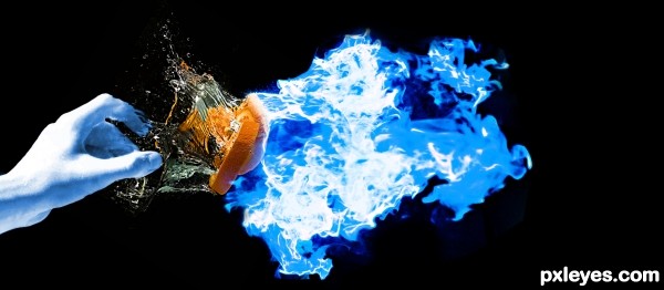
(5 years and 3096 days ago)
Please comment and criticize
Howdie stranger!
If you want to rate this picture or participate in this contest, just:
LOGIN HERE or REGISTER FOR FREE
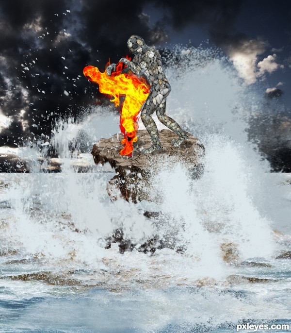
(5 years and 3304 days ago)
great imagination author...add more flames on the edges of the flaming guy...now look a bit to much cut-ed...best of luck
A bit chaotic...but I can totally appreciate the work you did on the stone man. Nice job!
they are fighting right ? 
good work 
Like gornats implied, that position is open to interpretation , people might ask if Stone is pawning or pounding Fire.
I wish i could help with a better stock source but all Ranum's wrestlers have the same issue.
In case you wanna change it, you could search for judo stock or try using this :
http://www.sxc.hu/photo/172104
yes but I think the title makes it clear guys, lol. Great imagination here, well done =- )
I had not noticed, but you are right, maybe I should change the title. the passion of the elements ha ha, thanks for your comments
Lol, I'm glad you have the sense of humour., author.
Howdie stranger!
If you want to rate this picture or participate in this contest, just:
LOGIN HERE or REGISTER FOR FREE
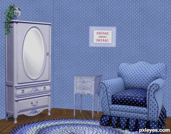
It was easier to put Granny in a home when we could decorate it the way she wanted... (5 years and 3359 days ago)
Nice work on the floor. Wall at left should be darker, as both planes would not receive the same light.
I wondered about that, since the light is striking the armoire from the right, I figured the wall behind it should be illuminated, though. If there was a corner by the armoire, it would be darker once you turn the corner, just as the LH side of the armoire is darker. The surface of the wall behind it is like the front, illuminated.
Thanks about the floor. It was fun making that part!
Agree with CMYK. It also would improve the image greatly if you tried to darken the inside areas of the cushions on the arms of the chair...it might help give some variance to the 'blue look' of the shot. Just a thought. Good job!
I agree, some variations in light around the walls would;ve been nice. It would eliminate the whole 'pasted in' feel.
The shadows the objects are casting look great and your floor pattern is crazy good!
Lovely blue room 
Howdie stranger!
If you want to rate this picture or participate in this contest, just:
LOGIN HERE or REGISTER FOR FREE
Please post your source links. See http://www.pxleyes.com/courses/guide/guide.pdf and http://www.pxleyes.com/blog/2009/06/how-and-where-to-find-legal-source-images/
Really is a great idea for the 5 elements, you're going to have to include your sources in order to stay in the contest. Side Note: You can change the title of your entry by going to PROFILE/MY ENTRIES and just click the title and it will give you the option to give it a proper name. Nice work and good luck.
Thank you.Your advise was really helpful.
Please post all source links for your entry. Remember all sources must be free of copyright and links must show the image used along with the usage terms or license for that image.
You should add the necessary information as soon as possible, if you don't you may be sent a warning and your entry will be removed until it is corrected.
At http://www.pxleyes.com/courses/pxleyes-guide/ you can download the Pxleyes Guide with all the info you need to participate and more. Especially interesting for new members!
I took all the pictures by myself using a cannon camera for making this image.So what source links i have to add?
Author..when using your own images, just place them (unedited)in your SBS.. and title them MY PHOTO.. that's it... it's a little wonky at first, but once you get used to it, it's easy peasy... PXLeyes has to be very careful with their sourcing so they don't get into copyright gobblygook (don't let that happen.. it's a legal NIGHTMARE) You'll get it..
Author you posted your images in the correct way and they are just fine!

Thank you Drivenslush for helping out, much appreciated!
WOO HOOOOOOOOOO!!!!! Great Job author... all up to code!!! I know it might seem a little nit picky but it's always better to be safe than sorry... GREAT LUCK!!!
Howdie stranger!
If you want to rate this picture or participate in this contest, just:
LOGIN HERE or REGISTER FOR FREE