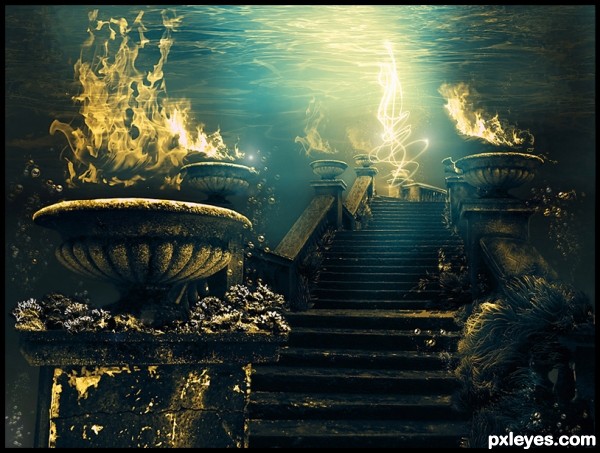
Thanks to:
Lydia Gschosmann on deviantart.com;
~redheadstock on deviantart.com
(5 years and 3412 days ago)
- 1: underwater plants
- 2: water
- 3: fire1
- 4: fire2
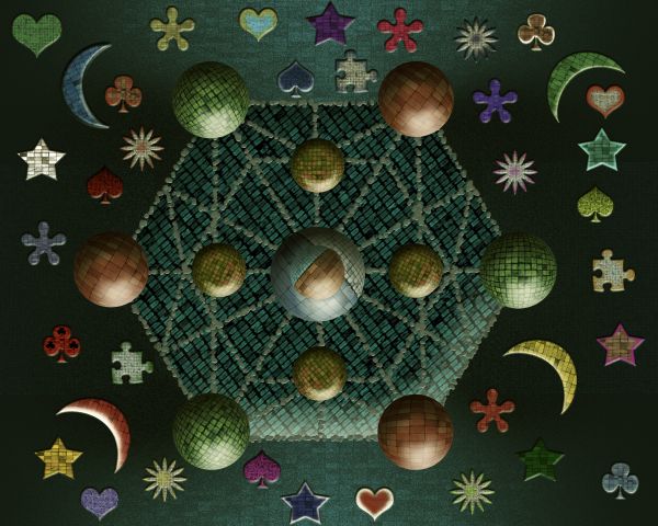
Only source image used. (5 years and 3684 days ago)
It reminds me a fortune teller board, or something like that... 
Where's your SBS?
KOOKY FUN!!!!!!!.. Makes your eyes juggle 
Simply beautiful
This is way cool 
Thank's guys so much...
wicked!!! 
a top 7 way to go friend 
Howdie stranger!
If you want to rate this picture or participate in this contest, just:
LOGIN HERE or REGISTER FOR FREE
Kate Wanless-http://www.sxc.hu/profile/K_Alex
G & A Scholiers-http://www.sxc.hu/profile/TouTouke
Mila Vasileva-http://milavasileva.deviantart.com/
Kai Princess-http://kaiprincess.deviantart.com/
sugarstar-http://sugarbreezy.deviantart.com/
My myspace is wherever I stand-http://damphyr.deviantart.com/
Thanks guys for the great resources... (5 years and 3708 days ago)
Very different approach ...add a SBS too  GL
GL
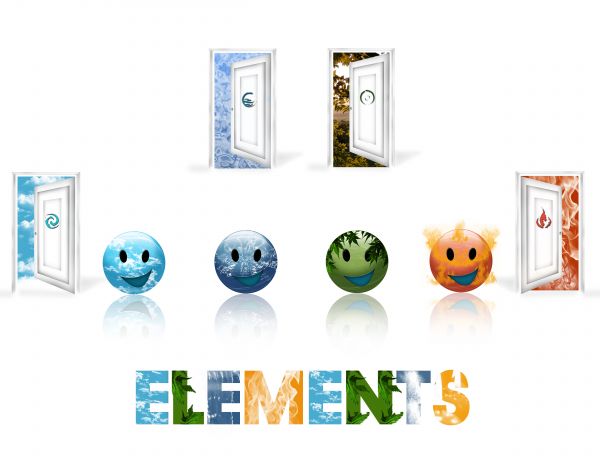
Different approach but looks quiet simple i guess...But all of them are beautiful...
It seems that this contest was geared at just making 1 door.
Howdie stranger!
If you want to rate this picture or participate in this contest, just:
LOGIN HERE or REGISTER FOR FREE
(5 years and 3725 days ago)
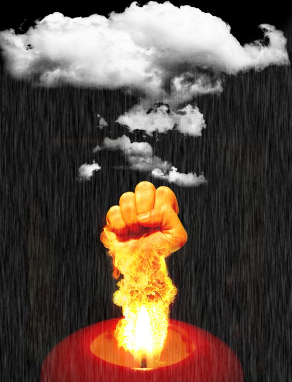
IMO, it seem a little off theme. Maybe a fist out of the cloud would have been better. The rain seems a little heavy.
very good 
Howdie stranger!
If you want to rate this picture or participate in this contest, just:
LOGIN HERE or REGISTER FOR FREE
Thanks straymuse,robby_m,somadjinn,NASA
(5 years and 3864 days ago)
Very creative, good luck!
Wel done
use the elements in the cloud form to retain the roundness.. it's looking a bit flat but I think you wanted it to have the curve feel of the sbs... (the free form and general structure of the image is absolutely wonderful... clever
EDIT: 


O.K Golem
giving it a science-mission-gone-wrong-giving -birth-to-another-planet feel!.good job
Golem has a great point, also the edges should be a little more wispy to match the clouds, it kind of looks cartoony otherwise.
Howdie stranger!
If you want to rate this picture or participate in this contest, just:
LOGIN HERE or REGISTER FOR FREE
No outside sources used? You haven't linked to any....
sources's coming. sorry for delay
GREAT concept. But the white scribbly thing is distracting and confusing.
I'd suggest making the bubbles a bit more prominent, fixing the noticeable lean in the frontmost column, and making the sea growth more consistent. Either get rid of a lot at the bottom, or add more to the rest. Also flip the flames of the LH urn behind the large one in front, and brighten the flames where needed so you don't have a couple really intense, and the rest looking washed out.
This has the potential to be a very powerful image, you just need to tighten up the execution a bit.
Really thanks for your comment. I'll think about it.
I really love it
Not sure how those plants were painted, from the SBS, but not a bad image.
I hope, I can more than plants
Truly fascinating image. I love the fact that you have put the fire under water! Very unusual and different concept. Your lighting one the stair is great and the removal of the snow is very well done.
Looking good!
The correct source link for source 1 is: http://syccas-stock.deviantart.com/gallery/755702#/d11rbgp
Thanks moderator, sorry for mistake
Howdie stranger!
If you want to rate this picture or participate in this contest, just:
LOGIN HERE or REGISTER FOR FREE