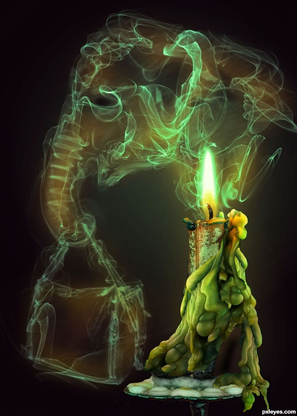
(5 years and 649 days ago)
- 1: shoe
- 2: candle
- 3: elephant
- 4: bag
- 5: smoke brushes
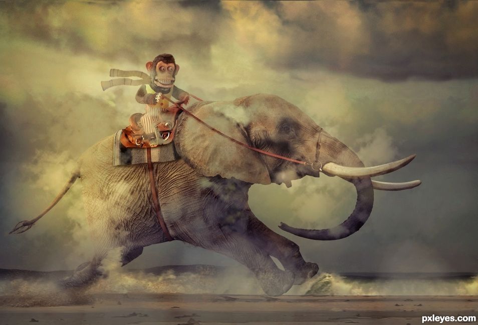
(5 years and 744 days ago)
Good image, shadows under the blanket & saddle will make it better.
You're right. I had some but they didn't show up well in the final version. It's like they disappeared. Maybe I clicked when I shoulda clacked and turned them off by accident. I made them darker, even darker than before. Thanks for the tip.
Updated SBS to show shadow changes. Added scarf to monkey.
I always learn something from this side of pxyleyes. I like your final production.
Thank still. Glad you learn stuff. 
Lots of intricate detail work has gone into this. Well done.
TY SA. It looked so ordinary on the beach and was considering changing backgrounds. However some smushed in some clouds and messing with colors gave it a nice dreamy look. Wanted to put them on a horse track racing horses but could not find a suitable pic on a dirt track.
Congratulations....
Thanks George55. Didn't expect such a high score.
Thanks George55. Didn't expect such a high score.
Congrats BWR, fabulous work and so cute too. 
Congrats brah 
Howdie stranger!
If you want to rate this picture or participate in this contest, just:
LOGIN HERE or REGISTER FOR FREE
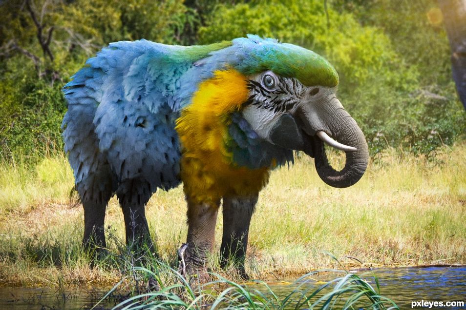
(5 years and 787 days ago)
It's so cute I can't help laughing 
Great work with the feathers
This should have scored higher.
Howdie stranger!
If you want to rate this picture or participate in this contest, just:
LOGIN HERE or REGISTER FOR FREE
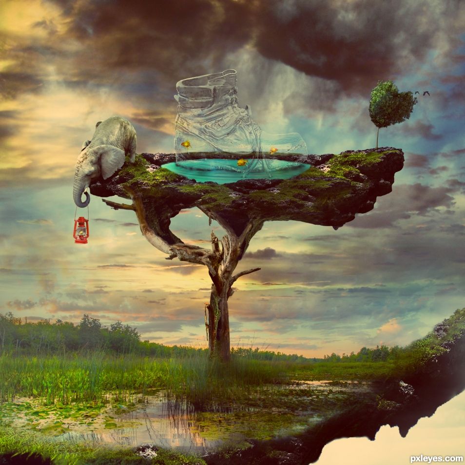
Airavata, a mythological white elephant
Extra stocks:
- Yellow fish: http://fantasystock.deviantart.com/art/Yellow-Tang-Fish-Aquarium-59596458
- Water splash: http://www.deviantart.com/art/Water-Splash-Unrestricted-162016734
(5 years and 1166 days ago)
Excellent!
Author, source no 8 the aquarium fish is a premanipulated image and can not be used. Please add to the SBS your own image that the birds are taken from.
Thank you, I have changed all
very good
Source 2 is a premanipulated image.
Thank you Bob, my mistake. I have used the pond image again to change it
Thank you 
Congratulations...
Thank you 
Congrats Aiden!!
Thank you Rein 
Howdie stranger!
If you want to rate this picture or participate in this contest, just:
LOGIN HERE or REGISTER FOR FREE
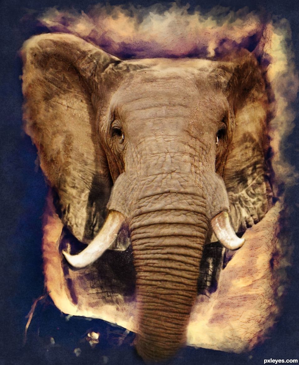
I changed the original tattoo source to sepia, deleted the side hand, filtered it in filter forge with HDRtist to get the artistic frame and make all the body hair less prominent.
I had to cut bits like tusks off the elephant to warp and transform them to fit the tattoo. I matched the eyes and ears to the original tattoo as close as I could. The original tat can be seen on the legs and lower ears of the animal. (5 years and 1183 days ago)
Author.. I'm going to hold my vote until I can see exactly how this is a tattoo.. it really needs to be "IN A SCENE" to make sense to me. Not a bad thing, but I think the image should be "coming out" of a chest/arm/leg. Not a dig.. just a little confusing to me at moment.
The image is very well done, but I'm not sure how it fits into the theme of the contest.. good luck
Hi Ernest, take a look at the original source tat. It is coming out of the side of a very hairy body. I left the lower ears and legs of the animal as they are on the original tat, except for changing the color slightly to blend with the color of the elephant. I put the elephants trunk over the mans shorts. The art filter has just made the hairy stomach less hairy looking. The idea of the contest is to BLEND the tat into the real thing to make it appear as if the picture is coming alive. In my own opinion, I did a good job.
I agree. It would have been better if we could see the original tattoo coming to life but we can not see the tattoo
Thank you very much for your complimentary comment velkanx. If you cannot see the transition between the tattoo and the real elephant, then in my own opinion I succeeded in the challenge.
If you look carefully at the original source and compare my work to it, you will see the original tattoo on the lower ears and legs and also on the shadows of the ears. The only thing that has been changed is the color so it blends better with the color of the elephant. If the transition between tattoo and the real thing were too obvious, I do not think the blending would show the tattoo coming alive.
The problem IMHO is the original source with the tattoo. That image is not really clear to start with. That art filter you used was no good idea IMHO it made it even more unclear with fading the edges inwards. You could have made the original image bigger and fade outwards, leaving the body which holds the tattoo more intact, maybe even expand on it by adding for instance an arm.
Please don't take what I'm saying too harsh, you're mentally still to attached to the image. This happens to all of us. Take another look at this image and the comments in 6 months or so and you'll see what I, and others, are saying and you might see what we mean
The blending is well done, no critique there just a
Thank you for the critique and suggestions for improvement. I appreciate it.
Howdie stranger!
If you want to rate this picture or participate in this contest, just:
LOGIN HERE or REGISTER FOR FREE
I like this.
Thanks BWR.
Such a close race!! .14 percent away from each other. Wonderful work BTW. I am impressed.
Getting a score close to yours is a high achievement in my mind since I think your work is amongst the best I have seen. I still am trying to beat my own top score though. Seems to be a tough goal to achieve.
Honestly I liked this one better than your Water Weight Lifter "The power of water". Just personal taste, but this one to me had more wow. I voted higher on this one.

keep going and one day you will top it. The stars have to align properly is all.
Thanks for all your encouragement BWR.
Congratulations!
Thank you very much filantrop.
Howdie stranger!
If you want to rate this picture or participate in this contest, just:
LOGIN HERE or REGISTER FOR FREE