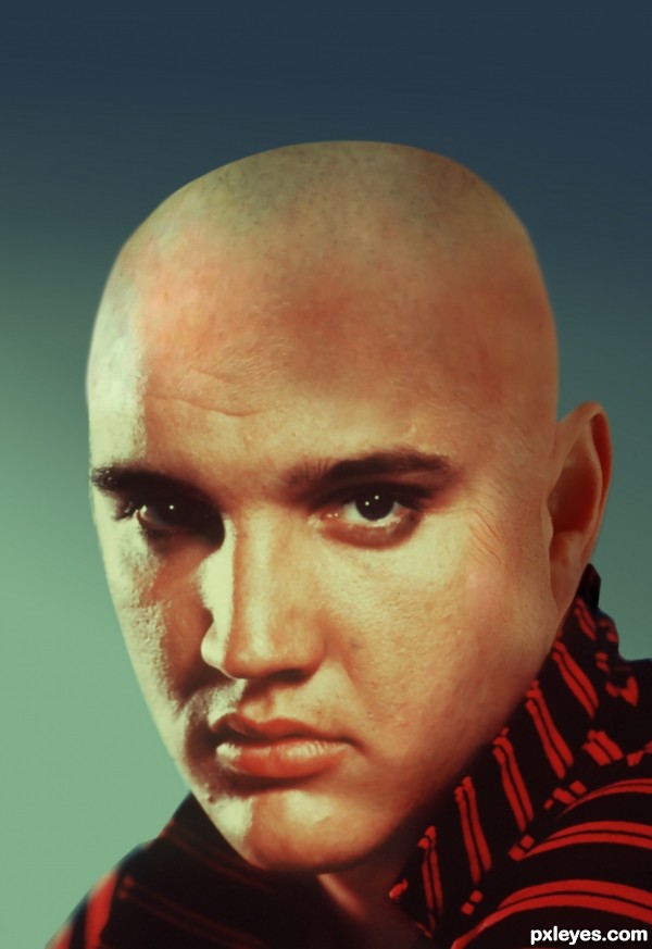
(5 years and 3261 days ago)
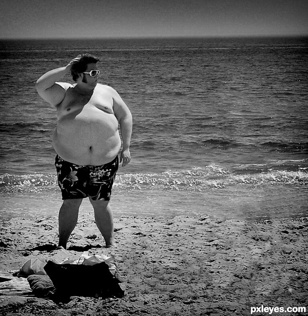
(5 years and 3607 days ago)
Good idea, but light on Elvis head is from upper left, and on fat man from upper right.
Author, it's nothing you can't solve (the lighting issue). 
lol good idea. I agree with cmyk you get better score 

Howdie stranger!
If you want to rate this picture or participate in this contest, just:
LOGIN HERE or REGISTER FOR FREE
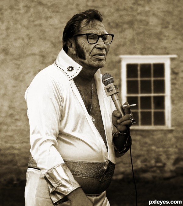
I'm just a hunk, a hunk of burning love
Just a hunk, a hunk of burning love
Just a hunk, a hunk of burning love
Just a hunk, a hunk of burning love
Just a hunk, a hunk of burning love
Just a hunk, a hunk of burning love.
My take on what Elvis would look like in later life.
All images from Flickr and texture from CGTextures.
Critique welcomed. (5 years and 3607 days ago)
Quite good blending and interesting idea. My nitpicks are the light comes mostly from left sides and a bit from right side based on the body (that's not direct light), but on the face the light comes from the right side, so you should adjust the light on his face to be more uniform (increase the light from the left side). Also, the eyebrows are white but the hair is still dark (maybe it's still acceptable since he can colorize his hair lol). The last thing is the stroke around the body and face is still visible in Hi-Res, you need to clean it more (make some hair for him, so the head won't look like cut and paste). Hope this helps and good luck!
PS: if you're able to make the folds on his body skin as the one on his face, that will be great!
Thanks for the suggestion langstrum. Added some hair and used some dodge and burn on the face and neck. Also removed some of the sharpness which caused the halo around him. I hope it looks better now.
Wow...excellent work. Great job, author!
Looks great! Just have the wall behind him show through the glasses next to his face. 
Holy blue suede orthopedic shoes! Hey that "cigarette" looks hand rolled. Could it be... nah. Very convincing image, I expect the tabloids will be running it soon. Excellent work!
Fantastic work author...every single detail look so realistic...u did really really god job here...well done
Really good, the images are very well blended, resulting in a realistic work. 
Fixed the glasses as CMYK46 suggested.
incredible work author!
Fabulous! 
Well deserved win...congrats! 
Congrats! for 1st 
Congratulations! 
Congrats Solkee, what a dude 
Congrats on you win - well done!
Congrats for 1st place..............
Congrats...well deserved 1st place...
Thanks everyone for the comments, faves and congrats. A special thanks to langstrum and CMYK for their suggestions that helped the entry improve.
Congrats for 1st place
Congrats!! Nice work!
Congrats! You earned it! 
Howdie stranger!
If you want to rate this picture or participate in this contest, just:
LOGIN HERE or REGISTER FOR FREE
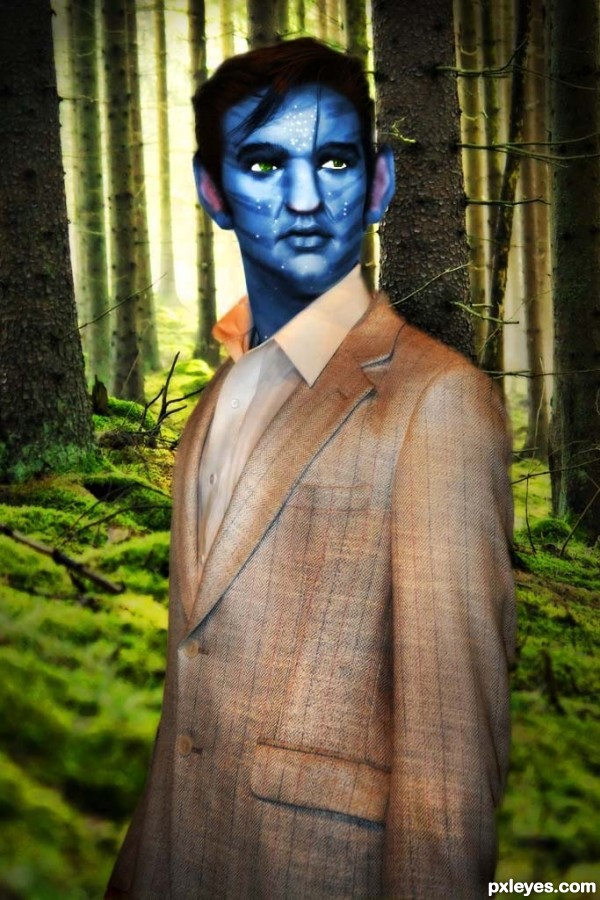
Elvis was joined to space troops to explore the pandora world.to his bad,he was kindanapped several blue aliens who called themeselves Na'vi.They change elvis into their species.Elvis is now the most handsome and modern among their species (5 years and 3608 days ago)
good job
Quite funny, but wouldnt it fit him better if he wears a real Na'vi outfit (instead of the suit he's wearing now)? Good luck!
Nice work author,but his head,especially his left eye is a bit weird...head is to blurry,eyes have strange shape and jagged edges,and his eyes and not equal,even a close...try to fix that author,because idea is very nice...good luck
Well done on an original idea. Good Luck.
superb idea ......... 
the avatar thing has been done too many times already. especially with the gazillion tutorials out there
Eyes must be bigger... they are small for an avatar. 
hahhahaha very cool!
Howdie stranger!
If you want to rate this picture or participate in this contest, just:
LOGIN HERE or REGISTER FOR FREE
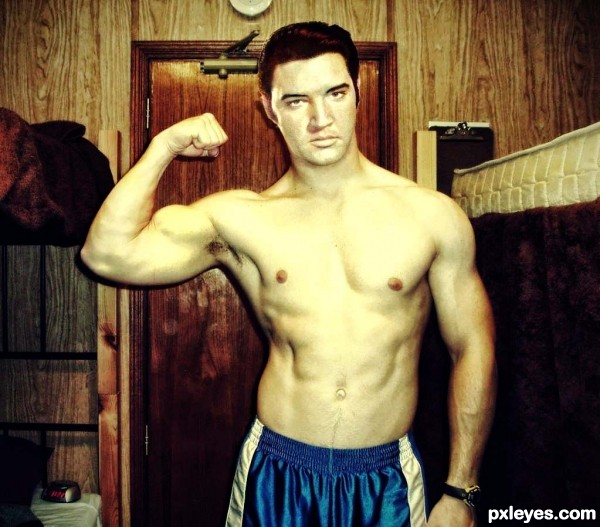
after he rocks in music industry.elvis was try to build up his body.now he shaped up well (5 years and 3608 days ago)
Good color matching. 
Hmm... good blending. 
U did great job here author...well done
good work
Ummm, wow, now that's what I'm talking about, nice work = )
Howdie stranger!
If you want to rate this picture or participate in this contest, just:
LOGIN HERE or REGISTER FOR FREE
The highlight's on the wrong side.
The skin coloring has a very obvious value change on the LH side in a reverse 's' shape, with the area above his right eyebrow also noticeably darker and a different color, and the lighting does not match in value or direction on the RH side of the image. The skin texture is also obviously different.
Lots better now...excellent revision !
please reshape the top of his head...more rounder please

he is the "KING" you know
Aheman: better like that?
Thanks for all your comments!!!
Howdie stranger!
If you want to rate this picture or participate in this contest, just:
LOGIN HERE or REGISTER FOR FREE