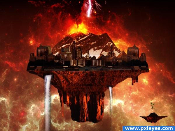
Let's Dine In Hell.....!
Buildings Image Credit - grngobstpr (http://www.sxc.hu/photo/1151912) (5 years and 3891 days ago)
- 1: Cosmos
- 2: Base Land
- 3: Snow Mountain
- 4: Buildings, grngobstpr
- 5: Volcano
- 6: Waterfalls
- 7: Plant

Let's Dine In Hell.....!
Buildings Image Credit - grngobstpr (http://www.sxc.hu/photo/1151912) (5 years and 3891 days ago)
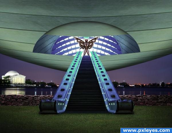
From the novel by Arthur C. Clarke, Childhoods End, the overlords reveal themselves after a generation of secrecy. (5 years and 3898 days ago)
Very nice use of source, i think the spaceship could do with a little bit more work, make it seem more streamline, but other than that, great image!
Was hoping to see this again...great work! 


great use of source, nice idea
I'll ditto CMYK46 
Major Nano Nano...
wow!!
very cool!
the source reminded me of E.T. or one of those movies from the 70's and 80's and your picture is what I imagined
Congrats for your third place!
Congrats!
congrats
Congratulations on the top three place! 
Congratulations for 3rd
Thanks to all!
Howdie stranger!
If you want to rate this picture or participate in this contest, just:
LOGIN HERE or REGISTER FOR FREE
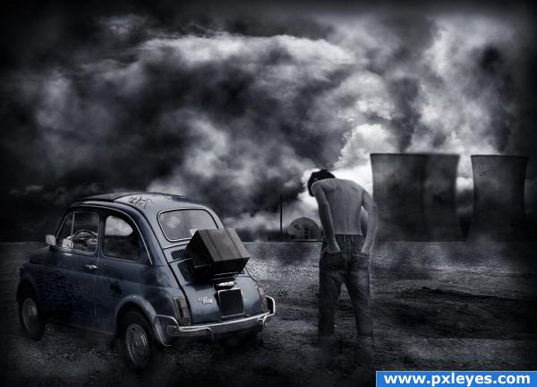
Thanks and credits to:
- rx-stock (http://rx-stock.deviantart.com) - for the ground image.
- night-fate-stock (http://night-fate-stock.deviantart.com) - for the lovely sky.
- diesel-stock (http://diesel-stock.deviantart.com) - for the rare power plant stock.
- SweetTradeStoc (http://sweettradestock.deviantart.com) - for the man's stock.
- funerals0ng (http://funerals0ng.deviantart.com) - for the cracken brushes.
- ch4ron (http://ch4ron.deviantart.com) - for the smoke/cloud brushes. (5 years and 3903 days ago)
He's a bit big for that car.. hehehe.. but the overall image is just wonderful.. the color scheme is perfect
He's a tall one :P
wow this image has a nice feel to it! its like the end of the world! i like it really
Howdie stranger!
If you want to rate this picture or participate in this contest, just:
LOGIN HERE or REGISTER FOR FREE
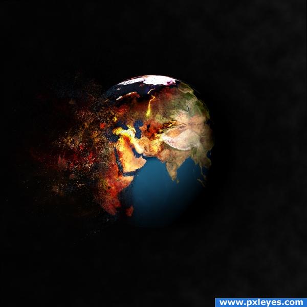
very negative outlook for the future, but oh well it was fun. thenks for owners of sources and brushes. alot of burning dodging overlayin and using brushes.
Hope u like it (5 years and 3908 days ago)
the shape of the globe is a little strange, try making the image round or eliptical, i'd also like to see this a little brighter. Good luck!
:o he copyd my title xD but still not bad and it wud be better if u made a space background instead of clouds
i kinda like the image...its just kinda simple...i mean the globe is an fire...and its not the right shape(ponti said it) and the background makes no since...
So much depression. Uh, I don't think the other commenters are considering the condition of the earth in this photo. If the Earth is exploding, it could very well get distorted. But if the cloudy background is supposed to be smoke from the explosion, then you should make it look like it's coming from the explosion. The earth is casting a shadow against a wall of clouds?
Howdie stranger!
If you want to rate this picture or participate in this contest, just:
LOGIN HERE or REGISTER FOR FREE
no extra images used. so no step guides. first i cleared out the main image background. then used multiple layers with cloud brushes and with different colors. some imagination, filters and layer blends, thats all. (5 years and 3914 days ago)
any comments are welcome
author.. A high resolution would be a great help to see this entry better.. I'm going to wait to vote til I've got a better grip on what work was done/ (sometimes the low res looks NOTHING like the high res). .good luck!!!
wow great job on the flames i love this image!... (hi res would be good  )
)
Howdie stranger!
If you want to rate this picture or participate in this contest, just:
LOGIN HERE or REGISTER FOR FREE
A hi res would be nice.. but without it - hard to tell, are those factories or hangars in the front needed/. Maybe colour match them to the background buildings? I would remove the lightning too - it just looks incomplete..
hey Animax...thanks for the comment...i have adjusted the lighting...
that young plant is HUGE!
I agree with elficho, try enlarging it and bringing it closer to the camera to make it look like it's closer.. maybe even blur it a bit to show depth.
another thing you could do is burn and dodge the city using the mountain you turned upside down as a reference
Hi elficho....thanks for your comment. I have trimmed the plant now...!
i think the focus is the problem... the little rock with the plant looks like it's right next to the big one. that makes the plant seem very unrealistic (i know, i know the image is unreal but this is silly). the one thing i think might help is (lens) blur. blur the plant and it's rock or blur the city. not too much! just to get that feel of depth. both can't be in focus.
hi all i understand that that plant is not suitable...but imaginatio has no end. The plant was not far behind, it was a small base which is down safe from the destroying world. The concept is one world is getn destroyed, while other is born. got it..!!! cheers...! anyway thanks for your suggestions.
gl
Howdie stranger!
If you want to rate this picture or participate in this contest, just:
LOGIN HERE or REGISTER FOR FREE