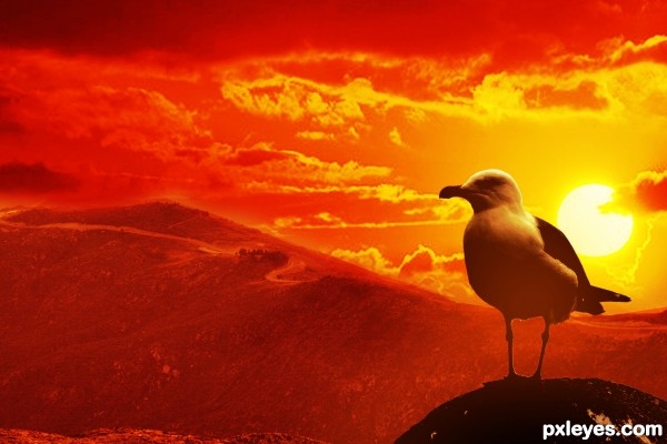
(5 years and 3006 days ago)
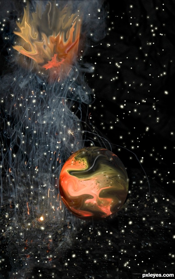
Only supplied source used (5 years and 3034 days ago)
Good attempt.
Maybe the flames in the upper part of the image could be more realistic (colour - shape)?
really nice composition and i think very fitting theme with the source  . I would blur the edges of the planet some more if you havent allready
Howdie stranger!
If you want to rate this picture or participate in this contest, just:
LOGIN HERE or REGISTER FOR FREE
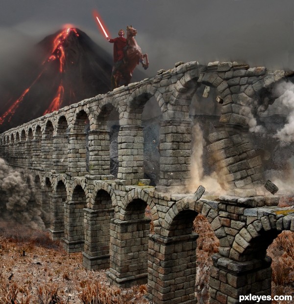
While i was working on this, i was also reading about Snurtr with the flaming sword and the battle of Ragnarok. The result was that image became very different from what i had initially in my mind. (5 years and 3049 days ago)
good hard work 
Vegetation on ground is out of scale with the rest.
good work done in destroying bricks........but the volcano is not fitting very well.....play with the colour of volcano to get a better result.....good luck
Thanks for the comments. Don't have the time to fix it now, so it will stay this way.
Congratulations on second place, good work.
congrats 
Howdie stranger!
If you want to rate this picture or participate in this contest, just:
LOGIN HERE or REGISTER FOR FREE
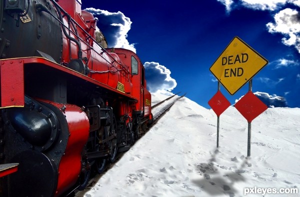
The engineer should have checked the map! (5 years and 3105 days ago)
cant check your first source.. link dont seem to work for me
Ok, should be good, thanks!
Pretty cool.
Link one doesn't lead to image used.
That is the train that was used. It is a working link.
It is from this set here: http://www.public-domain-image.com/transportation-vehicles-public-domain-images-pictures/trains-and-buses-public-domain-images-pictures/steam-locomotive-train.jpg.html
But putting this set link in doesn't seem to work for everyone so I've had to link directly to the image itself.
The image makes no sense, because you've put the "dead end' BEHIND the engine, not in front of it...Interesting idea, but it just misses the mark a bit...
The link you added works for the train. You've got 2 different light sources: Light on clouds from upper left, light on sign & train from upper right. Suggest flipping the sky background so they match up.
OH! Great catch CMYK46! I'll do just that! Thanks, you are very helpful!
Also, the sign is behind the engine because engines usually go fast and stop slow. Hes going to drive off the edge to his doom. Its showing that the driver did not see the sign in time and is still going. Poor guy :P
Only if he's backing up. Perhaps you are not familiar with older locomotives, but that engine is facing the viewer, not the broken track behind it...
Haha, I did not know! Oh well, I guess hes backing off the cliff. Anything possible with PS! 
Thank you for telling me, I will use this info for future reference.
thnx author for fixing the link and yeah lol thats exactly what I was tryign to see before i was going to comment on it.. hes goign the wrong way and can not possibly read that sign :P
its all good.. so much to think of when creating an image.. GL

Howdie stranger!
If you want to rate this picture or participate in this contest, just:
LOGIN HERE or REGISTER FOR FREE
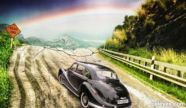
(5 years and 3126 days ago)
I like the rainbow, nice touch!
very nice blending
Good idea, but the hi-res is low res...
Very nice concept, good luck!
Howdie stranger!
If you want to rate this picture or participate in this contest, just:
LOGIN HERE or REGISTER FOR FREE
Howdie stranger!
If you want to rate this picture or participate in this contest, just:
LOGIN HERE or REGISTER FOR FREE