Stock author on DA is notified via "note". Thanks DanielaOwergoor for the link. (5 years and 3188 days ago)

I used one external source
Thanks to http://www.sxc.hu/photo/1192075
Author: BeverlyLR
(5 years and 3391 days ago)
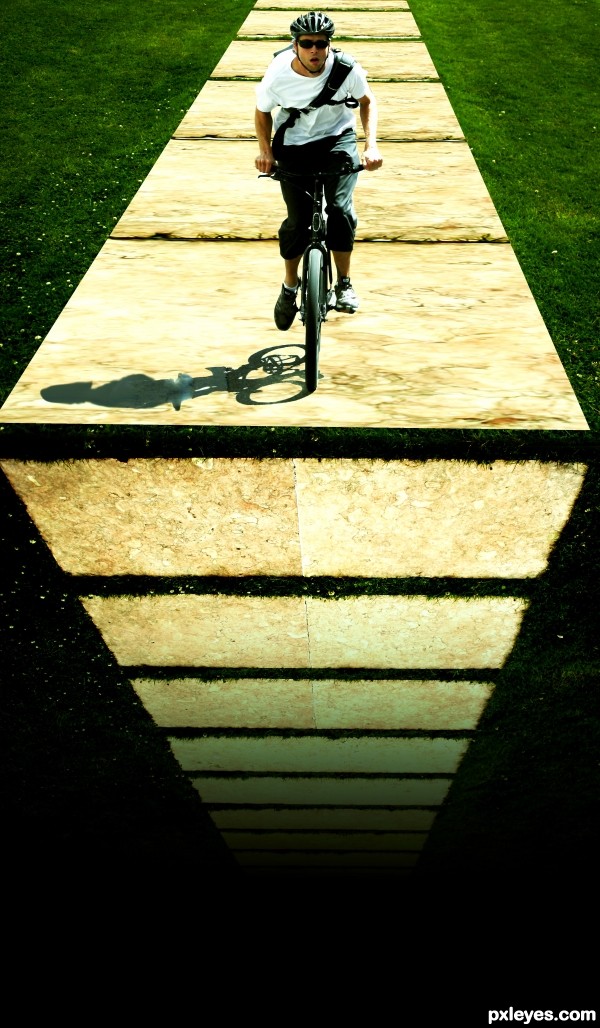
Good job! but I don't get the shadow ;D
Thanks 
Good idea, but I'd make the vertical face darker.
I agree with CMYK46, a darker tone on the vertical face would help. The shadow of the biker is from the source so it makes sense but you could try to even up the shadows tonality. It is a funny concept!
Actually even though the shadow is from the source, it should be extended.
hahahahahahaha great neat work author with a loads of humor...well done
Thank you very much for your valued comments.. I will try to do the changes. 
that downward are really makes this shot! Nicely done 
Boy is he in for a big let down!
Great imagination, will he stop in time = )
This makes my stomach fall to think of dropping off like this!!!! Poor guy! I agree on shadow problems and since he is getting light mostly from behind, I agree that the wall which is falling needs to be really shadowed. Love your idea!! GL
Howdie stranger!
If you want to rate this picture or participate in this contest, just:
LOGIN HERE or REGISTER FOR FREE

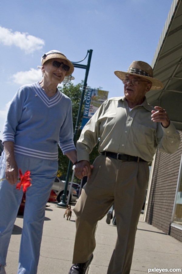
although they're old he still brings her a rose everytime he takes her out for breakfast (5 years and 3567 days ago)
this is a cool image
Howdie stranger!
If you want to rate this picture or participate in this contest, just:
LOGIN HERE or REGISTER FOR FREE

(5 years and 3752 days ago)
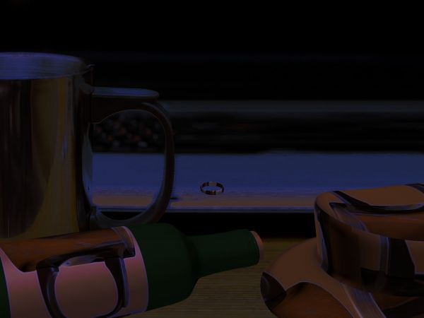
What's the floating ring thing? Handle of cup needs better edges...
I can't really see anything.....
Howdie stranger!
If you want to rate this picture or participate in this contest, just:
LOGIN HERE or REGISTER FOR FREE
Brilliant!
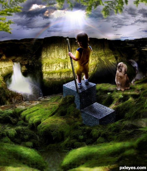
The angle of the top is off for the baby standing on it, it's too high in front, the kid would be falling backwards...
The dog is too hard edged, looking very "cut and paste," and the lighting on it does not fit with the rest of the image, since it is in shadow, yet is fully illuminated and casting a shadow in a different direction from the kid...
The waterfall is likewise lit from an entirely different direction than your light source in the sky.
Plus, your rainbow is distorted into an ellipse...
Good concept, but very rough in execution, with little attention to details and consistency.
Change the perspective on the cubes and you'll have a better entry.
1) perspective of the cube should be downwards (towards the front)

2) the boy should not have such a strong light cast, as the light ray is too far away
and the rays are on the mountains already
Thanks for all the nitpickings and suggestions, it helps me a lot in doing refinement to my entry.
Nice refinements!!! much more grounded GOOD LUCK!!!
congrats
Howdie stranger!
If you want to rate this picture or participate in this contest, just:
LOGIN HERE or REGISTER FOR FREE