just source :p (and brushes of clouds) (5 years and 3612 days ago)

Just follow what erathion said (5 years and 3625 days ago)
not bad..!!
Good idea, but different scales & perspectives.
Author, since contest must be anonymous, you have to ask mods to remove one of them and red flag it.
yup ,i red flag ad...
coloring differences between different sources looks out of place, as well as sizes..
Howdie stranger!
If you want to rate this picture or participate in this contest, just:
LOGIN HERE or REGISTER FOR FREE

Well, I thought that it was quite funny anyway =] (5 years and 4007 days ago)
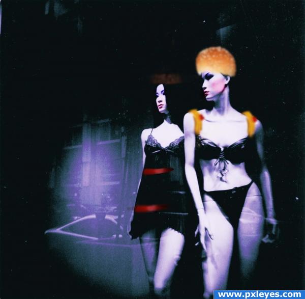
why are they blue? their unnatural skin color doesn't work with the unaltered color of the burger imo
LOL, i know but they are just mannequins so I figured that their skin colour doesn't matter XD
whatever used from the source, are blur
.. What did you think when you created this??..
sorry.... 
c00,
Nice idea! The thought of burger clothing is very clever.  That being said, there is so much more you could do with this. Give her burger panties, a sesame seed bra, etc. Go crazy with this one! Best of luck.
..i don't know what to say.. hmm...
thanks for the advice magicsteve, will try it out LOL yeah i think burger pants will do XD
ahhh two cats in catwalk... 
Howdie stranger!
If you want to rate this picture or participate in this contest, just:
LOGIN HERE or REGISTER FOR FREE

Only Source Used..
Brushes Credits:
Tree Brush: http://horhew.deviantart.com/art/Complete-Tree-Brush-Pack-22839764
Moon Brush: http://getbrushes.com/brush-authors/jelena-jovovic
Clouds Brush : http://getbrushes.com/brush-authors/javierzhx (5 years and 4021 days ago)
nice job
He's WONDERFUL.. I wanna play fetch with him..hehehe... but I'll let my brother retrieve the ball from him LOL
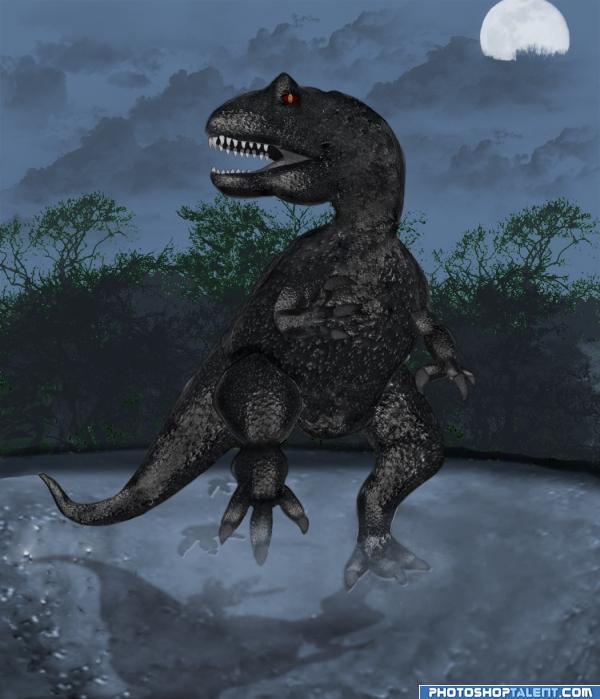
this could be just me..but is there a way to blur the stroke line around him.. it's okay.. but it does make him look cartoonie.. or that could be your goal.. he's just so wonderful, that the line makes him look like an animation.. if that was your goal, then ignore me.. but it would be cool to see what would happen if you soften the sharpness of that stroke line
YES!!! the soften lines makes it more real, (it's the price you pay for HIGH RES.. hehehe. .I probably wouldn't have noticed in regular res, but in high res you can see everything) good job author
thanks golem. i softened the stroke line a bit.. i suppose this is what u wanted to see. or is it something else?? i like the softened one better.. thanks for the tip..
very creative 


Really nice idea, the shadow is pretty good 
Interesting idea!! 
Great job drawing him! What's he standing on...wouldn't there be footprints? Blur the shadow a bit, otherwise it's lookin' good. 

wow....aweomse concept......but I agree with cmyk there should be foot prints....
the dinosaur should be brighter on the side facing the moon, gl 
thanks a lot CMYK. will work on gettin the footprints right away.. @Kid: i haven't shown his body which faces the moon.. from watchin jurassic park movies, i had observed that the dino skin were a bit 'shiny' at places.. i wanted the moon light on the earth surface to be bright, hence u can see a bit bright sky, see features on the ground and the body of the dino. The bright ambience also makes the shadow not thick black.. hope i am right on this..
edit: added some footprints, blurred the shadow and added some dust near the foot.. hope it is better now.. @Nator: I tried using the green skinned dino.. but i did not feel satisfied on blending it with the environment. So i went for the brown-black dino..
very nice
nice work... If it's water he's treading on - there's gotta be ripples on the surface, if it's fog - there have to be twirls, i think.
@zatrix: he is walkin on a bit sandy solid ground.. the shiny pat of the ground are certain shiny sand crystals and the dust is sand dust due to his heavy walk 
Nice work - but that cloud over the moon looks like it could do with a touch up.. 
great job 
Howdie stranger!
If you want to rate this picture or participate in this contest, just:
LOGIN HERE or REGISTER FOR FREE
I'm not sure if you can use the clouds brush...
anyway nice work and good luch author !
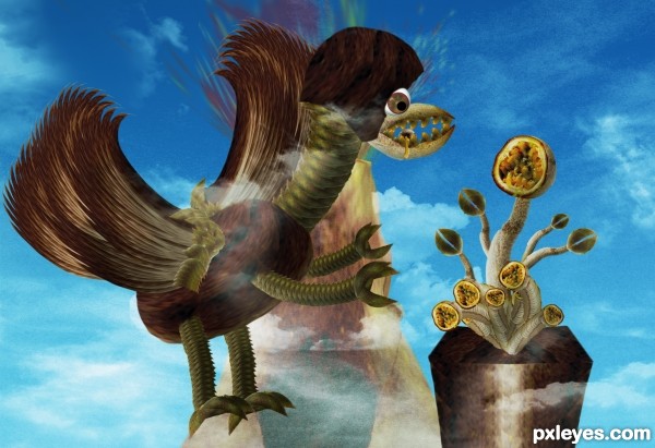
A bird-dragon-monster! Creative use of source...
i like it ! g l
super cool work...good luck author
Interesting..
different
Howdie stranger!
If you want to rate this picture or participate in this contest, just:
LOGIN HERE or REGISTER FOR FREE