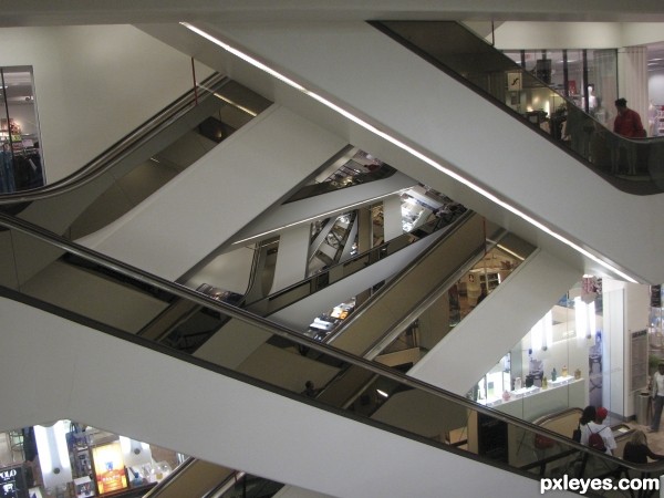
my own photo taken a few years back in Toronto (5 years and 3293 days ago)

Jessica-http://faestock.deviantart.com/
Stock Photos Galore-http://raindroppe.deviantart.com/
stockalicious-http://cyborgsuzystock.deviantart.com/
Seraphim-http://lotusii.deviantart.com/
Thanks guys for the great images...Happy Holidays... (5 years and 3779 days ago)
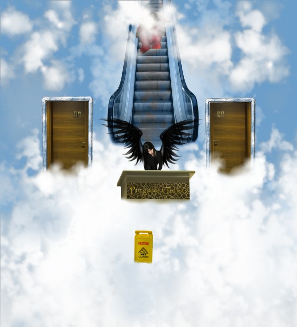
Good idea! Perspective on the desk thing is off, and what's the red thing on the escalator?
Thanks CMYK,that red thing on the escalator is the Santa from the source image...
Love the idea, very original, I think the doors look to out of place, perhaps a border of clouds around them or even fading the edges might help. Fix that and strighten the desk and you'll have a great image
Thanks for the tips guys...CMYK perspective is fixed,Nator i think that clouds around Santa now have more depth and Ray,i add door cloud borders.I hope its better now.Thanks again guys....
Perspective isn't fixed...all images are straight on except for the desk which is angled left.
Agrees with the perspective but I think a better fix would be some more feathering on the bottom edge. It just seems a little hard, compared to the doors that you got right. I think santa's face should be a little lit more visable. For what it's worth, your imagination and creativity, as well as a unique entry will earn you extra points.
haha this is such a good idea
Howdie stranger!
If you want to rate this picture or participate in this contest, just:
LOGIN HERE or REGISTER FOR FREE
just a suggestion (take it or leave it.. very droste by the way.. this kind of contest is totally up to the author)..
If you take a super soft brush and BURN each interior edge of each image it will draw the eye into to each separate layer.. BUT A SOFT BRUSH...will make each layer stand out, and not look like a pop shot taken by some teenage flake at the mall.. (it's all one color scheme at the moment)
enhancing the layers at different blurs and color contrasts will make the idea pop.. but this is all in my opinion... this is your creation so anything you decide will be just fine.. Just offering some simple thoughts from my bizarre, but always KIND mind
That is an interesting idea ..it is great to get constructive feedback,,,I had a comment earlier that was removed where the person missed the droste effect in the first viewing ... perhaps this is what I needed .. will let u know if I edit it
thanks again
super cool crazy work...gl author
Howdie stranger!
If you want to rate this picture or participate in this contest, just:
LOGIN HERE or REGISTER FOR FREE