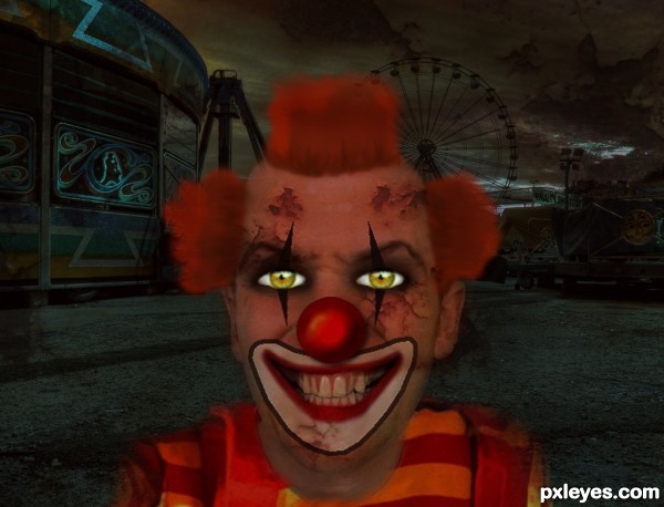
would u go?..... (5 years and 3535 days ago)
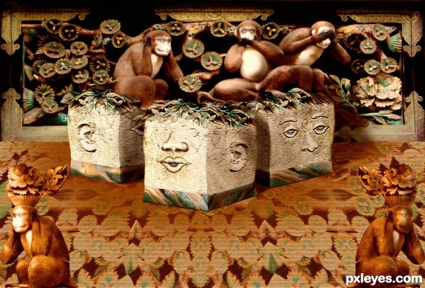
At Wikipedia you can read about this very old carving of the famous 3 wise monkeys. I gave them stools for their 'throne room'. http://en.wikipedia.org/wiki/Three_wise_monkeys
Thanks to David Monniaux for the wonderful photo of this fabulous carved panel. (5 years and 3602 days ago)
what a creative idea = )
Major texture explosion... excellent work!
nice GL
very cool work...gl
Great concept, but I wish the blocks looked like they were resting on a tabletop.
love the idea ....... nice job author ..... all the best .....
Dan, those are stools. I'm not sure why they should be on a table top. But thanks for your comment.

Clever idea ! Very good work 
Very creative usage of source......Well done.....GL
Nice creativity......Good Luck Author.
Howdie stranger!
If you want to rate this picture or participate in this contest, just:
LOGIN HERE or REGISTER FOR FREE

all done with liquify, copying , cloning and pasting and using eraser.
No outside sources used. (5 years and 3606 days ago)
Nice entry! I would desaturate the orange reflection on the bottom of the cigarette. Good luck!
i desaturated the orange in bottom of cig
he loves his cig
nice one ........... 
Very cool...good luck
GL to you!!
Howdie stranger!
If you want to rate this picture or participate in this contest, just:
LOGIN HERE or REGISTER FOR FREE
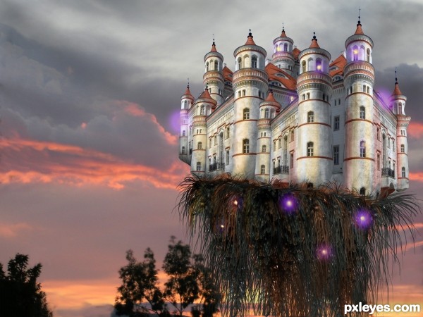
The evil castle dominates.
For the background I used one of my own photos. (5 years and 3628 days ago)
nice job
Nice work.
In high resolution, there are some strip lines going from top to bottom, also near castle left tower, IMO these are border from source, which need to be delete or mask. Also little black cut on the left 2 tower near window. Some black small strips at right and left tower edge.
Hide your background image and add new layer at the bottom and fill it with color to view all these remains of source.
and Author why only right tower is distorted?
Good Luck
nasirkhan, you are absolutely right!
I did this late last night and although I had the intention to distort every tower, in the end I was too tired to do it and forgot to fix the distorted one to resemble the other towers.
excellent
happy fun.. reminds me of the everglades for some reason
It's so beautiful that it doesn't seem an evil castle... I like those... er... spirits? 
Very nicely done....Love the whole thing best of luck
stunning!
Howdie stranger!
If you want to rate this picture or participate in this contest, just:
LOGIN HERE or REGISTER FOR FREE
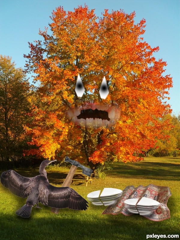
Just an idea that came to my mind :) (5 years and 3649 days ago)
Nice idea! 
It would be better if you made cooked duck on a plate with a hammer in its broken teeth, but this is a nice idea too. 
Looking at lighting source, your shadows must be a little darker, and run to the left. Duck has a fine white outline that you must take off... 
A cormorant isn't a duck.
try to fix the shadows... 
Create few more layers for better blending...with this light my advice is:first dark blue overlay layer,second,dark brown color layer and then maybe,but just maybe gold color or soft light layer.Of course play with opacity...just an idea author...good luck
funny idea 
Lots of sources mean lots of work, I admire that. I noticed the duck has a halo around it. A quick fix is to ctrl click on the layer to select it. Then go to select/modify/contract. You will only need a couple of pixles. Then just inverse your selection and hit delete. Good luck.
like this tree 
Howdie stranger!
If you want to rate this picture or participate in this contest, just:
LOGIN HERE or REGISTER FOR FREE
Great compo. But I'm not sure if source 2 is usable (premanipulated image). Anyway, GL!
ok changed source 2 hope its ok now
New source is also premanipulated.
ok thx the eyes again hope its ok now
ok thx the eyes again hope its ok now
Howdie stranger!
If you want to rate this picture or participate in this contest, just:
LOGIN HERE or REGISTER FOR FREE