(5 years and 3934 days ago)

Changed it up a bit....watch your back! (5 years and 3935 days ago)
make a baby one looking up at him..LOL.. that would be the bomb... good work author (don't mind me.. I see things in my minds eye all the time and I just spit it out LOL)
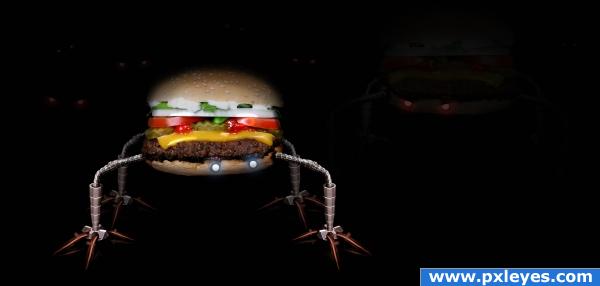
I love the robot burger! Not sure if it's twin/reflection is necessary, though. As Golem said, maybe a baby burger (like a slider!) looking up at him would work a little better. Still, nice work author!
AHHHHHAHAHAHA love it
is that a reflection or his "evil brother"? either way, it's feet should be more visible, and its top (the bottom of the image) less visible.
good work, but reflection not ok
check high rez! ^^
Good Luck.
good idea
Excellent image and idea

 very UFO!
Howdie stranger!
If you want to rate this picture or participate in this contest, just:
LOGIN HERE or REGISTER FOR FREE

Only the source image and PS used. (5 years and 3937 days ago)
Super KAPOW... zowie!!!!
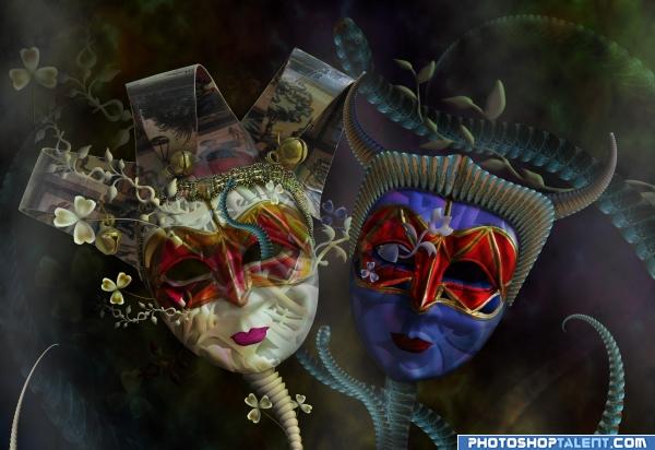
the texture on the white face bothers me a lot... good concept, mood is okay, a bit messy and not much work done on color and lighting.
cool image
Nice atmospheric piece...the thing coming out of the white mask's eye kinda bothers me, and I would have changed the expression on the dark mask...
really good work! only thing is, the snakeheads are to small (hard to figure them out). a face expression change like cmyk said would give it also a special 

that's beautiful! great work, author. I like that you used those default shapes and manipulated them.
nice job

cooool
good work
very nice!!
very nice 
good
beautiful !
very pretty
Excellent work..........Good Luck Author.
I think the evil should have more black/red tones in it to make it more realistic, the good is very nice.
First class image very nice work indeed!
Thanks to all for the comments Surely I have disappointed those who would like to turn the evil mask into something really evil- more devil's red and black plus angry mug, even blood and guts added. Soooorry, I don't feel the things like this. Let's give even the evil a chance to be more good looking and smiling and a hope to become better. Thanks a lot again 

 Surely the image has many things to be improved but this week I was just overworked
This is really niceAuthor!! 
Congrats! Well done!
Congratulations on 4th... beautiful entry 
congrats!! 

congrats
this is amazing, all your work is really whimsical. I LOVE IT!
Howdie stranger!
If you want to rate this picture or participate in this contest, just:
LOGIN HERE or REGISTER FOR FREE

(5 years and 3955 days ago)
good mood
Source links?
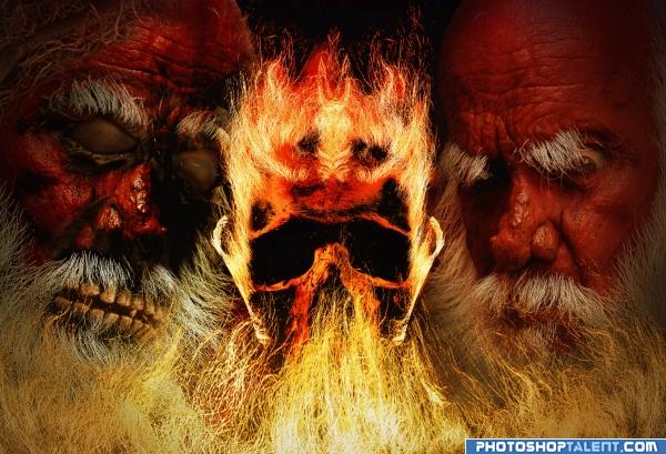
Done...sources up now. The fire i made from his beard
Yikes.. No HO HO HO here.. BRRRRRRRRRRRRRRRRRR.. very creepy. and I think that was the point LOL
i dont really like it but thats just my opinion gl
gl
Thanks tuckinator for making such a constructive comment!.....personally, if i dont like something i just dont comment at all.
5.2? WTF.....some idiots here dont know how to vote i guess! They vote on theme instead of technique.
Howdie stranger!
If you want to rate this picture or participate in this contest, just:
LOGIN HERE or REGISTER FOR FREE
Very nice!! Good work!!
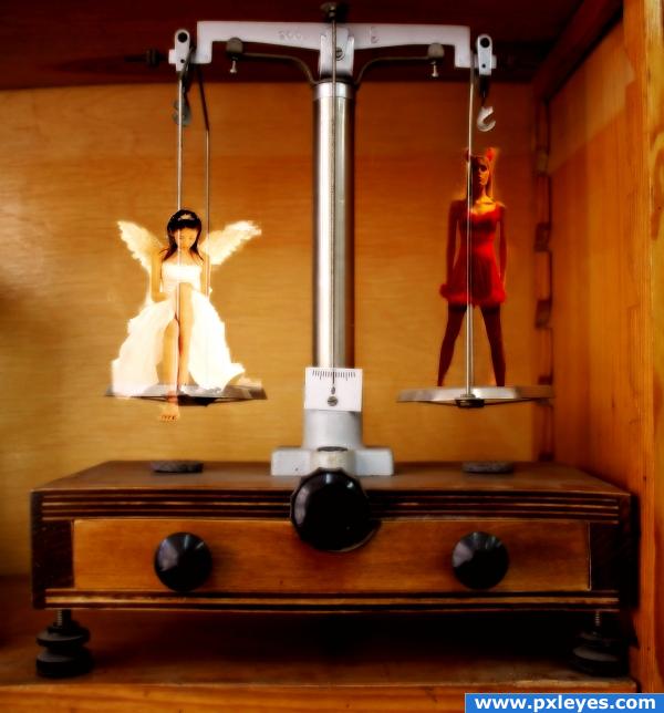
The figures should be behind the rods that connect the pans to the scale arms
hum!

Nice idea!!!
i think it's too red. this way the evil side dominates so it kinda negates the "balanced scale" theme
nice work on image.....love the concept...also it would be better if I can see high res......anyways GL
good idea, but bit blurry
One of the better good vs. evil pieces that I have seen good work
nice
yin yang?
Howdie stranger!
If you want to rate this picture or participate in this contest, just:
LOGIN HERE or REGISTER FOR FREE