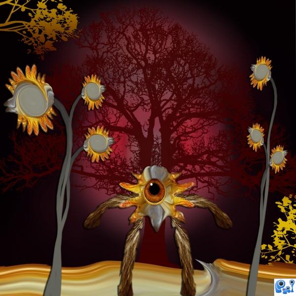
Only source image used. The trees used in this image are brushes with gradient effects on them.
Thanks to Stock Graphic Designs for the tree brushes. (5 years and 3784 days ago)
- 1: Tree Brush

Only source image used. The trees used in this image are brushes with gradient effects on them.
Thanks to Stock Graphic Designs for the tree brushes. (5 years and 3784 days ago)
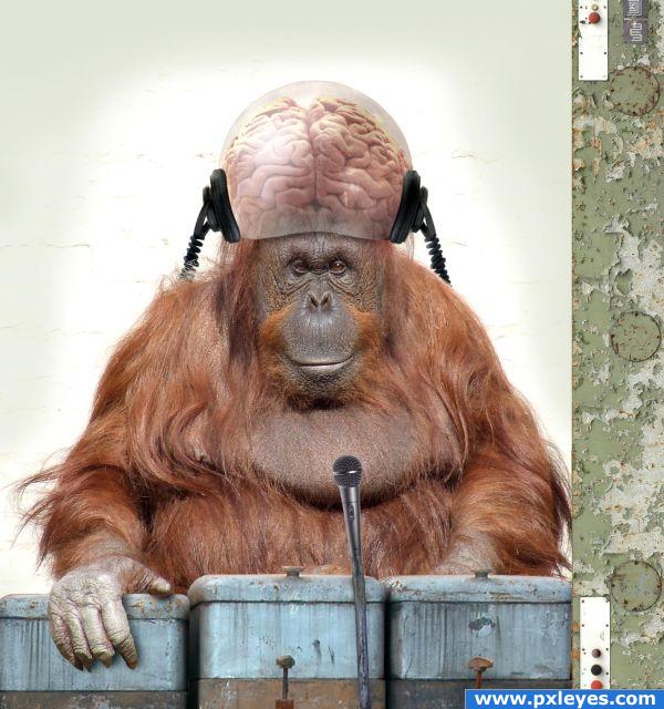
Even when mankind is extinct and the great apes run machines telepathically, they'll still need DJs. (5 years and 3830 days ago)
the headphones seem to be glued to his head.. 
Haha! Excellent! Great creativity..what i can see in the high res is a bit of a white halo around the mic, but excelelnt image otherwise! Good luck!
@ Elficho, the headphones are attached to the bubble helmet. 
erm... all ressources are in different reso and you didn't nothing here to synchronize that.. but headphones have serious perspective problem and if it must be bubble-helmet, then are hair too not in right way - need to cut his hairstyle  but course are fingers wrong and very black cut-out, so technique elements - and if some technique are very old, will be better if all technique is very old... but brains blending is not very good - those are not connected to head...
  but first look was funny - probably you just wanted to make a little punk
  cheers!
your resources are all in different resolutions and you did nothing to synchronize them, the headphones have serious perspective problems, and if you have a bubble helmet, then the hair that is all around the edge should be properly masked out (a lot of debris and excess hair is every where, and inside the helmet as well), if you are using older techniques.. it would be better if all techniques were very old  the brain blending is not very good.. the brain looks separate from the base and not connected to the head, But First look was funny, probably you just wanted to make a little punk..
  cheers!
LOL Fille, maybe in 2 or 3 years if you sober up & learn English we can discuss your comment. Thanks for trying, though...
in this you are right - i've never learned english... and thank U2 for trying...  cheers!
It's really the sobering up part I was referring to...
if you mean my style of thinking (course i'm sober), then it will be very painful, how sober you are... 
OK Fille, we'll just pretend you're not a drunk.
so... i used little help and gived translation in my first comment... but i really don't want to discuss...  cheers!
oh i get it  but author, you gave yourself away with those witty responses..
  (had to vote now to be sure) ((gotta love fille's translation))
Fille, I've never seen you be such an anus on anyone else's entry, so I wonder what your problem is. Just go away and bother someone else.
gee author.. fille hasn't commented on any piece for so long.. it's refreshing to see him comment once again, you should be thanking him, not chastising him by calling him names and accusing him of being a drunk.. as they would say in England, very bad form..his points are valid.. and should be considered .. I've looked under high res and the resolutions are quite off.. I already gave you a High mark for such a wonderful concept, but it would be better if you leave the condescending tone outside the comment area.. it would be best if you deleted or at least modify your accusatory tone... I just love this entry, and making it better is just a part of PXL.. you post an image expect to get criticism and advice .. it's really how this is suppose to work (contact a MOD if you have a real problem with something and let them handle it)
OK geniuses, what resolutions are "off"?
Calm down author.. breathe breathe....
the Head phones are high res.. the clear ball is low res..
the head phones are inside the sphere not on the surface....
where the brain meets the body. the brain is shining through some of the skin..
not merged where the microphone meets the stem there are two totally different resolution..
microphone is high res the stem is low.. they don't merge as high as what I know you are capable of..
the resolution of the red button control panel wall is high res while the three boxes are very blurry compared to it'
the background has a lot of stuff that looks like debris
the left side of the orangutan is dark and the other side is lighter, does not concur with the light hitting the helmet, the buttons on the pastel green wall, or the light hitting the 3 canisters...
(and you know how much I hate to do this kinda stuff, I like to focus on the positive of peoples work.. but you asked)
but remember.. these are seen in high res.. if you printed this image.. none of that would show to much unless you were making a wall poster.. the overall concept and design is excellent
actually i'm not genius - Some researchers argue that the geniuses IQ begins at 140, while others argue that even at 190 - i have only 137... However, since IQ is learnable, then i hope one day to be a genius and really understand your mentality.  resolution problems means that one picture have one resolution and other have... other resolution... to hide it in final work you have in photoshop many filters and blending-stuff.
  cheers!
LOL Golemaura and Fille....both of u have written a long story to read LOL 


I give Fille credit to at least try to learn English.
OHHH, by the way.....I'll drink to that! And a drink for this picture also because it is cute  lol
lol
Personally i think that even thought there is a difference in resolution, does it really matter? it's hard enough finding the sources you want without having to worry about something as small as RESOLUTION! This image is excellent, the author obviously worked hard with a great idea he had, so i think we ought to just leave it at that.
Golem, your comments are absurd. The "stuff that looks like debris" is a textured wall.
Then shouldn't the subject be overly bright if it washes out the background so much?
It's exactly as it is in the source pic if you bother to look.
ahh.. but you introduce the bubble on the head with it's own specific lighting.. it would effect the overall lighting of the piece.. would it not?..look at the the light flash in the primates eyes.. the flash light is in the right side, not the left.. totally different light source for the primate to the bubble
Edit: 
Golem, just shut up already with the absurd nitpicking.
like i said this is funny picture, but author's answers put me to think that author really thinks this picture is in high technical standard...  it makes me laughing and it is more funny
  btw this is not good excuse how things are in original sources - maybe already those are bad?
  cheers!
You too, Fille.
funny idea, nice image!
Fille & Golem, it's only Sunday. You have almost a whole week to post additional ridiculous and inane comments, so feel free...I could use a week's worth of free laughs. Not to mention the laughs I'll get from other members laughing at you. I think allowing members to be exposed to the opinions of flaming douchebags would be the least i could do.
i see you didn't get it... ohh.. no matter, great picture! good luck!  cheers!
LOL...seems like a big cluster F*** to me
Razor, you are indeed correct.
LOL already 34 comments!!!!  BTW I have never seen Golemaura and Fille comment so much on any entry LOL


IMO its a great image!!! 
I'm not going to get into this one but I do have one question: What are the boxes in front of him? Shouldn't a DJ have turntables or something?
nice job on the glass covering the brain
The concept is cool and original, but if it is supposed to be a dig at DJ's, why didn't you place a record deck and mixer in front of the ape?
@ micjammusic: He's got all that stuff out of sight...that's what his left hand is doing...
Nice entry....smart idea and well executed......but come on guys....24 out of 38 comments just from you 3....hahahahaha!
WOW!!! Good concept but the resolutions should at least be close to the same! I think all entries should be as high quality as possible. 
As for the other commentors..... We all learn at a different pace.............some just choose not to learn at all!
For sure the coolest DJ I have ever seen  I really like the dome with the brain in it on his head. And your choice for the machine, cause that works way better as if you would have used real turntables, which probably wouldn't exist at all anymore, considering, that mankind is extinct and why should apes need them anyway. But it's just "simple" this way, what is a good thing! I suppose, that you won't need turntables, if you have a brain like that, simple machines are enough there. Ok, that was a lot blahblah for something short: Great image!
  Good luck
mic looks weird, hand shad is wrong.
haha someone here needs to have some sex and turn off the pc for some time 
 IMHO the perspective and resoultions are right...but you author should smoke a joint
  ok now take my high score
great job 
Congrats for your third place, Bob!
Congrats for 3rd. CMYK... nice to see it again!!!
Congrantulations on 3rd..................it amazes me how low these top 3 entries scored compard to other entries in other competitions. I would of thought all top 3 would of got over 70!
Congrat CMYK... 
congratulations!
Congrats!! Is he available for Mod duty??
Congratulations for 3rd
Congratulations on third, I just love this image and mostly the originality of it!
Truly hilarious! And scary accurate too. If you've ever been on some radio stations you'll know this is spot on! Helluva job author! P.S...might this be a descendant of Howard Stern?
Howdie stranger!
If you want to rate this picture or participate in this contest, just:
LOGIN HERE or REGISTER FOR FREE
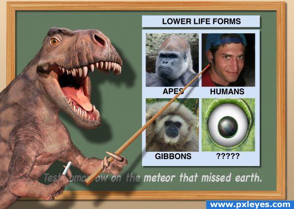
What if the meteor that helped end the reign of the dinosaurs missed earth? Science believes they could have evolved high intelligence to become the dominant species on the planet instead of us mammals. Thanks to Giallo and spaceranger for the use of their images. (5 years and 3831 days ago)
Glad to see this one back...  I learned A LOT from it
Though whose the lower life form in the upper corner, he looks like trouble to me
(GolemAura quickly scampers out of the comment area before General Mod Giallo whups him!!!)
ha ha funny.
HAhahahahahahaha! Brilliant!
Good one 
great!! ;D
Awesome Entry.....Good Luck Author.
lovely entry.'nice to see it back again. . cant hide from those MODs GolemAura..
contest goal says "imagine an existing animal" ............Dinosaurs don not exists.....
cool
The inside edges of the dinosaur (near the shadow) should be darker because they'd be shadowed also. Also the front of the first arm should case a shadow on the body.
This is insanely great, and don't listen to Visba about edges & shadows...
very cute!
Thanks for the comments. LKY this contest is from the old PST days. In fact it was one of the last contests. The original wording was a little different and there were other dinosaur entries. I checked with the moderators and they said any animal as long as it was a real animal that lived. The Contest guidelines mention this.
*lol* Just hilarious  Funny idea and great execution! Gian makes a good example for a human and adding Waz as unknown species is perfect. Good luck!
huhuhuhu!! (have to admit that the ape on my left looks more clever than me  )great job mate
 (I'll have my revenge just gimme some time and mhhhh)


funny!!! very good job 
Congrats for a great second place, Spaceranger!
COngrats! I remember how funny this one was!!!!!!!!  it was the week pxl died wasn't it?
congrats on your placement. 
Congrantulations.....these top 3 aall should of scored over 70! .......Very weird!
Congrat SpaceRanger... 
congrats!!!!
Congrats Space!
Thanks everyone, greatly appreciated!! I guess I better watch my back then eh Giallo? Yes annabat this was one of the contests the week of the crash.
Congrats!
Congratulations for 2nd
Congrats for 2nd. Spaceranger!!!
Congratulations!!
Howdie stranger!
If you want to rate this picture or participate in this contest, just:
LOGIN HERE or REGISTER FOR FREE
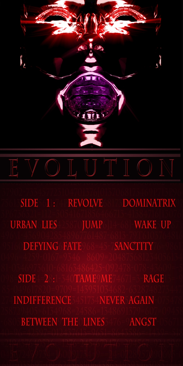
my imaginary band....used sources from my own stock section....oh, and i know wide images always get chopped on these uploads, so i did my cover and my song list long ways.... (5 years and 3866 days ago)
Excellent job!
OLD SCHOOL album cover.. awesome
Good work!
Not a bad idea, but bad layout.
Howdie stranger!
If you want to rate this picture or participate in this contest, just:
LOGIN HERE or REGISTER FOR FREE
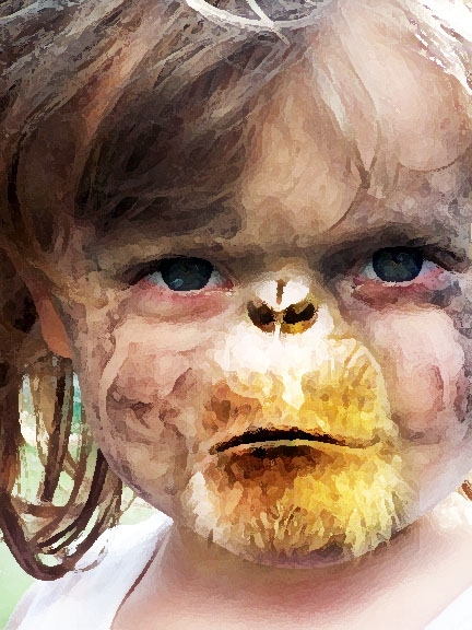
I wanted this to look like a sketch or a painting of something some had claimed to see. Like a fabled big foot creature. Monkey Girl. (5 years and 3866 days ago)
Funny, it suits her  . You may want to make her lips a tiny tiny bit less black so they fit better with the rest of the image. Good luck!
that would actually be going back on the evolution charts, not forwards...  unless your talking about a girl monkey, not a monkey girl. a girl monkey would mean a monkey turning into a girl, and a monkey girl would refer to a girl turning into a monkey.
I actually like this, i think you did a good job.
Howdie stranger!
If you want to rate this picture or participate in this contest, just:
LOGIN HERE or REGISTER FOR FREE
very artistic creation. My fav part of this work would have to be the use of the eye. It has provided an interesting focus point. GL
Cute!
Howdie stranger!
If you want to rate this picture or participate in this contest, just:
LOGIN HERE or REGISTER FOR FREE