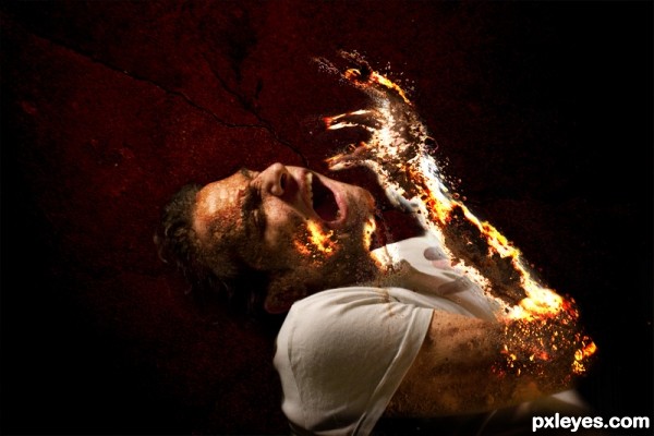
I've used my own source photos in this one
Mainly the model.
Four photos of sand.
Composite background texture.
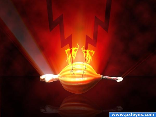
The fire effect achieved with layer mode using smudge tool.
(5 years and 2908 days ago)
(5 years and 3077 days ago)
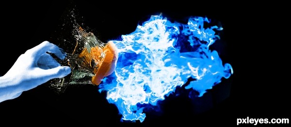
Please comment and criticize
Howdie stranger!
If you want to rate this picture or participate in this contest, just:
LOGIN HERE or REGISTER FOR FREE
"Good Luck!" (5 years and 3347 days ago)
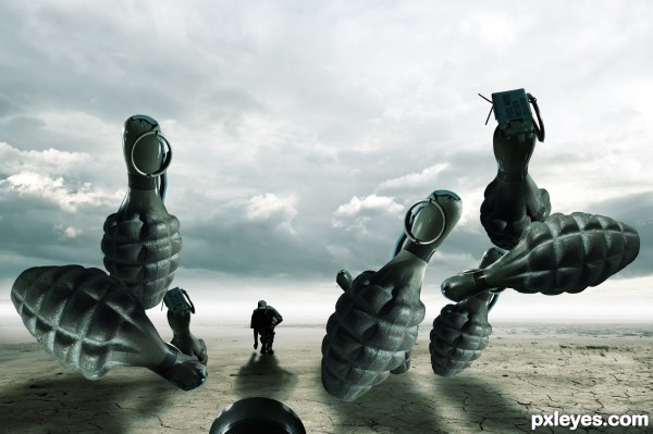
Excellent dramatic image, lighting & color...good luck, author! 
Great work
super cool work author...well done
Congrats for 3rd
Congrats!!
congratulations...
Congrats!
cool idea... congrats...
Congrats for no.3!
THX for votes, comments and congratz!
Howdie stranger!
If you want to rate this picture or participate in this contest, just:
LOGIN HERE or REGISTER FOR FREE
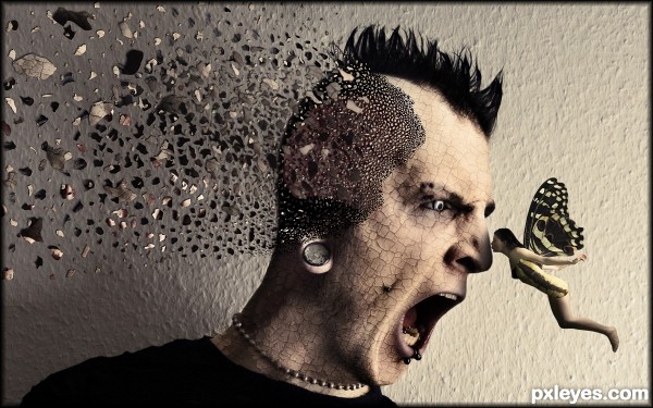
Something I did about 6 months ago to keep me busy.
Thanks to mffugabriel-stock, AbsurdWordPreferred, mjranum-stock and youvegotmaille. (5 years and 3381 days ago)
Fantastic image author!! Great work..!! A fav if ever i saw one 
Well done Author. I love it. G/L.
Excellent pic, great work.
This is excellent.. Would love to see a SBS if possible  Great job, really
Added an animated SBS Toothpick, hope it helps explain the making of the image. Sorry that the building of the fairy is not in it but I lost the PSD file for that.
really cool work! 
Cool!
Reminded me of a similar entry ( Burning kiss- i think ) with the same fairy model & concept. The guy used different layers of cracked earth the one underneath was red and it looked like skin was pealing off. Veterans surely know it.
This is cool too, and i'm happy to see it since the old entry died with PST, and the user didn't come back.
But you entitled it: explosive kiss - in explosion the exploded parts either become smaller or stay the same, they don't increase size. I know the idea is from the tutorial with the exploded face, but many people stated that the flaw in concept is that bits shouldn't get bigger.
I agree, I've always thought that tut was wrong. The larger fragments should be closer to the source, and get smaller as they expand. Good entry, though. 
nice work author
nice work author
Great work author...cool colors and the great mood...
great concept and result !!
This is FREAKING AWESOME!!!
Wicked-cool even! 


GL to you! 
How to destroy a tough guy with a blow of a kiss... 
Love it ... he looks angry and/or astonished ... is that because she is blowing his mind? Or ... okay, I will leave it at that. There are children present!
This is what i call " MINDBLOWING "....gud luck author
Congrats for another great placement this week!
Congrats!! So close, shpuld have won IMO  Great entry and congrats again!
Well deserved congrats my friend! 
Congrats!
Excellent work.  Congrats
Loved it when I voted and love it still! Congrats on a winner!
Congrats on your second place  it was close!!!! and what an awesome second place!
Howdie stranger!
If you want to rate this picture or participate in this contest, just:
LOGIN HERE or REGISTER FOR FREE
AHH GET DOWN!!!!
xD Once again, it's another experimental maniuplation, i hope you like it :) (5 years and 3911 days ago)
awesome
Thanks 
Howdie stranger!
If you want to rate this picture or participate in this contest, just:
LOGIN HERE or REGISTER FOR FREE
Author, you need to post your uncut photos in a step-by-step guide.
how could I do this I seems that I skipped this step!!
how could I do this I seems that I skipped this step!!
http://www.pxleyes.com/guidelines/
very impressive! and fun! (not the greatest feeling LOL but I think that was the idea ) GOOD LUCK!
thank you for your comment I do appreciate it
Ouch is the first word that came to mind, cool art work =)
Indeed a well done effect, would have loved to see in HiRes. Good luck!
Howdie stranger!
If you want to rate this picture or participate in this contest, just:
LOGIN HERE or REGISTER FOR FREE