All source
CS3
Wacom Bamboo Tablet (5 years and 3303 days ago)

Heh, I spent most of the time actually thinking of the idea rather than on the work itself.. Although I did have fun making this one.. Enjoy :) (5 years and 3590 days ago)
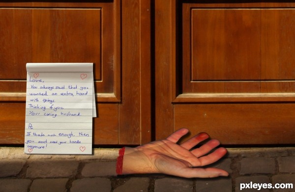
Not bad at all, but according to the text not threatening enough, imo. What if you change it a little bit that i.e. the wife (I guess) demands from her hubby to be more a helping hand at home instead of help his friends to get rid of money that has been spent on beer and such? And then the hand is from one of his friends. Just an idea  . Good luck!
Hand is a bit distorted... 
Howdie stranger!
If you want to rate this picture or participate in this contest, just:
LOGIN HERE or REGISTER FOR FREE

Thanks to starxdust (Has been notified by SXC PM)
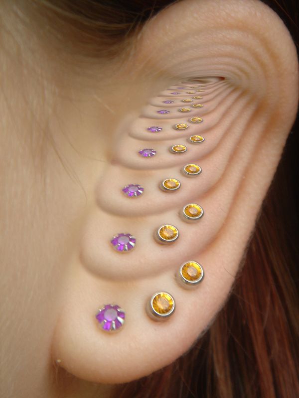
Scaling,masking and adjustment for contrast (5 years and 3697 days ago)
Blending is good, but you can clearly see the end of it. Correct me if I'm wrong but isn't the dorste effect supposed to be an illusion of inifinity?
I think I agree with the gamer.
EDIT: better
Added a few more layers
Howdie stranger!
If you want to rate this picture or participate in this contest, just:
LOGIN HERE or REGISTER FOR FREE

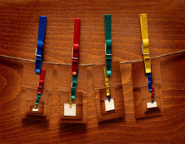
all source. just crop and fit into the white squares and add the clothespin bottoms (5 years and 3773 days ago)
funny
Funny idea indeed, almost Magritte like (though maybe should be more surreal for that). Good luck!
interesting idea. Just a suggestion, and it would make it appear less simple. Change te background Even if it's a diffferent colorm it would stand out again the common. Most of these entries are using the same background.
Howdie stranger!
If you want to rate this picture or participate in this contest, just:
LOGIN HERE or REGISTER FOR FREE
nice blend, GL!
very nicely done author, very slight nit pick would be the shadow on the yellow box..its a little too grey compared with the other shadow on the box, maybe use more of a brown/orange shadow than grey. Still very well executed
Adjusted the colour of the shadow on the yellow box -- much thanks geexman for the fix
That looks real good. The additional tools look as if they were there......! Goooood Luck author.
interesting...

GL!
very very nice realistic neat work...best of luck author
Howdie stranger!
If you want to rate this picture or participate in this contest, just:
LOGIN HERE or REGISTER FOR FREE