(5 years and 2634 days ago)
(5 years and 2944 days ago)
Howdie stranger!
If you want to rate this picture or participate in this contest, just:
LOGIN HERE or REGISTER FOR FREE
(5 years and 3262 days ago)
Brilliant! Really creative here....very very nice work and fun too!
Very nice idea!
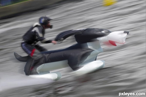
I think the dog would look a bit more integrated if the main layer is also motion blurred. I still see more blur in the hands of the pilot than in the ears of the dog. I really love the concept! Good luck!
yaaa very creative its portraying a totally different angle of the dog as compared to the original image..... GL author
thanks guys....
good work gl
Awesome Job!! Great use of the source  Best of Luck
Howdie stranger!
If you want to rate this picture or participate in this contest, just:
LOGIN HERE or REGISTER FOR FREE

Then God said "Let there be light on that tree" (5 years and 3268 days ago)
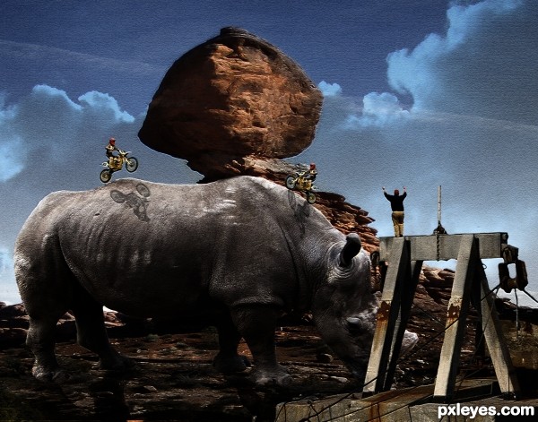
I like this one. I think the colors work well with the composition. Lovely. 
A very common scene in my area. Good job.
wonderful! good luck!
Well done man, i really like how the brushes take this to a new level. I would have liked to see a little shadowing from the clouds maybe but its a great image. Goodluck!
Thank you for the feedback. I'll give it a try and see if I am able to improve the quality of my entry.
A great example of the duality of nature!
Congrats for 2nd
Congrats!
Congrats!
Thank you all! I am happy to recieve so many votes.
Congratulations on your 2nd place win....Beautiful work!!!! 
Howdie stranger!
If you want to rate this picture or participate in this contest, just:
LOGIN HERE or REGISTER FOR FREE
(5 years and 3607 days ago)
Uuuh...scary.
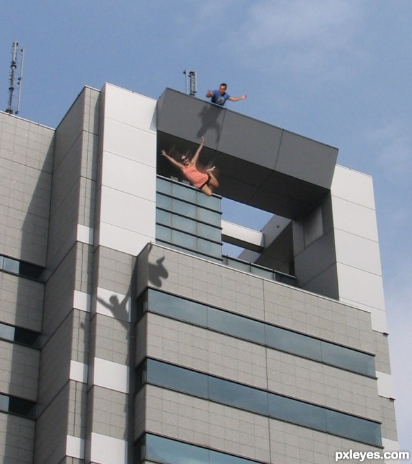
The shadow of the falling woman should also be falling and I think you should let the shadow of legs be visible on "extra part sticking out" - where the shadow suddenly gets cut. try also to blur and fade the motion blur a little so it not that straightsharp. Like the idea a lot. GL
Much better, but I wonder if the shadow of the falling woman might be to big - I can´t say for sure but it feels like it. And add some falling blur to the shadow - then I´ll be satisfied 
actually, the shadow should be bigger( taller ) but i made it the same size as the girl.....and based on the angle in which the light source coming from a real shadow would be an entirely different shape rather than the same silhouette of what the girl looks like from perspective in which the picture was taken....but i just meant to keep this simple 
My goodness!... Is there something like a net waiting for her down there? 
 I'm sure she had it coming. One of the most original chops I've seen GL!
hahaha, did he push her? neat idea, jawshoewhah's right, pretty original. Good job
Congrats for your second place!
Congratulations for 2nd
Congrats!
Congratulations!
congrats! 
Howdie stranger!
If you want to rate this picture or participate in this contest, just:
LOGIN HERE or REGISTER FOR FREE
Well done author, excellent result.
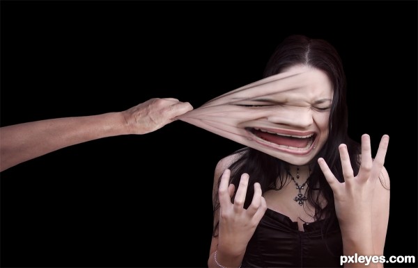
It's a shame the teeth are stretched too, but it's a good attempt regardless
Face looks good, hand not so good. Funny idea.
The scale of the hand pulling seems a little small.
Really good job, hilarious idea! Agree with previous comments, with a little tweaking this could be spot on.
Congrats!
Thanks!
Congrats!!
Thanks!
congrats!
congrats!
Thanks!
Congrats ¡
Thanks!
Wowwwww.... Congrats
Thanks!
Howdie stranger!
If you want to rate this picture or participate in this contest, just:
LOGIN HERE or REGISTER FOR FREE