Photoshop Pictures: Eye (page 10)


results 46 - 50 of 120

Crashed Supper - created by Titan85


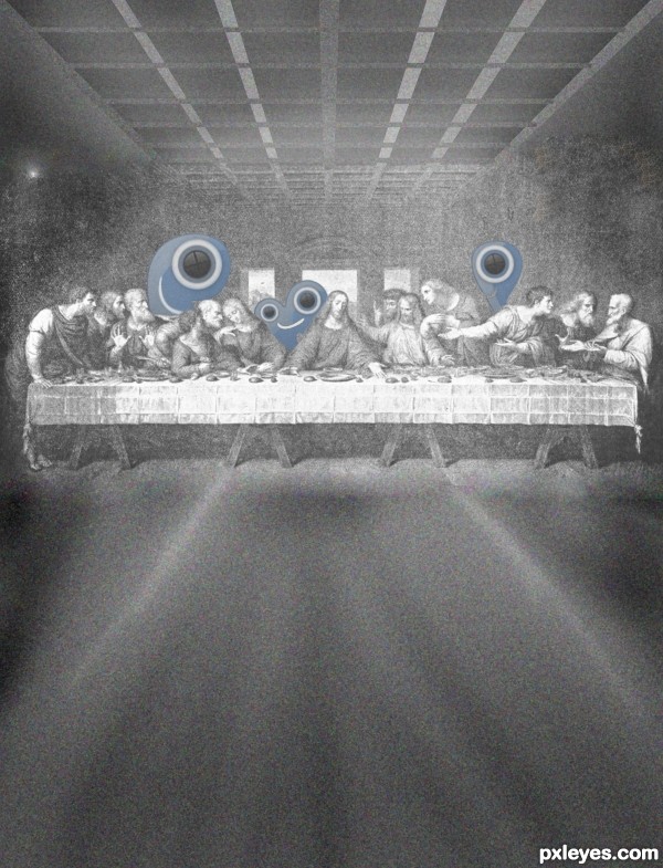
Crashed Supper
Favs: 0SBS: 4Hi-resRank: 5/5Score: 56.6% (0)15351 views

When held under a black light, Leonardo da Vinci's "Last Supper", shows three characters only known as P, X, and L. Historians and philosophers are working around the clock to explain the three uninvited guests.

Thanks to http://breadsite.org (5 years and 3099 days ago)

1 Source:

avatar jack2
jack2 says:

not fun,, inspiration is gone???? i mean where is the work

avatar erikuri
erikuri says:

Link is not working.

Howdie stranger!
If you want to rate this picture or participate in this contest, just:

LOGIN HERE or REGISTER FOR FREE


swan - created by chookobot


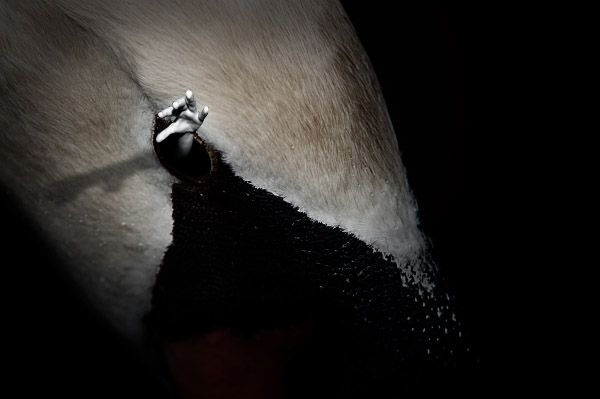
swan
Favs: 0SBS: n/aHi-resRank: 5/5Score: 56.4% (0)4915 views

(5 years and 3106 days ago)

1 Source:

avatar neo2011
neo2011 says:

good effect.gl

author says:

tnx

avatar Mikaelbg
Mikaelbg says:

Why? lol good luck

author says:

why?

avatar Androla
Androla says:

maybe i don't get it...

avatar basem11361

!!!!!!!!

avatar fille
fille says:

He's got day and the night in his hand... cheers!

author says:

haha

Howdie stranger!
If you want to rate this picture or participate in this contest, just:

LOGIN HERE or REGISTER FOR FREE


Apple of My Eye - created by RickLaMesa


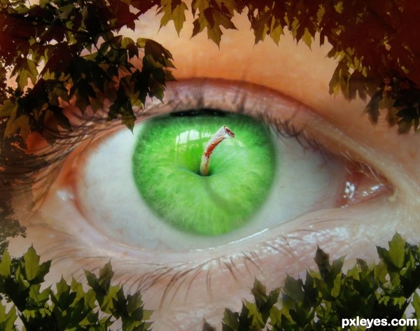
Apple of My Eye
Favs: 3SBS: n/aHi-resRank: 5/5Score: 58.7% (0)12473 views

(5 years and 3137 days ago)

3 Sources:

avatar CMYK46
CMYK46 says:

Hmmm...I can't decide if I think the stem needs a shadow, or a reflection...anyway, I like this!
Edit: Yep, the shadow works for me.

no avatar
olga says:

Interesting consept! GL!

avatar rbsgrl
rbsgrl says:

Creepy and cool!!

avatar erathion
erathion says:

Very cool work author...great mix of elements...best of luck

avatar pearlie
pearlie says:

Creepy a little, but great concept! Good blend, author.

Howdie stranger!
If you want to rate this picture or participate in this contest, just:

LOGIN HERE or REGISTER FOR FREE


eye of the water - created by rakib888


eye of the water
Favs: 4SBS: 1Hi-resRank: 1/5Score: 58.4% (43)9083 views

(5 years and 3181 days ago)

avatar 6tann
6tann says:

nice shot....

avatar MossyB
MossyB says:

Great photo.

avatar sgc
sgc says:

Color change on water and crop work well!

avatar erathion
erathion says:

Very very nice work author...Original image is great too but now u have mystic effect here...best of luck

avatar greymval
greymval says:

Good work & pretty nice effect.

avatar jawshoewhah
jawshoewhah [banned] says:

PERFECT example of on theme! WEll done author!

author says:

thanks guys for your kind comments

avatar madamemonty

Congrats lovely work

avatar arca
arca says:

Congratulations!

avatar spaceranger

Congrats!!

avatar ramesan
ramesan says:

congratulation...

Howdie stranger!
If you want to rate this picture or participate in this contest, just:

LOGIN HERE or REGISTER FOR FREE


Eye of the Tiger - created by PSA2009


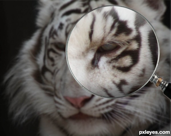
Eye of the Tiger
Favs: 0SBS: n/aHi-resRank: 5/5Score: 51.4% (0)5739 views

Everybody knows this... the famous theme tune from Rocky.... Modifications have been carried out as per comments received- Thanks Guys! (5 years and 3182 days ago)

2 Sources:

avatar MossyB
MossyB says:

The enlarged eye is too blurry. Great concept, but the purpose of magnification is to see something larger and clearer.

avatar arca
arca says:

Really clever idea and love the song!

I have to agree with Mossy ... perhaps instead of enlarging the eye you could reduce the rest of the Tiger ... your image is quite large and you could easily reduce it to 1200-1500 pixels wide (a lot of monitors are no more than 1280x1024) and still have a decent High res. Also, in high res the edges of the Magnifying glass are a bit rough (to help this you can select the Glass, contract selection by 1 or 2 px then apply a layer mask and blur slightly or you can create a new layer and set blur tool on "sample all layers" and blur the edge then erase away what you don't want ...or if you don't like either of those could just go over the edge with the blur tool but you don't have as much control.

Edit: MUCH BETTER!

avatar pixelkid
pixelkid says:

Would be even more dramatic if you could introduce a bit more brightness in eye and some color. I realize that this goes beyond logic...but it would make the image stand out even more. Then again...is there logic holding a magnifying glass up to an animal such as this? Anything goes!

avatar erathion
erathion says:

cool thinking...GL author

Howdie stranger!
If you want to rate this picture or participate in this contest, just:

LOGIN HERE or REGISTER FOR FREE