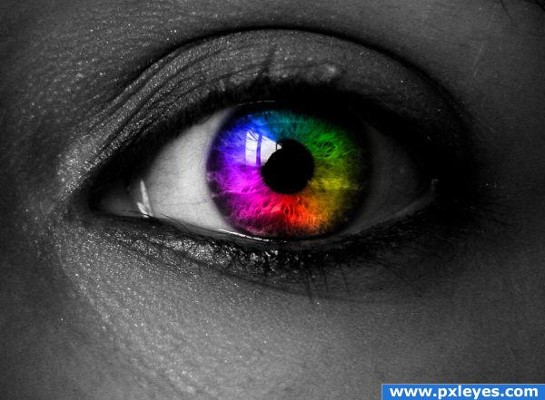
(5 years and 3835 days ago)
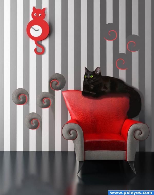
Source photo and a photo of my cat, Shadow were used with airbrush, brush, pencil, and cloning tools. Used small area of chair arms to make design for walls, then duplicated the piece. Just a simple piece, but have been away from PS for awhile, so need to brush up. (5 years and 3858 days ago)
Very wacky image.. good luck!
I really like the cat clock idea and the real cat isn't too badly blended but I don't see the attrction of the chair swirls all over the wall.
you spoil your cat... or at least the cat forces you to spoil them.. it's a very nice image... good LUCK!!!
Why are the curly things dimensional at left, but flat at right? Cat clock is good, black cat is too big for chair.
Very cute concept. But I'm not sure what you did to his tale and why. If you wanted it in front of the chair instead of to the side, I would have just cut it off at the base, Edit>Transform>Rotate it to change the angle maybe. Also, try this tutorial for reproducing the cat's hairhttp://www.pxleyes.com/tutorial/photoshop/1253/How-To-Make-Puss-in-Boots.html. You can skip the copy and paste part. Just work directly on the original cat layer.
looks unfinished
Howdie stranger!
If you want to rate this picture or participate in this contest, just:
LOGIN HERE or REGISTER FOR FREE
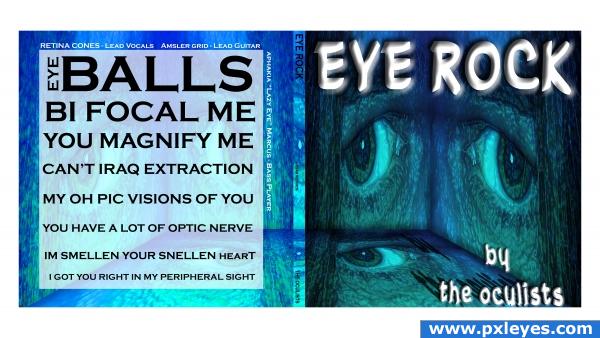
Ophthalmologist alter ego (5 years and 3860 days ago)
Howdie stranger!
If you want to rate this picture or participate in this contest, just:
LOGIN HERE or REGISTER FOR FREE
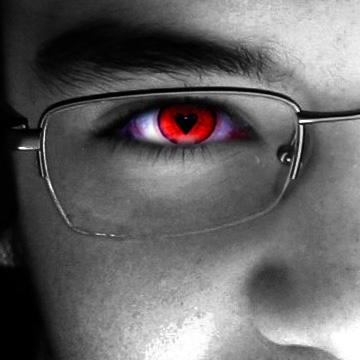
You can see love in my eyes.
(5 years and 3871 days ago)
Clever image, good luck.
Nice - dont forget to list your sources or original pics in your sbs! GL.
Nice pic, but I think your highlight areas are a bit distracting.
yes i know the i messed a little bit eith the higlhits area... but it's not that bad.
fun idea! great image!
simple, but to the point
Howdie stranger!
If you want to rate this picture or participate in this contest, just:
LOGIN HERE or REGISTER FOR FREE
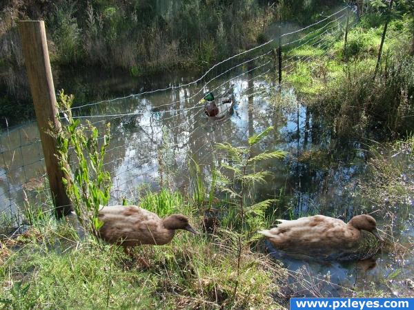
Three ducks and lots of water (5 years and 3873 days ago)
Nice work - you have a little bit of work to do around your ducks still though. The one in the background looks odd with the mesh all distorted like that, and the one on the right, what did you do around it? Liquify?? Bit more work needed.. GL.
Nice one. Good luck 
Hi animmax -Thanks Ive had a rethink and seen what you are talking about but Im not going to be able to do a thing about it before Voting happens 
Looks great!
Thats ok - its all about learning.. GL
pretty neat!
Howdie stranger!
If you want to rate this picture or participate in this contest, just:
LOGIN HERE or REGISTER FOR FREE
i cant edit my comments for some reason... but nice quick change there author looks good.
I think this image has a lot of energy...very strong piece...nicely done
nicely done!
Howdie stranger!
If you want to rate this picture or participate in this contest, just:
LOGIN HERE or REGISTER FOR FREE