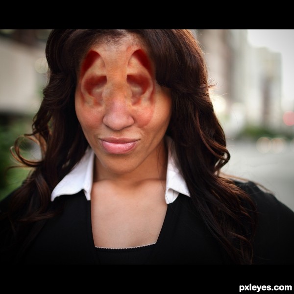
Cut out ear and copied to main image. Duplicated, flip, erased extras and changed blending mode, applied healing tool and blur and dodge. (5 years and 3152 days ago)
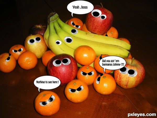
An image describing the power of the oranges ;d .
Image of fruits by me. (5 years and 3153 days ago)
very cute 
fruit mafia ................. better be careful it's not sweet any more .............it is coooooool entryyyy
leave those bananas ALONE!!! hehehe.. good work!
Good idea & cuteeeeeee imagee 
Humor nice, cool!
lovely work author
great idea
like it a lot
my fav
Nice idea!...very cool
Howdie stranger!
If you want to rate this picture or participate in this contest, just:
LOGIN HERE or REGISTER FOR FREE
(5 years and 3157 days ago)
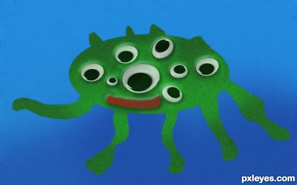
Add some shading to the body.
where
Add the shading on the opposite side of the light source as it is reflected in the eyes (pretend you are shining a flashlight on the eyes - the shading will go on the other side of where the flashlight lands on your subject.
You can also add some gradual shading to the legs to make them look more rounded. This might help some: http://artswork.asu.edu/arts/students/line/line4.htm
1) select the green body using "magic wand"
2) use "dodge" for highlights (lighter part of the body towards the light source)
3) use "burn" for shadows (darker part of the body)
add simple bumpy texture to body:
1) add "noise" (not too much, need to experiment)
2) add "blur", "gaussian blur"
add depth for water background:
1) select the water area
2) choose a darker blue, use "paintbrush" paint at the bottom portion of the image
3) add alittle "noise" , then a little "motion blur", then add "ripple" or "wave" (under "distort" to taste
Hope this helps, of course there are more methods that can be used... do some exploring online photoshop tutorials 
now its better aheman?
Howdie stranger!
If you want to rate this picture or participate in this contest, just:
LOGIN HERE or REGISTER FOR FREE
(5 years and 3172 days ago)
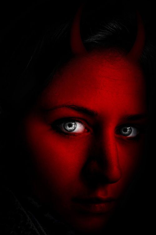
Good that you added an sbs, or I wouldn't see how you used the source. Your use of source is quite minimal.
On the horns...they look very 2 dimensional, and not actually attached to her head. Perhaps work on blending them in better. They also are not evenly spaced or balanced on her head either. Look at pictures of horned animals to get a grasp on what I mean, but pay close attention how those horns grow from the skull of the animal, not just sit atop the skin. Your horns need to be better seated in the skull.
I hope that's not to crtitical, I just think it would help.
good work author gl

Take Jade's advice. This isn't a great use of the source, but you can easily improve it.
Thanks for all comments!!..I'll try to make some changes soon.
Too minimal a use of the source, and a somewhat lackluster manipulation because the overall values are too dark. The horns are barely visible at all.
Yes to minimal use of Source Image, the Main Source Object is the light bulb not the Red light from the Background. The Horns looks 2D, not realistic, not authentic.
Howdie stranger!
If you want to rate this picture or participate in this contest, just:
LOGIN HERE or REGISTER FOR FREE
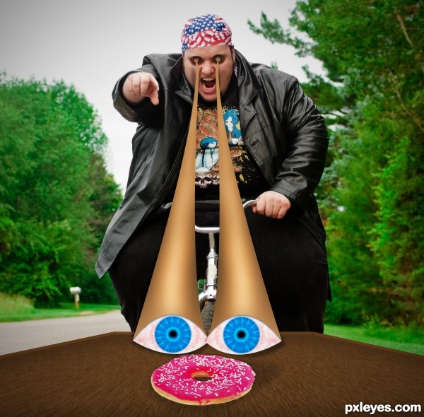
I first color corrected the photo a little bit, and removed the blue and red fringe around the guy, then i created the table, with some fibers, and textures. Then i created the big thing: the eyes. They took small amount of time to create them actually. Last, i added shadows and few things. (5 years and 3235 days ago)
very funny author
hahahahhahahaha...cool...GL author
Howdie stranger!
If you want to rate this picture or participate in this contest, just:
LOGIN HERE or REGISTER FOR FREE
I think a better title would be, "Ears looking at you, kid..." LOL!
Very weird but well done!
Ear Lobe work could blend better on the cheek face in the middle of the image (a simple soft brush erase would fix it instantly... good idea.. creepy as hell LOL.. good luck!!
Salvador Dali
Howdie stranger!
If you want to rate this picture or participate in this contest, just:
LOGIN HERE or REGISTER FOR FREE