(5 years and 3236 days ago)
(5 years and 3279 days ago)
Howdie stranger!
If you want to rate this picture or participate in this contest, just:
LOGIN HERE or REGISTER FOR FREE
(5 years and 3313 days ago)
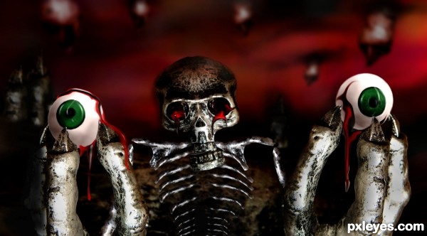
oooooooo, reminds me of that creature from Pan's Labyrinth .. great job!!!
i love the idea! and good finished product
you got the idea.., I like it.., 
ewe and cool!! I like it!
Great job author...love this image so much...IMHO eyeballs are to clean u could apply tome texture on them and maybe add some cracked blood vessels...just an idea...GL
actually erathion i made the eyes realistic at first with more realistic blood but it came out
much too disturbing , so i decided to go with this 'plastic' version .
thanks for the feed back 
Very creepy and gruesome ... great idea and well done.
Love the freestyle on the skull and skeleton! GL Author!
Howdie stranger!
If you want to rate this picture or participate in this contest, just:
LOGIN HERE or REGISTER FOR FREE
(5 years and 3368 days ago)
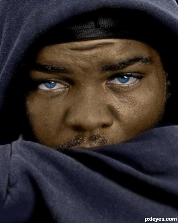
You got the skin and clothing spot on! I'm not sure about the really bright white eyes though.. maybe add a little shadow and depth into them.. GL! 
I made a little change,hope it is better now... 
This is a great image, but IMO whites of eyes are never pure white...there's always a touch of color. Look at other high res pics of eyes (RGB images of course) and see what I mean. It's a subtle difference, but would make your image almost perfect. GL author! 
ok,I throw some color in,hope it's better...
The eye whites are still too bright white. But the skin coloring is very good.
IMO the eyes are much better. Again, GL author! 
Very very nice work author...best of luck
Nice source choice author. Like the color selection on dress. Eyes stand out. Very intense compared to the original. Cool ! GL 
nice job... all the best 
Howdie stranger!
If you want to rate this picture or participate in this contest, just:
LOGIN HERE or REGISTER FOR FREE
My Photos (5 years and 3372 days ago)
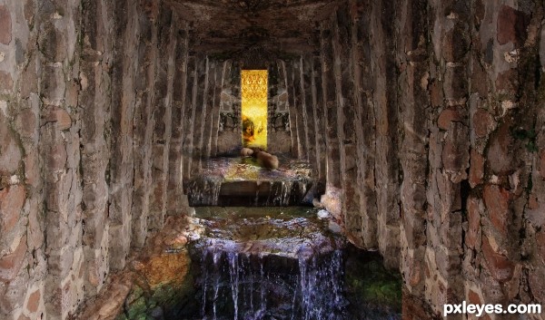
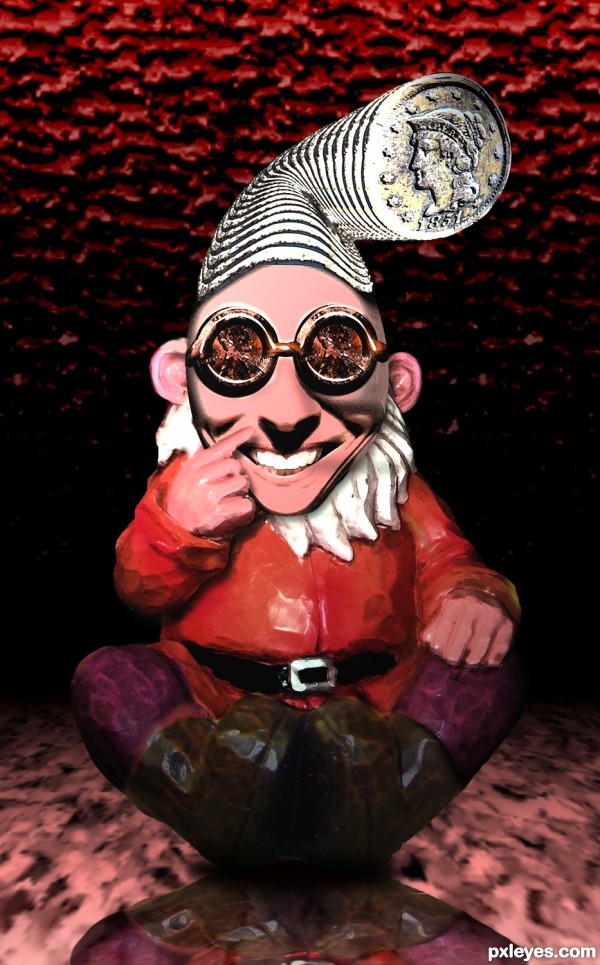
hahahahaha...what a crazy dwarf...love the final product author...well done
Precious hat 
Howdie stranger!
If you want to rate this picture or participate in this contest, just:
LOGIN HERE or REGISTER FOR FREE
Very well done...nice idea
thanks!
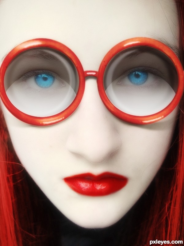
i like the effect very much, bravo , you can clean up a little the face the hair and rotate very little the face (has a small angle on right) overall I see this more like design , advertising ...is good!

edit: and the lips need adjustments on the shape
thank you for advice! i didn't change the lips, but cleaned the skin
well, i've changed the lips a bit
how is this related to the coffee cup?
awesome Idea, great use of the source
thank you!
very cool image and smart usage of the source image...best of luck author
many thanks!!!
thanks!
WOW
Nice entry and cool one! Surely a high rate from me. GL!
Nice one ....GL
Question: Since the red rims of the glasses share the same light source (light reflections in same position), how come the lenses reflect light sources and create shadows from two different directions (like one is a flip of the other, instead of a duplication)?
By the way, I love the highly "polished" look of the model - great job with the glamor.
Congrats!!
Congrats
Congrats...
Howdie stranger!
If you want to rate this picture or participate in this contest, just:
LOGIN HERE or REGISTER FOR FREE