(5 years and 3417 days ago)
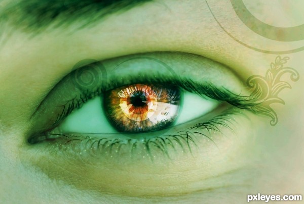
Here is my entry for mixed manipulations.
Photo downloaded from http://www.photos8.com, rest of all created in Photoshop!
All comments and suggestion are welcome... :) (5 years and 3421 days ago)
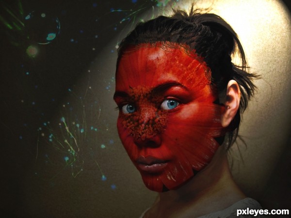
I would have put the "stamps" around her eyes as if they were tatoos or makeup around her eye (darker)
tattoos I mean
I agree with k5683 just make the tattoos around the eye darker IMO This is pretty good just don't make the opacity low and make sure it blends in properly when you make it darker.
i suppose u used brushes for the tatoos...plz provide the link to the tatoo brush....
Hay Siddhartha,
I have created that shapes in "Inkscape software" - www.inkscape.org
then imported in Photoshop. I have uploaded that will send you link once the winner of this contest declared.
This is really pretty, and I agree that the tattoos should have been darker. But it is really pretty 
Thanks JPDesigns!
nice work...gl
Thanks for your comments erathion!
Howdie stranger!
If you want to rate this picture or participate in this contest, just:
LOGIN HERE or REGISTER FOR FREE
(5 years and 3490 days ago)
WOO HOO.. instant Fav.. (I LOVE THESE!!!!).. the eyes are GORGEOUS.. good luck author 
me too
thank you guys 
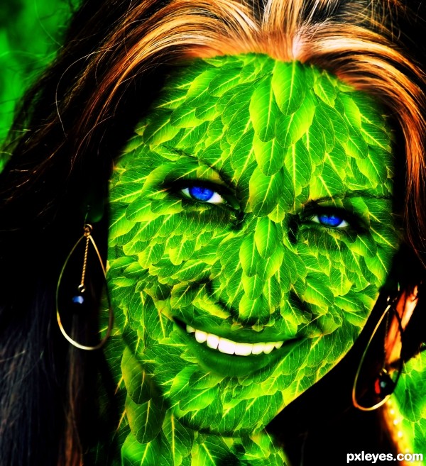
Nice image -- transition betwween the hair and the face could use some work so the hair is above leaves -- the ear ring on the left is partly behind the leaves and there is a bit of stray green on the other ear ring.(Could be a reflection) Also maybe some other blending modes or combination of blending modes for the leaves would improve the look. Leaves seem a bit heavy over the face
thanks @ alan, i made some corrections! thank you
Howdie stranger!
If you want to rate this picture or participate in this contest, just:
LOGIN HERE or REGISTER FOR FREE
(5 years and 3499 days ago)
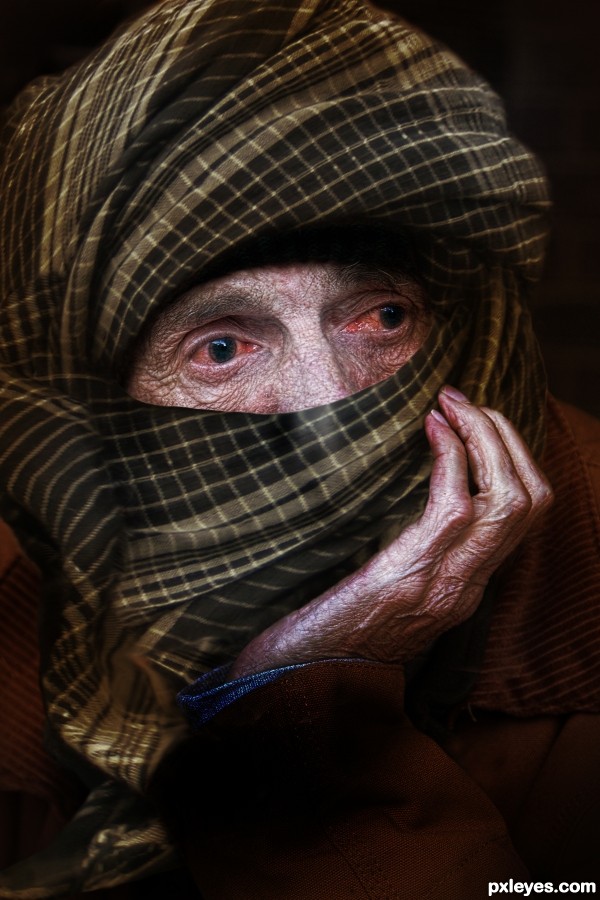
Great idea, but in high res there are a lot of bad edges, and hair from his beard showing, like on his palm. Take some time to look this over & do some cleanup, and you'll have a great image. 
CMYK46 _ Thanks for the guidance ! Image has been fix
Look over the high res again. There's a bad edge on the head scarf on his nose, and more of his beard showing at mid left, as well as a transparent edge where 2 parts of the scarf overlap.
I think you didn't need to touch on the sleeve.
Man give the poor guy some eyedrops hahaha
Image I've tried to fix up again. I think now would be fine.! Thanks all for comment .
Oh yeah IRONCOW I'll give it eyedrop ...ha ha ha
very cool...he is a thirsty day walker...
Howdie stranger!
If you want to rate this picture or participate in this contest, just:
LOGIN HERE or REGISTER FOR FREE
(5 years and 3556 days ago)
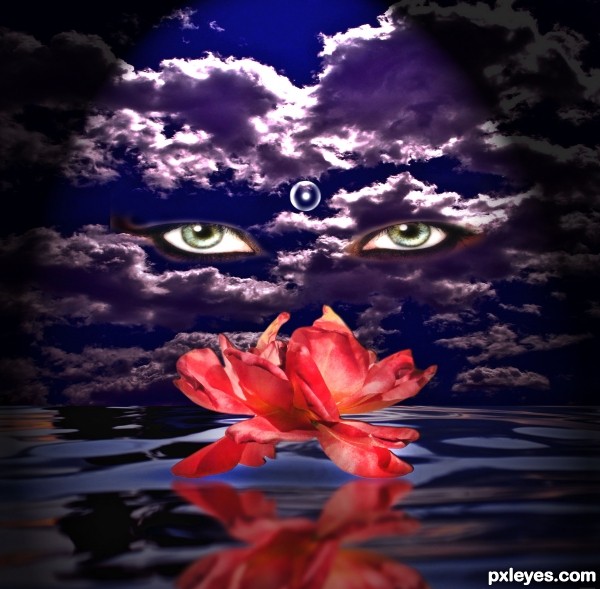
There shouldn't be a gap underneath the reflection. SBS would be good to show how the water was made, or is it another source?
this isnt bad
Howdie stranger!
If you want to rate this picture or participate in this contest, just:
LOGIN HERE or REGISTER FOR FREE
At first glance I couldn't see it was a flower. But nice idea
Howdie stranger!
If you want to rate this picture or participate in this contest, just:
LOGIN HERE or REGISTER FOR FREE