(5 years and 2966 days ago)

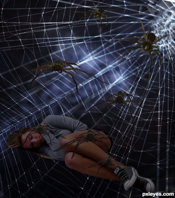
Thanks to the following artist from Morguefile, for providing the pics of, Spider (Xandert), and the Spider web (kahanaboy). Also thanks to kphinney from pxleyes for the pic of the girl. (5 years and 3071 days ago)
Background spiders should be as blurry as background web.
Nice concept but IMHO background is too much blury. Good luck!
The spiders look too cut and paste, floating in front of the webs, rather than being part of them.
Thanks for comments. Made the web sharper. Mossy, thanks!
Better now, nice change!
Gives me chills just looking at it.
Howdie stranger!
If you want to rate this picture or participate in this contest, just:
LOGIN HERE or REGISTER FOR FREE
Good work...your highlights really make it!
Thank you CMYK46!
looks good author, glad you put in a link for tutorials
You're welcome. Thanks for the comment. The tutorial is a bit old (8 years) and you have to adapt a bit , but I found it useful.
Howdie stranger!
If you want to rate this picture or participate in this contest, just:
LOGIN HERE or REGISTER FOR FREE