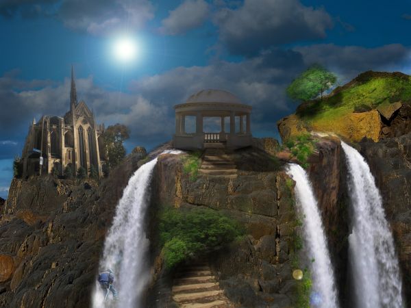
dis one is my 1st matte painting,i try to give my best
(5 years and 3708 days ago)
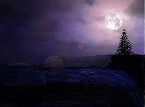
I used the liquefy tool to make the water fall effect. I also added a lens flare. (5 years and 3720 days ago)
The horizon line looks a little bit wavy...
What erikuri says. No problem that you use the liquify tool to make a waterfall, but keep the horizon line straight (or just as it is in the source image). Mood is ok, though perhaps a bit weird to see a moon in front of the clouds. Good luck!
Thank you...is the horizon better?
I know it's a bit complicated, but now it seems like the water direction is up, what it's impossible, 'cause we're talking about a waterfall... If you get the horizon line straight, parallel with the edge of the pic, everything's gonna be NICE - because your work is beautiful!
thanks again...ill try my best at fixing it 
doubt the moon can cast such a bright flare, or maybe it's because i've never seen it before -_-
Howdie stranger!
If you want to rate this picture or participate in this contest, just:
LOGIN HERE or REGISTER FOR FREE
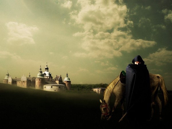
Landscape by Silja Erg http://siljaergstock.deviantart.com
Model by Lindowyn http://lindowyn-stock.deviantart.com (5 years and 3770 days ago)
Nice chop, but not very dusky...
It's daylight saving time here  Thanks CMYK...
lol@day light savings
Adding color to the end of the sky and maybe darkening it would make it look more like dusk. 
Thank you jawshoewhah! Darkened the sky a little... Not much, I'm afraid to lose the moody atmosphere 
nice
great job 
Howdie stranger!
If you want to rate this picture or participate in this contest, just:
LOGIN HERE or REGISTER FOR FREE
(5 years and 3793 days ago)
congrats on your placement.. all entries are winners in such a hard comp... 
Howdie stranger!
If you want to rate this picture or participate in this contest, just:
LOGIN HERE or REGISTER FOR FREE
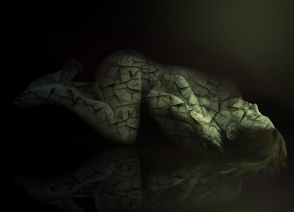
Enjoy!
credits and thanks:
http://fetishfaerie-stock.deviantart.com (5 years and 3817 days ago)
lovin it!
Try a displacement map & high res version...
nice work!
Would like to see high res version.......but quite nice.
agrees with high res version.
Very nice image...gl
I would have loved to seen the step by step and high res for this image.,It could have helped heaps in the voting.
great 
Howdie stranger!
If you want to rate this picture or participate in this contest, just:
LOGIN HERE or REGISTER FOR FREE
fab
Beautiful image...IMO the climber has a highlight on his back that is coming from a light source that isn't there, soften it and blend the trees into the walkway a little more..Make it crisper..Hope this helps and Good Luck =)
Nice idea, I agree with the climber comments, and i think a little subtle use of the 'dodge' tool to give some sharper highlights on the central structure would really make it 'pop'... well done
Congrats!!
Howdie stranger!
If you want to rate this picture or participate in this contest, just:
LOGIN HERE or REGISTER FOR FREE