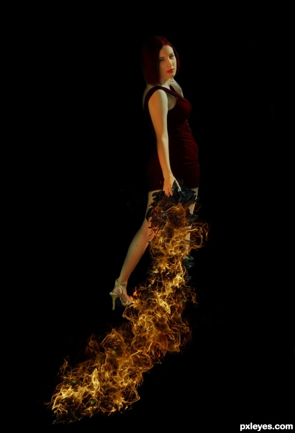
1) I cut out the girl with masking.
2) Used brush and Overlay to color hair and dress red.
3)Added fire.
4) shaded to accurately compliment the fire. (5 years and 2592 days ago)
- 1: Fire
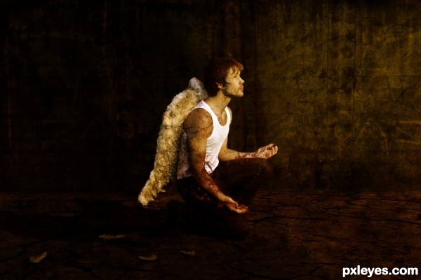
Thanks to tigg-stock for Angel photo (5 years and 2970 days ago)
I really like the end result, and in hi-res is it great too.
Thank you 
No wonder he's fallen...his wings are all stumpy & malformed. 
I hope you mean it in a good way 
Howdie stranger!
If you want to rate this picture or participate in this contest, just:
LOGIN HERE or REGISTER FOR FREE

(5 years and 3007 days ago)
HEY.. it's Luke Skywalker under Cloud City! (what the image reminded of) good luck author, and good job 
I'd give the swing seats some thickness, otherwise it's a nice job. 
ok tried to make the seats thicker hope it looks better now 
.
whhhoow.... i want to sit there too! 
nice picture..
goodluck
Moody 
Congratulations! 
Howdie stranger!
If you want to rate this picture or participate in this contest, just:
LOGIN HERE or REGISTER FOR FREE
(5 years and 3285 days ago)
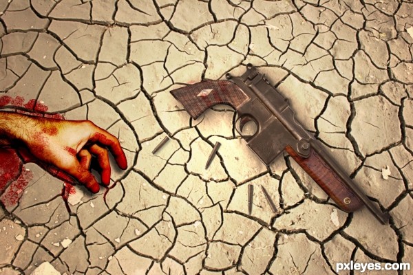
Disturbing and really well done, author. Too bad you don't have a high res version to view. I'm sad...I like looking at the high res version. 
Howdie stranger!
If you want to rate this picture or participate in this contest, just:
LOGIN HERE or REGISTER FOR FREE
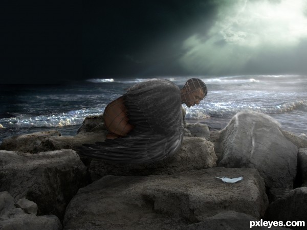
Credit too:
Fire Horse Leo from Flickr for the sea
Also:
~arctic-Stock-feather
~DelinquentDog-Wings
pueang-Rocks
xDante-stock-Dark sky
'jademacalla-head
~substock-Male torso
All From D.A.
For their amazing stocks allowing me to make this image possible. (5 years and 3304 days ago)
wow, looks really good, how did you find that man in that pose to fit him in.
There's a masking problem on the sky, I think a layer got out of place ( left side of the image right above where the wing finishes). It's pretty obvious actually even in low res.
Besides that, you have a nice entry with a good mood and a nice compositional triangle: sun in the clouds, man's butt (cause of warm color contrast + taboo  ) and the white feather. You could even crop from the left, and it would still look fit.
Thanks for the heads up Greymval. Didn't catch that one ! My eyes are failing me as I head towards the top of the hill. Not long before I'm over it LOL  Will rectify the problem ASAP.
EDIT: fixed
@emiK I couldn't find an actual fit, that's why puppet warp in CS5 is invaluable 
His rump most be FREEZING!!! very neato!!!
i still see the left top gray square
cool one, one of the better in this contest
congratulation...
Congrats! Well done!
Congratulations!!! Have a cookie!
note: cookie is purely hypothetical.
Congrats!!
Congrats on your win
Howdie stranger!
If you want to rate this picture or participate in this contest, just:
LOGIN HERE or REGISTER FOR FREE
Source 2 is wallpaper & not usable. Check here: http://www.pxleyes.com/blog/2009/06/how-and-where-to-find-legal-source-images/
5.11. Use of Search Engines to Find Source Images: If you find images with google or yahoo image search, it doesn't mean they're not copyright, always check the source site to see if the image can be used or not. Wallpaper images are usually copyrighted.
Please take time to read http://www.pxleyes.com/guidelines/photoshop/
Sorry About that. I changed the link so credit is given.
Please read the guidelines in the information provided above. Wallpapers are not usable sources.
So I have to take it down? (sorry about this im new here)
Alright, Fixed and wont happen again.
The edge of her left leg needs refining.
Check the layer masking all the way around, the black background makes the lighter edges show.
Alright I fixed it to my best ability, thanks for the advice.
i love your fire. how did you do it ?
Howdie stranger!
If you want to rate this picture or participate in this contest, just:
LOGIN HERE or REGISTER FOR FREE