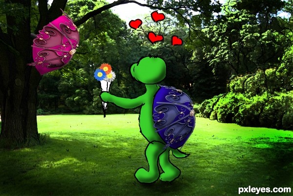
don't leave your umbrella stuck in a tree...
(5 years and 3252 days ago)
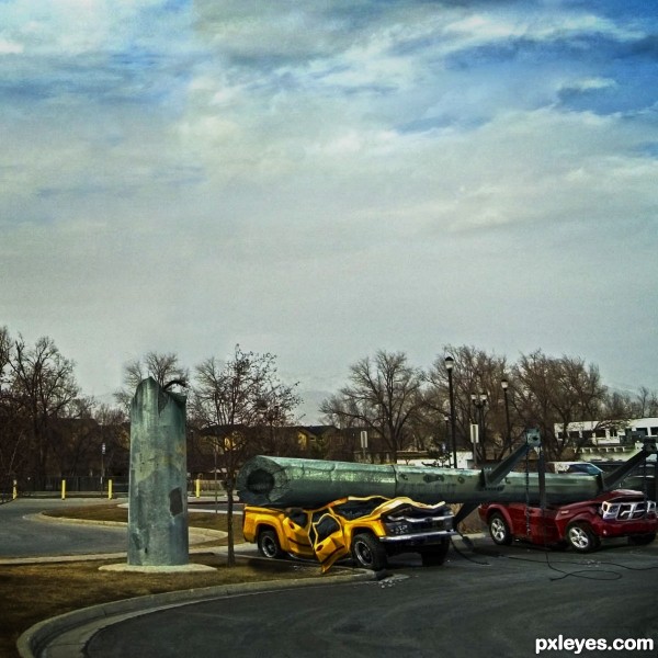
Unlucky parking. no cars were harmed in the making of this picture. No external sources used either. (5 years and 3254 days ago)
Ha ha ha Love it!! Well done..
Nice...very believable! 
clever thinking

Great one...It should be 2 thumbs up and a highest score!
Great work author...well done
Nicely destroyed! 
Congrats, fabulous work 
thx
Congrats!!
Good job and congrats!
Howdie stranger!
If you want to rate this picture or participate in this contest, just:
LOGIN HERE or REGISTER FOR FREE
(5 years and 3260 days ago)
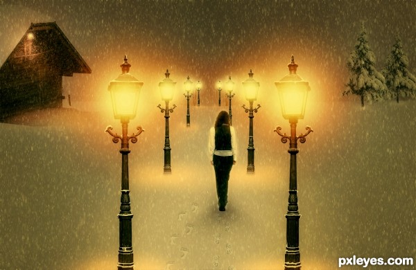
Very cool work author...IMHO she is a bit big compared with the rest of the image...also perspective of the laps is for few degrees wrong...try to fix that and this will be great...by the way great touch with adding foot steps in the snow...best of luck
She's way too big, and the perspective on the tops of the lamps is wrong. Good idea & mood, though.
Also, symmetry doesn't help this image, two identical buildings is a bit weird. Find one or some tries for one of the sides.
edit: I made changes. Thanks erathion, CMYK46 and greymnal for your useful suggestions. But I don't understand how can I make my lamps perspective better...tell me
well done!
From the angle at which the lamps are shot, I don't see what you can do about the perspective issue.
You could transform the lamps just a bit , so that those in the foreground appear bigger, but Make Sure you Don't split the image with them. Splitting image = failed composition.
Also make the far distance foggy, so that you can't perceive horizon, but just image it. Check works of ponti & arca if you don't understand what i mean. I usually do it with some scatter common brush on a layer which I gaussian blur. But internet has many tutorials, try them.
Last tip: since all your elements are vertical, image might be plain - try to tilt the snowfall, a few degrees.
You're doing good, and you're also the only guy with warm mood!
Howdie stranger!
If you want to rate this picture or participate in this contest, just:
LOGIN HERE or REGISTER FOR FREE
(5 years and 3284 days ago)
This is beautiful!
Very emotive concept and very nice atmosphere. I miss a SBS.
very very effective work...best of luck author
This is fabulous, every detail, colors, dramatic theme ... Perfect! Fav! 
Good work my friend!
great work!
Congratulations!!! Have a cookie!
note: cookie is purely hypothetical.
Congrats!!
Thanks you all!
Congrats
Howdie stranger!
If you want to rate this picture or participate in this contest, just:
LOGIN HERE or REGISTER FOR FREE
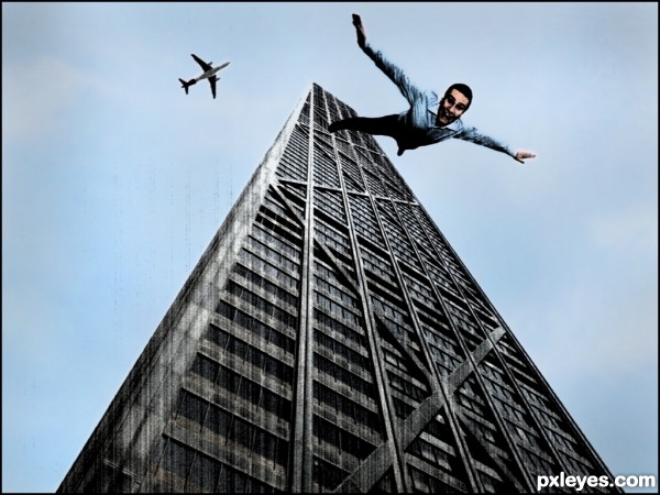
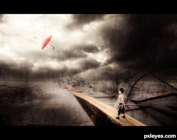
I'm sure we have all had the dream where we are falling and wake up with a jolt before we hit the floor...:-) I've played with filters to try and capture the fractured nature of dreams... (5 years and 3382 days ago)
Ive had those dreams..lol. Cool pic
reminds me of 9/11
taintedhockey i'm sorry thats not my intention. Just trying to portray what its like when you dream your falling.....sorry for any upset caused...
sad dreams...
Im always falling off a cliff 
Normally I dream I fall from the stairs 
Nie job 
Classic dream...cool execution author...best of luck
These always have my stomach in turns! This portrays what I've had a bunch of times! Good job. 
c00l.......;!)
c00l.......;!)
c00l.......;!)
We always wake before fall down!!
I can relate.  GL!
GL!
Howdie stranger!
If you want to rate this picture or participate in this contest, just:
LOGIN HERE or REGISTER FOR FREE
The linework outline of the turtle is very choppy and crude. You might want to smooth is some.
thanks for your comment mossy. the lines are very choppy cause their hand drawn. i left it there to leave the cartoon'ish factor on the picture. like a small fary tale in the real world i think if i smooth them i will loose a bit of that effect.
you could put a shadow under the turtle if you want to ground him a bit (not too dark, just a gauss blurred disk underneath him blended into the grass, also your hand drawn lines are awesome.. (you can see them great in HIGH RES) you might want to think about doing the same thing to the background, trace around the edges of the trees with the same type of lines.. just a thought, something I would do to make it look entirely like a cartoon.. love the shading on the turtle... as always IMHO
EDIT: GREATLY IMPROVED.. it really looks like a story book illustration now.. good luck author and good work!!!
thanks for the great advice Drivenslush! hope you like the new version
nice mixed media,good luck!
Howdie stranger!
If you want to rate this picture or participate in this contest, just:
LOGIN HERE or REGISTER FOR FREE