(5 years and 3205 days ago)
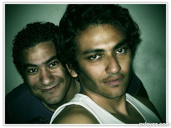
this is my brother and his friend (5 years and 3229 days ago)
HEHEHE!!! at first I was like.. Well this is just very nice photo, but the SBS really shows all the hard work you put into this author... GREAT JOB
thanks drivenslush 
Very nice job on this, and your series of images in the sbs - but it would be nice if you added some comments as to what you did to achieve the effect. 
Edit: Thank you for the explanation, author - really nice dramatic effect you achieved!
thanks pearlie ,,and i added the comments 
Howdie stranger!
If you want to rate this picture or participate in this contest, just:
LOGIN HERE or REGISTER FOR FREE
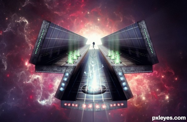
"Superior beings do not have companions"
comment and critics plz...lol
Hope you like!
(take a look in SBS and High Resolution)
bb
(5 years and 3313 days ago)
high res is fantastic! great work author!! gl
Creative use of the source!
holy shit dude! good luck!
Front section has minor gaps on rhs; but this is sweet imho...
This is amazing in Hi res.
This is amazing in Hi res.
wow...this is so powerful...well done author
Pretty cool image, author. I love how you saw a 'hand' of sorts in the plasma image. 
Wow, I like this a lot, especially the colors and the use of perspective.
WOW!!! Fantastic work! Very appealing! 
Nice work = ) I am wondering though where you have found that quote "Superior beings do not have companions"?
That is great, love the colors and the perspective works pretty good. Gl author.
Amazing!!!!
Congrats  terrific work
Congratulations! Great work!
Congrats!!
congratulation...
congrats mate  great image !!
very nice image...cong.
Howdie stranger!
If you want to rate this picture or participate in this contest, just:
LOGIN HERE or REGISTER FOR FREE
(5 years and 3441 days ago)
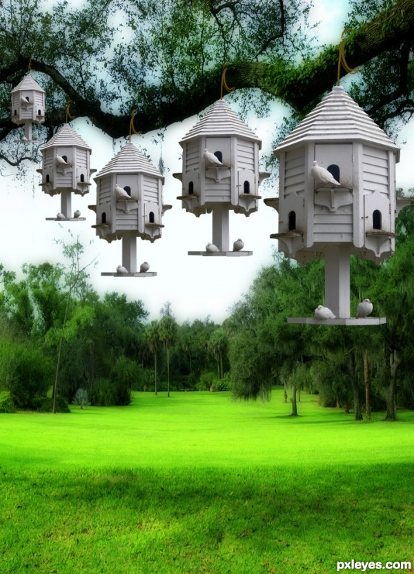
The upper part in my eyes looks great, however the birds at the bottom look a little weak. I would suggest either removing them completely or making them smaller and giving them shadows. Good overall work though 
Suggest varying the birds on the houses to avoid cut & paste monotony, and blurring slightly as they recede.
Creator
I agree with CMYK46... This is a wonderful idea and so beautiful but maybe moving the birds around would make it that much more appealing?
I so love this entry author,u did great blending work...But replica is to much...as guys before me sad,would be way better with different variations of birds positions...any how i like this and i wish best of luck
Howdie stranger!
If you want to rate this picture or participate in this contest, just:
LOGIN HERE or REGISTER FOR FREE
(5 years and 3455 days ago)
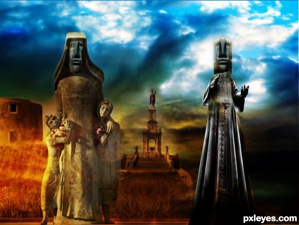
Good idea, nice clean chop! If you can flip the background statue it'll match the light source on the left foreground statue. 
Always a keen eye, good observation. I was so fixated with the building and colours I forgot to think about the statue itself. Inverted it to match the left oriented light source, thanks CMYK.
wow, I like this colorful implementation. The warm colors of the left side. Also a good idea to segue dark to the right.
I think it could be a good idea to associate the right staue more with the background, it seems now a lil bit superimposed.
nice colors author and cool mood...
Howdie stranger!
If you want to rate this picture or participate in this contest, just:
LOGIN HERE or REGISTER FOR FREE
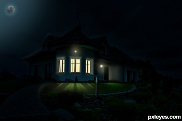
Needs to be seen in hi-res to be fully appreciated. This is a very good start, but the spread of the various lights needs work. The left and right windows should allow a lot more light on to the left and right sides of the lawn. The right exterior porch light doesn't seem to provide much illumination on the lawn at all. The very bright and very white foreground post lamp is illuminating very little.
I suspect the post lamp has a solid top and bottom so it can only spew light out its sides. Ergo, it can't illuminate the post it sits atop. (I recommend a nighttime stroll around your neighborhood to see how different lighting-fixture configurations cast light.)
Some sort of over-exposed interior inside the windows would be more realistic as well. And why not throw in some stars to make the sky more interesting?
hi-res is uploaded! and i made some changes and i think now it's better!
Beautiful work author...gl
Howdie stranger!
If you want to rate this picture or participate in this contest, just:
LOGIN HERE or REGISTER FOR FREE