No external source used.
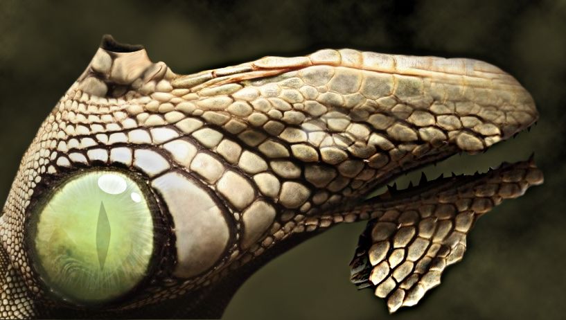
Thought of trying a dino face with the source and ended up with this.. :)
Comments & Suggestions welcomed :) (5 years and 3678 days ago)
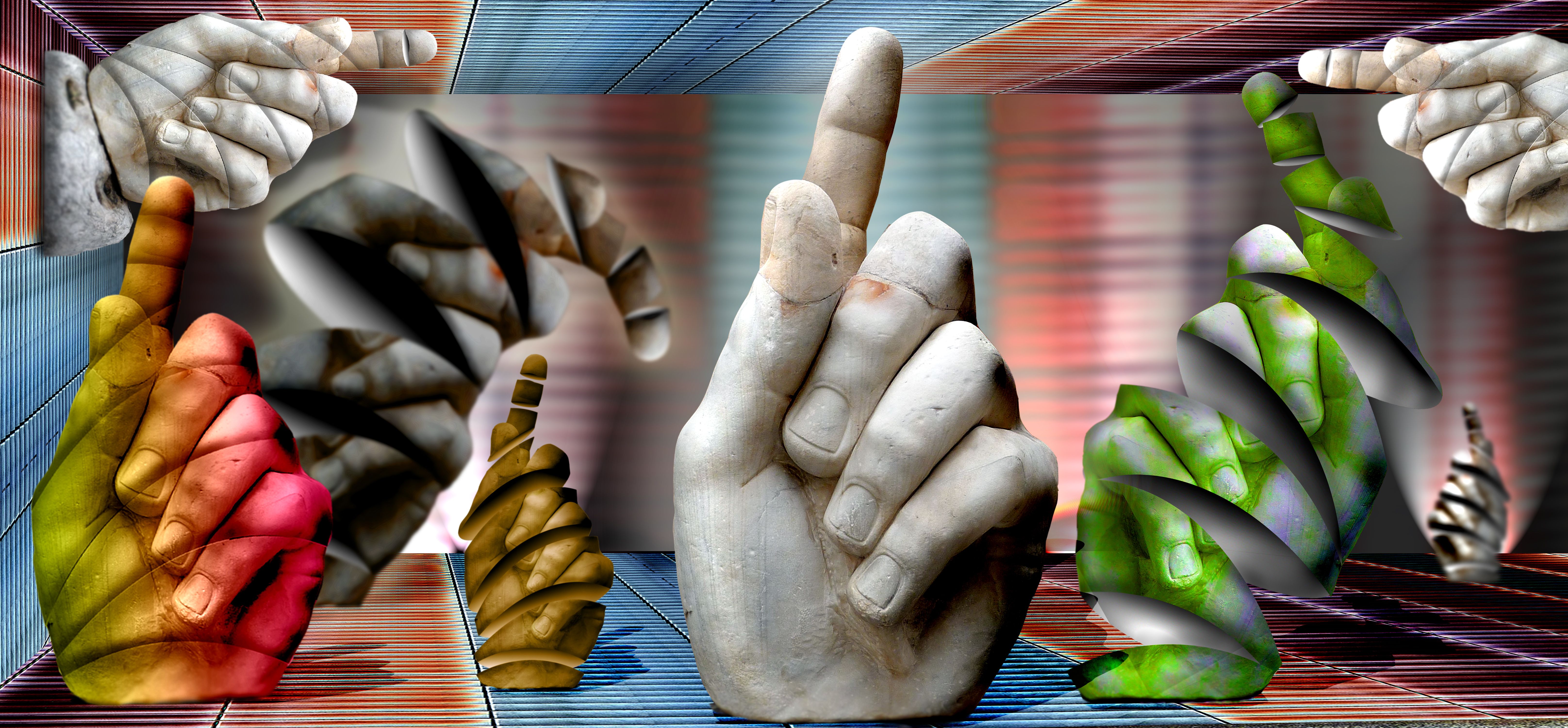
Made from source (5 years and 3730 days ago)
I like this! You put a very surrealistic quality into it and my ONLY nitpick is the white line comming from the tan hand, just left to the center one, only noticable in high res. I think if you fix that, you got yourself a winner. 
nice colours
fixed
Now it's perfect. You have my vote for 1st! Good Luck! 
Wow! It's you????  Had me fooled
I really love the kind of crazy feel of this image... really thought provoking. Great job!!
Howdie stranger!
If you want to rate this picture or participate in this contest, just:
LOGIN HERE or REGISTER FOR FREE
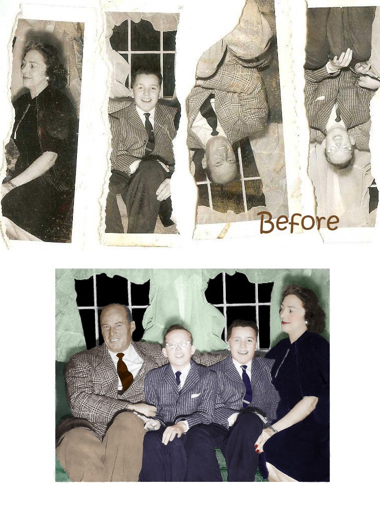
A borrowed photo. (5 years and 3742 days ago)
looks like a good rebuild..........but you had an opportunity here to alter the lighting and shadows, so why didn't you?
Wow, but it needs some extra work
I'd add a vignette and bring up saturation a little bit since it's kinda washed out. Also, the coat of the boy on left is not very good. gl!
its good but when I flip the bits and reposition on speparate layers, they all fit together realy easilly, with a slight rebuild on the mans leg.
so, what are you saying?
That its very good but perhpas not as dramatic as it first seems.
Thanks all for comments. I was not trying to be magical just was givening my self more of a challange than just color and removing specks.
ok, I see your point, but it is still a color conversion, and not a bad one at that.....
Did you actually tear this image into 4 pieces to make for more of a challenge? Just curious.
I wonder that too... I also wonder why did you show some teared parts upside down.... Looks more 'dramatic' that way... :P Well, if it was really teared like that before the restoration then you did a great job making it look like it wasn't. No sign of it at all
I took the parts that were scan for me by a source and worked with what I had
very nice
Howdie stranger!
If you want to rate this picture or participate in this contest, just:
LOGIN HERE or REGISTER FOR FREE
(5 years and 3744 days ago)
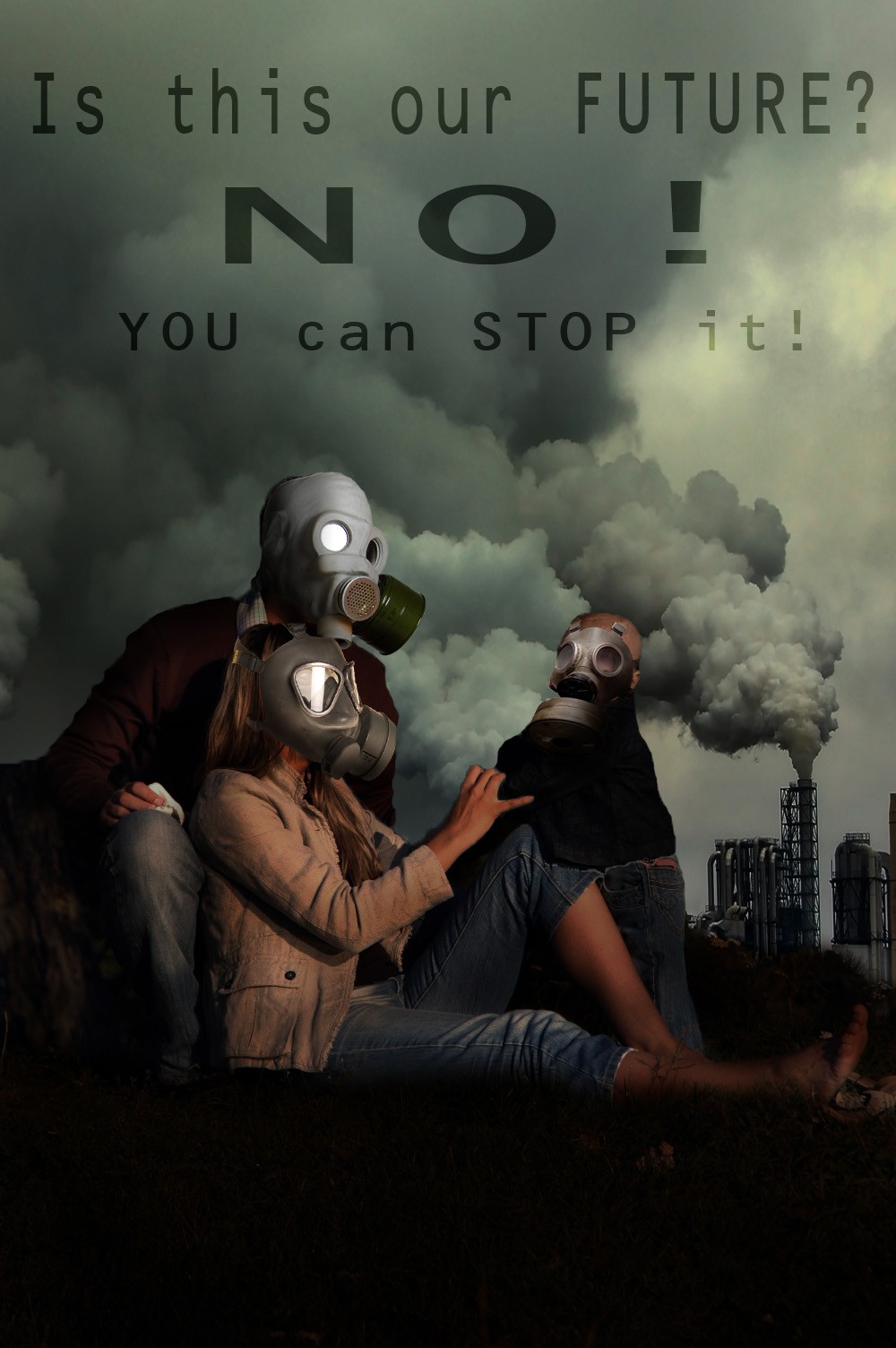
Great final result, but needs a high res version! 
take care of the edges esp on her hand and the bottom of gas mask cape on right. blur edges a bit. My opinion, otherwise a fine chop Author.
Good mood, nicely put together. If you feel like, you cà n experiment a bit more with the text layout. For example, make the letters light instead of dark and put "you can stop it!" under. Right now it's all dark there, it almost begs that something will be put there. If you like, you can also make "NO!" bigger because there's more space. But all this only if you think it's looks better, of course. Good luck!
Strong message
all is good , but i think you should change the font:S and color to (red&yellow ) , or only full white..
great
Glückwunsch zum zweiten Platz, Kekskrümel! Schön, mal wieder was neues von dir zu sehen
Congrats,
Congrats
Congrats!
Congratulations!
Howdie stranger!
If you want to rate this picture or participate in this contest, just:
LOGIN HERE or REGISTER FOR FREE
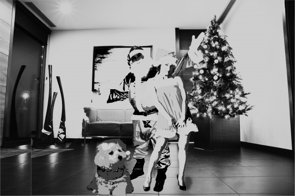
Mr & Mrs Claus and their Doggy Claus in their new home ! (5 years and 3765 days ago)
your suggestion please !
I suggest giving them shadows and finding a usable source image for the baby...
The sources you are mentioning are only available if you are a member, better is to use the URL like this: http://www.sxc.hu/photo/1121815 , then everybody can see the source
no offence author, but this is very hard on the eyes. Why did you choose to go with this very high contrast image for the people?
Ditto Ray
Ok thanks ! i'll try to fix it and put another baby pic !
sorry ! could not find any baby claus ! i repleced it with a dog ! is it ok now ?
other than the high contrast, I am distracted by how disproportionate the people are to the room. The dog is a giant compared to the size of the people and the seem pretty small in proportion to the tree and the sofa
i;m only a beginner u know... i've just started photoshop since the last few days...
ok, first of all we know you're a beginner, no offence intended but you are obvoiusly playing around with cutting & pasting, different filters etc. What you need to ask yourself is why am I editing the image this way?... Is it to give it an old school b&w photo effect, something more abstract etc. Unfortunately this has just taken what look to be some decent stock images and made them hard to look at. But continue to play and you'll find what looks good - and dont be afraid to ask people here for advice, there are some talented people here (I'm still a beginner too but I hope this helped )
Thanks RayTedwell ! I'll try to do so ...  :P
:P
Howdie stranger!
If you want to rate this picture or participate in this contest, just:
LOGIN HERE or REGISTER FOR FREE
Photography and photoshop contests
We are a community of people with
a passion for photography, graphics and art in general.
Every day new photoshop
and photography contests are posted to compete in. We also have one weekly drawing contest
and one weekly 3D contest!
Participation is 100% free!
Just
register and get
started!
Good luck!
© 2015 Pxleyes.com. All rights reserved.


Howdie stranger!
If you want to rate this picture or participate in this contest, just:
LOGIN HERE or REGISTER FOR FREE