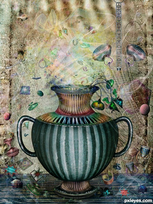
Two sources, Photoshop and Illustrator (5 years and 3479 days ago)
- 1: source1
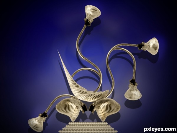
Source image used. (5 years and 3488 days ago)
S.O.S. 
Simply converting the fancy bulbs into a fancy lamp is a bold approach in the face of likely CBR excess -- for which I commend you. I also like the crispness. The base seems very flat, however -- which captures the overall impression of just stacked elements with no interrelationship (such as cast shadows onto) with each other. Furthermore, I think lamps are more dramatic when they're turned on.
ahha nice construction there!
Very creative author well done.
Howdie stranger!
If you want to rate this picture or participate in this contest, just:
LOGIN HERE or REGISTER FOR FREE
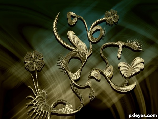
Only supplied image used.
Please see in High Resolution. (5 years and 3490 days ago)
great detail and nicely built

Very cool.
Very neat and well executed.
great construction and very nice shapes...best of luck author
nice job broo..
Howdie stranger!
If you want to rate this picture or participate in this contest, just:
LOGIN HERE or REGISTER FOR FREE
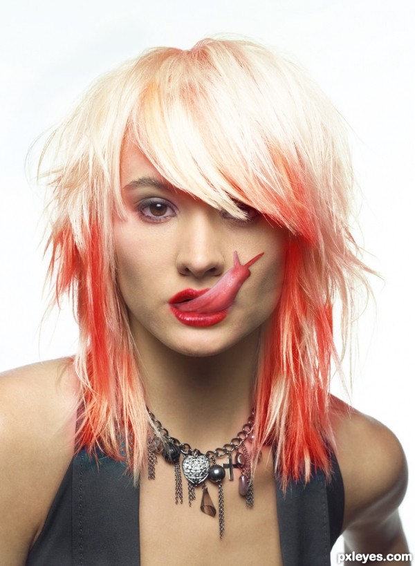
i created this image imspired by an amazing tutorial i seen although my version is not as flawless im quite happy with the result, the hair is supposed to be the way it is just to add a sort of surreal, fantasy ish effect :) hope you like
CREDITS: to "COI-stock" for the red lips used and also "Katanaz-Stock" for the model
"As of 28th of July 08, you now have permission to use our stock OUTSIDE of DeviantART!! This is brilliant news, and I\'m sure many of you agree as in the past we\'d sadly turned down hundreds of requests.\"
please vote/comment
(5 years and 3533 days ago)
great entry, GL
Your source 2 needs permission for use out of DA....plenty of time to get it or change model, would be a shame to get this pulled. Well done author 
Nice out side source like what you have done with her hair!! Could do with a little work still, shadows on the slug should be softer,edges are to hard at the moment. And there is a very visible line that runs across her chin that needs to be removed.
sharp eye Warlock, hope thats better 
Very well done, author! I've seen this tut before, and I think you followed it perfectly. GL!... 
OMG, that's horrible - fantastic work, author! LOL, hope you get your images worked out. I think you achieved your goal in step 8. 

Nice job! Fix the shadow of the slug...the lighting is from above.
Thanks for the advice "CMYK46" i was unsure as to weather the shadow would be as i have it or at a 90 degree angle the tongue ... non the less i made an edit taking in your advice
hahhahah cool1
creative
sweet!.... nice job on the color.
very creative, one of the best, gud luck 
Very nice and creative =)
very similar with this: http://effects.worth1000.com/entries/282750/lust. But I think that 2 different person could have the same idea... sometimes...
ye this is because it was the tutorial that inspired me, sorry i must of deleted it when i updated my description part 
Howdie stranger!
If you want to rate this picture or participate in this contest, just:
LOGIN HERE or REGISTER FOR FREE
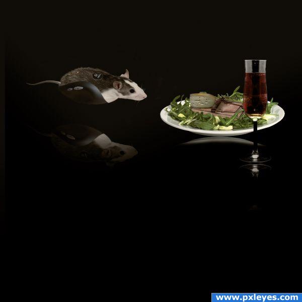
Special thanks to authors(Kai Kuusik-Greenbaum,Jasper Kuperus,Peter Galbraith,Nick Normann,Piotr Lewandowski and Helmut Gevert) of great pictures which i used for this project . (5 years and 3812 days ago)
You should tweak the reflection a bit... Looks like they are floating... But if you intended to make them look as they are floating then it's okay... 
Thanks for the suggestion i change the reflection little bit...
You would only see the bottom of the plate in the reflection, and it should be closer to the plate and the reflection of the glass is crooked...
I hope it's better now...
the reflections should be directly beneath the objects. which means you cannot select everything, flip it and put it lower. this way the plate and the mouse look like they're floating. also, this looks like a flat surface these objects are on so there would be no distortion on the reflections.
Extraordinary!
cute
reflections are hard to get correct for sure.rule of thumb is usually remember reflections connect with the original image and either reflect in the surface below or stretch out depending on light source.. love your creation  GL
GL
Howdie stranger!
If you want to rate this picture or participate in this contest, just:
LOGIN HERE or REGISTER FOR FREE
So much fun looking at all the little details.. WEEEEEEE
wonderfully done! I really like this.
I'm with no breath, it's amazing!
Wow!!!!!!!!
awesome
Amazing work with lovely colors.
My personal favorite in this contest...maybe is that not ok to say,but author,this work is amazing...well done
Amazing work and wonderful details. Your work always inspire me. I know how much effort and time is involved for creating such great artwork. Congratulations.
nice work
This is not your great-great-great-grandma's amphora! Beautiful work once again, especially with both programs.
Many thanks to all for the nice comments and favs
Congrats for third!.....Having said that I thought for sure you would've taken the top two spots. Keep up the good work, it's an inspiration for all of us.
Lovely work - congrats!
Congrats for your third place, Cornelia!
Congratulations!
Congrats! for 3rd place.
congrats,......nice detailed creation,......
Congrats!!
wow Congrats Cornelia
Congrats

Congrats.. it's beautiful as always
Congrats!!
Howdie stranger!
If you want to rate this picture or participate in this contest, just:
LOGIN HERE or REGISTER FOR FREE