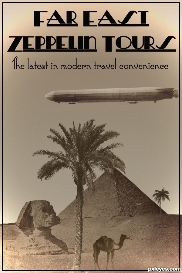
Expanding travel horizons at the beginning of the 20th century. (5 years and 2547 days ago)
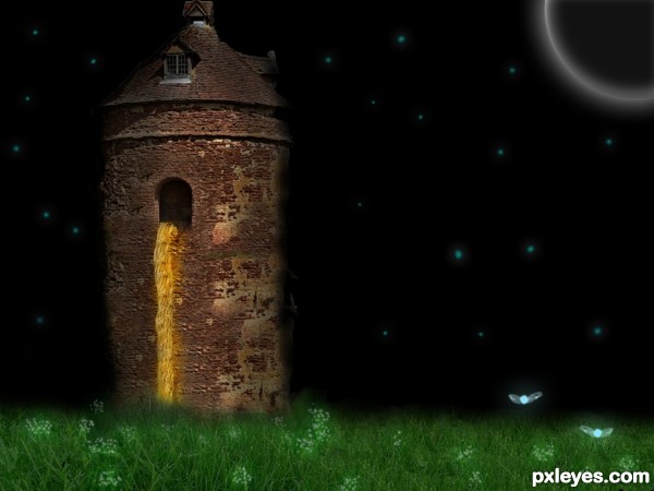
I used some external images glows, soft brushes, some external brushes and i made the navi(Zelda) using brushes and a glow effect. (5 years and 2620 days ago)
Links need to lead to specific image used. Morguefile has changed its layout. The image URL now appears in the popup window, at lower right.
IMO the brushes on the tower don't work. The hair effect is good, but it's sharp at the top & blurry lower. It all should be as sharp as the top part.
I changed the link ps thanks for advice 
I changed the link ps thanks for advice 
Good job on your entry
My opinion:
You cropped too close to the tower, and not treated the image as a scene which would work alot better!?....
If those are stars then I think adjusting the levels on a noise layer would give a better effect, you could then highlight the ones you wanted to pop out with the standard star brush set to screen or lower the opacity slightly - or just leave it - totally your own taste
If they are glow bugs, a soft brush set to screen, then white also set to screen to intensify the inside of the glow.
I second what CMYK said about the hair.
EDIT: you changed the hair, it looks worse than before! keep the original as a base and clone in sections from the top, with a soft brush so it's a hint at detail along the length!
I did everything you said  thx
thx
Much better now...GL author. 
Thanks for advice! 
I really like your grass and bugs
Thanks! 
that's make me remember my lovely story..
"Rapunzel" 
good idea !!
Thanks! 
Howdie stranger!
If you want to rate this picture or participate in this contest, just:
LOGIN HERE or REGISTER FOR FREE
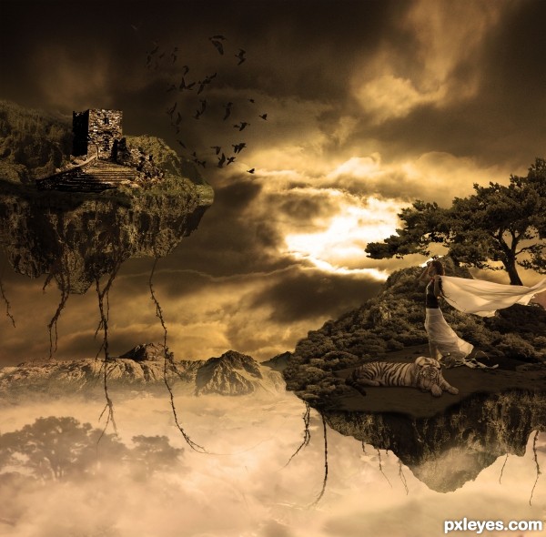
Rest of sources;
Tree, http://www.flickr.com/photos/dnet/5921703288/sizes/l/
Mountain, http://www.sxc.hu/photo/470196
Mountain, http://morguefile.com/archive/display/58971
Vines brush, http://fractured-sanity.org/index.php?id=4&navi=2&site=nature6
Birds, http://www.flickr.com/photos/42dreams/298838903/sizes/z/ (5 years and 2722 days ago)
Author, this is a very appealing image, but there is a bit of work you need to do. You have visible edges of some of your stock photos, it is particularly noticeable in the middle of you image under the mountain range. Also the farther floating island has a straight edge which looks a little odd, and in high res. there are some remnants of that photo edge in the sky. Good luck.
Thx Madamemonty. Didn't even see that, normally i look for edges  . Hope i masked them all out now.
Floating island image #25, 361... 
NIce work
Thank you
fantastic
Thanks 
Congrats on 2nd, maiaschka.
Thank you 1Dt8r
Congrats!!
Howdie stranger!
If you want to rate this picture or participate in this contest, just:
LOGIN HERE or REGISTER FOR FREE
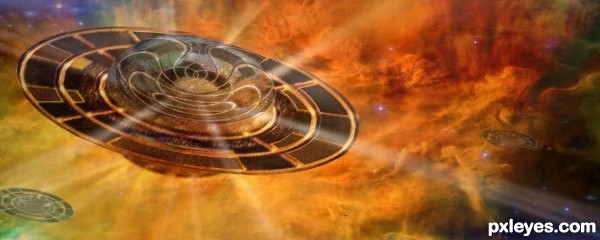
Thanks to NASA for the wonderful photo of the Lagoon Nebula. (5 years and 3105 days ago)
Fantastic!
wonderful image.. lovely textures all over the place.. yep.. definitely a fav for me! hehehe
Looking good, easy to recognize the source.
awsome!

Howdie stranger!
If you want to rate this picture or participate in this contest, just:
LOGIN HERE or REGISTER FOR FREE
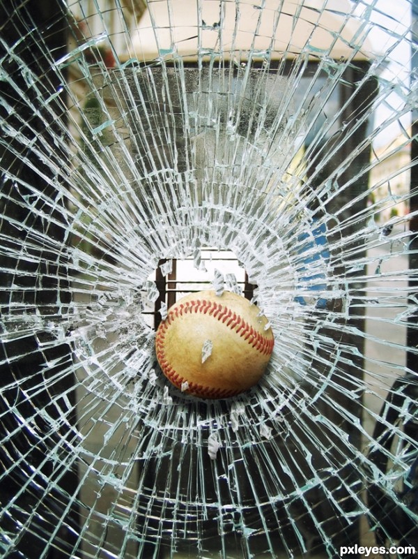
Oh boy!!.. poor window. (5 years and 3121 days ago)
Nice image, but the baseball looks bigger than the hole. 
Howdie stranger!
If you want to rate this picture or participate in this contest, just:
LOGIN HERE or REGISTER FOR FREE
Damn...great minds think alike. Looks like 2 antique looking posters now. Nice font work BTW.
This is good but like all the other entries the border and outline is far to sharp, blur and or a outer glow to make it look printed and not so Well photo chopped.
Excellent color & font work. Nice!!
Howdie stranger!
If you want to rate this picture or participate in this contest, just:
LOGIN HERE or REGISTER FOR FREE