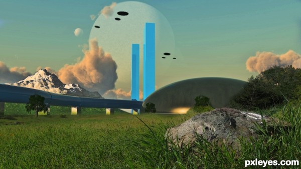
This is a compilation of work done with CS5, 3DS Max 2010 and VUE 9.5 XStream. (5 years and 3242 days ago)
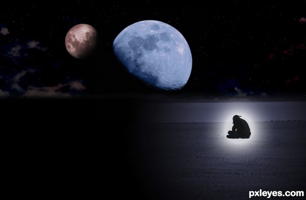
(5 years and 3298 days ago)
Really good concept. I can see where you were going with this. Best of luck.
Thank u Rod !
Howdie stranger!
If you want to rate this picture or participate in this contest, just:
LOGIN HERE or REGISTER FOR FREE
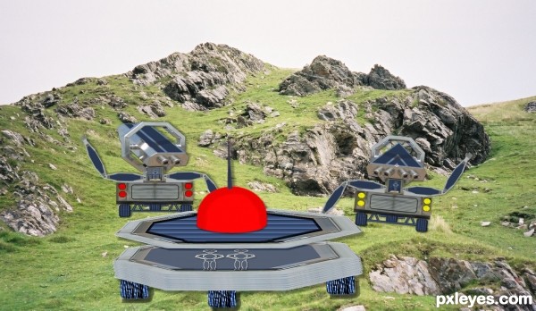
Spec Thanks to Lelaina for use of his picture found in member stock on pxleyes.com (5 years and 3326 days ago)
Having all your elements below the horizon line, really dulls the image. Inserting some big mountains with strong diagonal lines would increase the dynamics of your composition. GL.
The sky looks too realistic for the rest of the image.
if possible change the angle we are looking from or add more detail like greymval suggested!
Thanks guys I did a redo is this in the line of what you suggested
Looks cool, I would add some shadows under the robot guys. I think it would really help the image 
nicely done
very cool work author
Thanks all I redid but to late to get it in
Howdie stranger!
If you want to rate this picture or participate in this contest, just:
LOGIN HERE or REGISTER FOR FREE
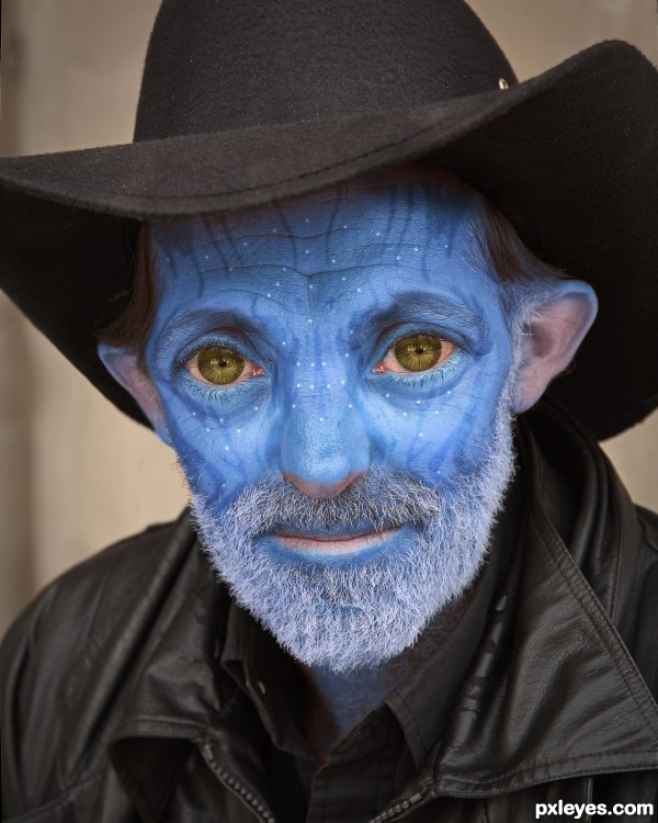
(5 years and 3352 days ago)
Been waiting for this one!!!  Great work author
LOL, I had fun with it!
lol! that is sooooooooooooooo funny! 100%
Nicely done, good SBS! 
Very cool...... nice job.
Thank you all for your comments! I knew this was probably a bit of a naif idea, but it was this photo or never!
Howdie stranger!
If you want to rate this picture or participate in this contest, just:
LOGIN HERE or REGISTER FOR FREE
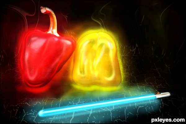
(5 years and 3406 days ago)
Beautiful! Love the colors! 
Fabulous piece of work...well done author
Hot stuff!!!!
Howdie stranger!
If you want to rate this picture or participate in this contest, just:
LOGIN HERE or REGISTER FOR FREE
The pink cloud next to the blue towers looks odd with the vertical shaping, and competes with the towers and the moons for visual dominance.
The snowy mountain is a bit too high contrast compared to the rest of the image, while the black space ships are too dark, looking like painted spots with no depth.
The blue towers show odd blue shapes (reflections of each other?) that are inconsistent with their placement, and distracting, particularly the one on the front of the rightmost tower.
The light reflection at the bottom of the dark dome shape is misplaced, since the large clouds show a light source much higher in the sky.
And what is the white mark on the right of the rock in front? It looks out of place.
It's a really good composition, and has good visual flow, you just need to adjust your lighting, reflections, and that big cloud.
Software is not invincible, and often does not take into account the difference between a spotlight aimed at a subject, and a sun, millions of miles away, providing "global" illumination on a planet with an atmosphere...

I wonder if there's an alien version of Pepto Bismol for those embarassing travel moments?
Why that spot of nature adds a good deal of realism to my picture, thanks for spotting that I had not even noticed until you pointed it out. Funny what draws certain peeps eyes, no wonder you said my picture has good composition and visual flow.
Thanks!
Nice 3D work, author, this has a 50s-60s scifi look, which I love! Cool texture on the foreground elements, too.
Howdie stranger!
If you want to rate this picture or participate in this contest, just:
LOGIN HERE or REGISTER FOR FREE