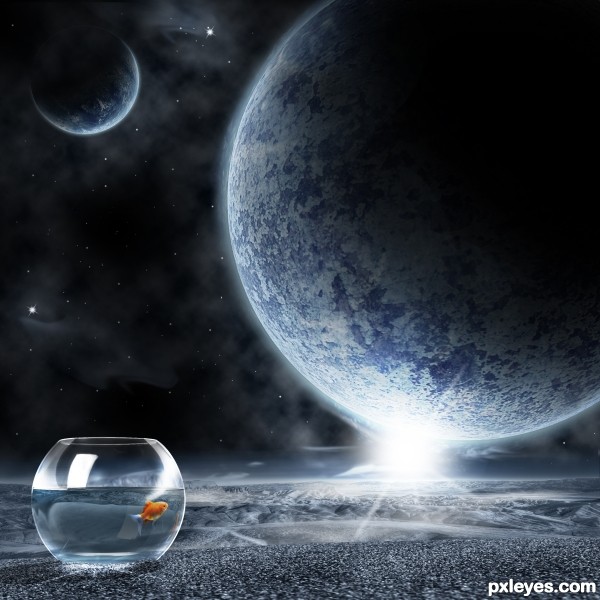
Don't forget to watch the full resolution image. ;) (5 years and 3649 days ago)
- 1: fish
- 2: concrete wall
- 3: foreground
- 4: background

Don't forget to watch the full resolution image. ;) (5 years and 3649 days ago)
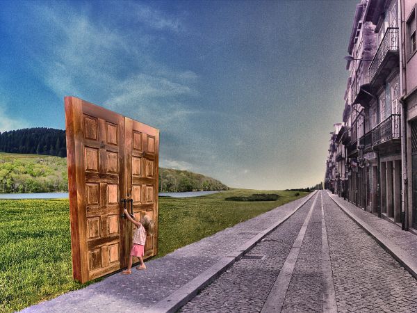
Nature is so near, but really we are so far.
Thanks for view and comments. (5 years and 3710 days ago)
Good idea, but doors are too distorted...
Very surreal  cool...
Howdie stranger!
If you want to rate this picture or participate in this contest, just:
LOGIN HERE or REGISTER FOR FREE
(5 years and 3758 days ago)
very interesting g.l
High marks for creativity!
Howdie stranger!
If you want to rate this picture or participate in this contest, just:
LOGIN HERE or REGISTER FOR FREE
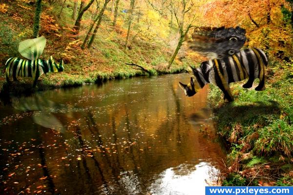
Gary is obviously having a problem crossing this river... credits to Marlong-Sveres-Backey and Alitaylor for the source images (5 years and 3871 days ago)
The blending is very good! I think you should choose a less noisy background to give more attention to the animals.
Good idea, i agree with Isolflow though. 
very smugly  cheers!
reminds me of that short lived SITCOM Titus.. when the father throws the little brother in the water off the pier and says.. "Don't be a Wussy" then has to throw the older brother in and say.. "go save your brother LOLOLOL.. very cute and funny... (the wings need a little more definition to carry better) but very humorous
Idea great...rhino skins great...wings bad...
Howdie stranger!
If you want to rate this picture or participate in this contest, just:
LOGIN HERE or REGISTER FOR FREE
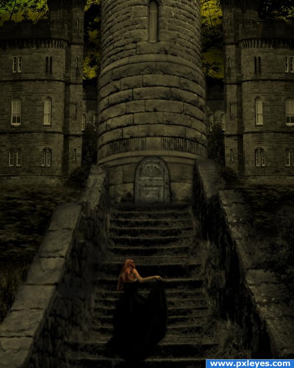
i got a gothicy feel from the source pic, so i went with it. Sources used:
"Bells Falls9" by *faestock at deviantart.com: http://faestock.deviantart.com/art/Bells-Falls9-89940375
"Little Castle" by =liitle-stock at deviantart.com: http://little-stock.deviantart.com/art/Little-castle-57195356
and...I changed the door, it's now "Cathedral Gate Door 2" by ~jdbartlett at deviantart.com: http://jdbartlett.deviantart.com/art/Cathedral-gate-door-2-75772050
(5 years and 3886 days ago)
Building perspectives are different, but good mood & color...
ahh, can fix that. much thanks!
i like it
wowowwowwow love it
hollywood style.... welldone
awesome!
Howdie stranger!
If you want to rate this picture or participate in this contest, just:
LOGIN HERE or REGISTER FOR FREE
Really good !!! However, you provided the really hi quality Hi-Res, so I can see some mistake, especially the area between the land and the bowl. You can use the brush to make it look better (now it's still like cut and paste). Also, to make the realistic image of the scenery behind the glass bowl, you have to distort the image in the glass bowl (the glass bowl is nearly global, so no image goes through it can keep the original shape. Just refer to some real image, you can find out how you should distort that. Overall, this work is very impressive.
Love it! Nice attention to detail.
Thanx for the comments, adjusted a few parts on the bowl.
wonderful job !
Congratulations!
congrats
Thanx for the comments en favs!
Congrats!!
Howdie stranger!
If you want to rate this picture or participate in this contest, just:
LOGIN HERE or REGISTER FOR FREE