(5 years and 3206 days ago)
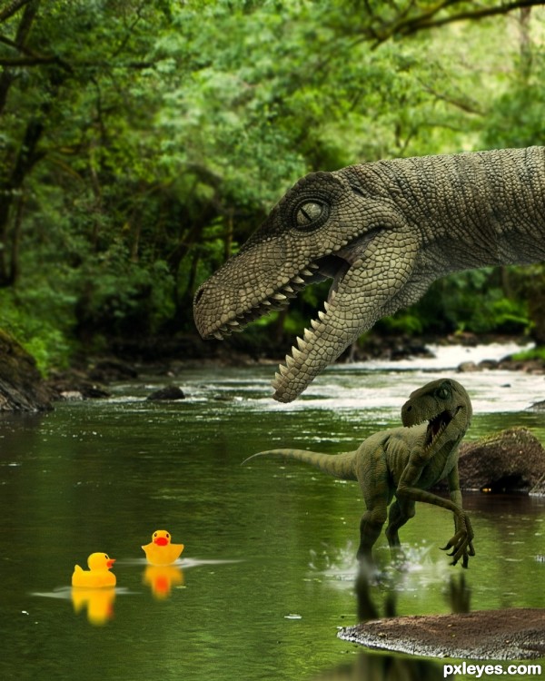
Swimming in the river was fun, until these velociraptors showed up! The fun is over, at least it looks like....
Thanks to mqtrf for the pic of the river, and to grafixar from morguefile for the two pics of the velociraptors. Just a little work, but lots of fun. (5 years and 3235 days ago)
Would have been even funnier if the big raptor was about to eat the small raptor who is intent on eating the ducks, but it's still a good image. GL author. 
Hey Bob, this is fun, isn't it? Yeah, I did not think of that, good idea. Maybe my next! Glad to see you safe from Irene....! 
hehehe!
It looks like the little velociraptor is running away from the duckies. I would have been better if he was behind them (compositionally speaking). He's also a bit too dark in front. But it's a very imaginative idea!
These 2 raptors must be very scared as they never seen rubber ducks in their era. It's very nice artwork composition, where the bigger raptor appears very sharp and close, whilst the smaller one is a little bit blurry to show depth of field. The eyes of the raptors are focusing on the rubber ducks to direct the viewer that the rubber ducks are the main actors in this stage. The colour harmony of yellow and green emphasize the funny scene of rubber ducks that are "lost" in the dinosaur era. Thumbs up
Thank you for comments.....
nice work author like it
looks very realistic
HEY! LEAVE MY DUCKIES ALONE YOU BIG MEANIE MONSTERS!  Great job author!
lol munch munch  Nice chop Author
Good job on those reflections. Real funny picture. Good luck, friend.
Thanks again for all comments. MnMcarta: Thanks for your pic, it was cool working with it!
Cute
the ducky do not seem to be afraid...
what an !dea sir ji.. 
Poor thing, he can't even start swimming until this big dino comes @ it!!!! 
Lovely work author! 
Howdie stranger!
If you want to rate this picture or participate in this contest, just:
LOGIN HERE or REGISTER FOR FREE
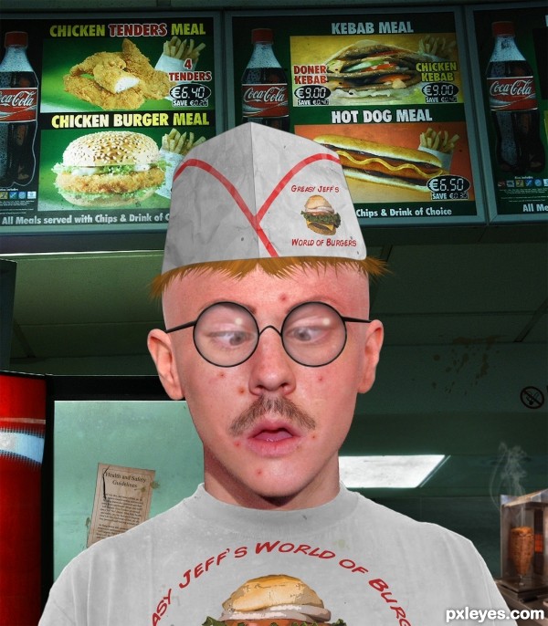
Unfortunately it seems I have run out of time and so can't finish this properly.
Feel free to point out the numerous problems but chances are I already realise they are there... The hat, hair and glasses look a little dodgy (to put it lightly) because I'm about as proficient at drawing from scratch in Photoshop as a mouse is at accountancy.
Also some of the photos were low res and scaled up to be used as templates... I just never got round to actually replacing them. As a result it's probably best that you don't view this at full size, it'll only upset the pros.
Anyway, I find the end result kind of amusing at least (though to be honest I should have just gone down the road and snapped a photo of the monstrous beast of a man in the kebab shop instead)... (5 years and 3272 days ago)
Delightfully hilarious! Well done.
Very funny 
facial blend is EXCELLENT!!! good luck author
I just love this ... and your comment makes it, somehow, even better!!! Definately a fav ... I will check it out when I need a laugh!
LOL@ kebab meal and your safety guidelines. Funny, author! 
Yeah... I probably shouldn't have left the deranged rantings that are my filler in focus on the health and safety sign...
congrats!
 ) funny Congrats!
Howdie stranger!
If you want to rate this picture or participate in this contest, just:
LOGIN HERE or REGISTER FOR FREE
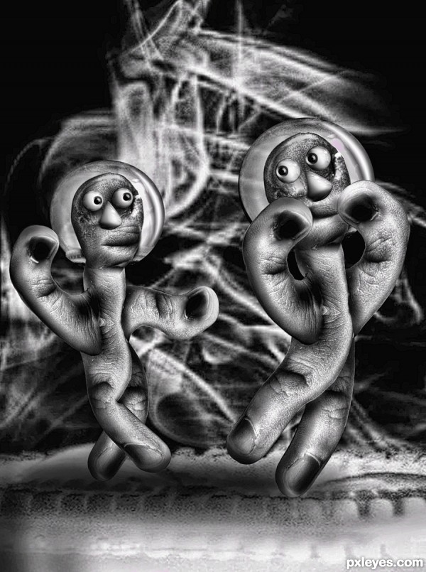
Fifty Ninth Bridge Street Song (5 years and 3277 days ago)
great creation,when i look at your SBS,guess, i get a new lesson from you to learn,thanks for sharing!! my beat wishes for you
title should be "tap-dancing on the pie"... haha.... very nice 
Cute dancing finger-puppets, clever. Glad you're an artist and not a surgeon! 
Congrats!
Howdie stranger!
If you want to rate this picture or participate in this contest, just:
LOGIN HERE or REGISTER FOR FREE
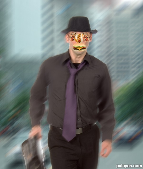
(5 years and 3393 days ago)
why do such creepy things with people??? do you really like it?
Yes, it's creepy. But it's also creepy what we do to our bodys eating rubbish!!
Good point author!
Stop stalking me with your camera... lol
It might be advantageous to crop out all the extra background and zoom into the work involved in just the face (as that is much more on theme with the contest) If anyone is voting on this picture, the High Res is best, you can see the food detail much better their) just IMHO author, good Luck!!!
Thanks Drivenslush! Of course you're right. There was too much background...
Thanks for your advice!! 
I have to agree with Driven ...great in high res! You can see the whole "face". Well done.
Howdie stranger!
If you want to rate this picture or participate in this contest, just:
LOGIN HERE or REGISTER FOR FREE
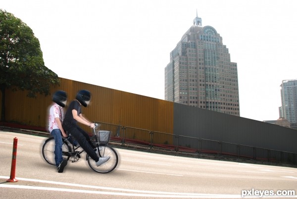
Funny image, but maybe the motion blur needs to be used differently. Rght now there's motion on both sides, while it should be mostly coming from their back. Perhaps if you smudge and then blur the motion, you can exaggerate the effect (but that's up to you). Very funny bike photo in the SBS btw, almost a pity thar their faces are covered by helmets . Good luck!
Funny! Lovely work author and best of luck!
the building behind looks distracting and out of place
Funny concept, IMO bikers art too bight, good luck!
Howdie stranger!
If you want to rate this picture or participate in this contest, just:
LOGIN HERE or REGISTER FOR FREE