(5 years and 3760 days ago)
- 1: ajmac

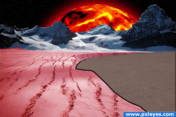
Here is my ideal place. The snow is strawberry ice-cream and the ice is chocolate. I deleted the sky then used source 1-the Sun tuorial then copied and pasted it behind the landscape layer. I used colour balance on the snow then used the source 2-chocolate tutorial to make a layer style and used it on the ice. (5 years and 3827 days ago)
????
This is another example of seeing a few tutorials and trying to cram everything in one image. Try concentrating on one theme and spending a little more time to get a realistic look. Keep at it!
Howdie stranger!
If you want to rate this picture or participate in this contest, just:
LOGIN HERE or REGISTER FOR FREE

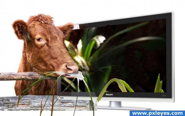
Me on pot?! I'm a cow and cows don't smoke, u know... and face it, dude - I ain't the one watching a cow eat flowers off a plasma TV
Just couldn't resist doing this hehe
See the sources I've used, won't make an sbs cuz there's no need - I just cut out the pieces I needed from the sources and put them all together.
I used healing brush, burn, patch, smudge and blur tools to "eat" the flower off the screen.. hmhm what else.. Oh, and warp tool on the flower and the second cow's "mouth".
To make the reflections: copy the layers and set the mode to Soft Light, erase what's not needed.
Enjoy! :-)
EDIT: I have the permission from the author to use the tv photo - credits to airgap. I hope u see this, mods, cuz I can't redflag again hehe (5 years and 3931 days ago)
very cute image... good work author
you need to do some cleaning up around the cow's head 
thnx elficho, i'm getting old obviously lol
hahah lolo cool
check the cow's reflection you can still see some of the flower and greenery through it
lol cool idea =)
Ichapell, I kinda did that on purpose since we have not only a reflective surface, but also an internal source of light - i.e. the TV. So i thought both the reflection and what's on TV should be visible, no?..
I like this. Very creative. Good job author. Good luck.
Howdie stranger!
If you want to rate this picture or participate in this contest, just:
LOGIN HERE or REGISTER FOR FREE

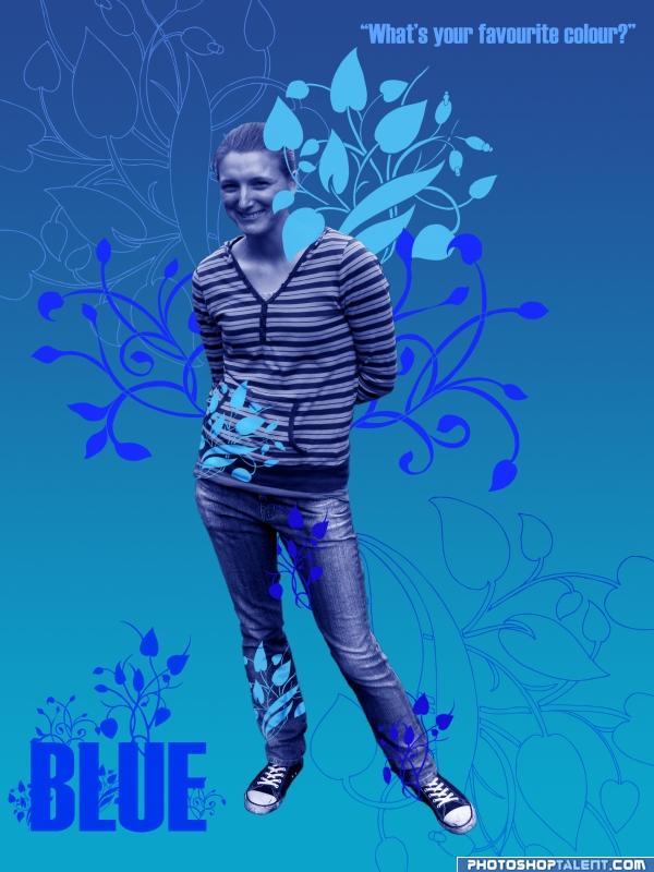
Cut image - feather edges - desaturated it - color balance to blue - used plant/flower brush - Dodge and Burn on 2 of the patterns for shadows etc. oh yea and gradient background. (5 years and 3967 days ago)
very nice and definately blue
Too much red...
To keep it more according to the contest goal, you should reduce the red in the blue, yes. Good luck!
awesome ill get onto that! thanks for the comments - keep em coming - pick the hec out of it  so i can learn from it please
heheheheheheheheheheheheheheheheheheheheheee...  just... heheheheheheheheheheheheee
 high!
high!
would be a great ad... for something LOL.. good luck
I agree that this could be an interesting ad. The lavender 'wings' are not blue, however. And as an ad, I think it would work better if (at a minimum) her skin and hair were their natural color -- which would be counter to the requirements of this contest.
need to remove the pink sorry.
good
You definitely should be designing ads for products. Really nice!
nice job 
I don't really like the blue skin on people  but the ornaments look great!
Howdie stranger!
If you want to rate this picture or participate in this contest, just:
LOGIN HERE or REGISTER FOR FREE
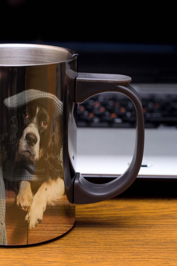
Unfortunately, it fits in with a few other similar entries.
Well done, but too simple and unoriginal.
Howdie stranger!
If you want to rate this picture or participate in this contest, just:
LOGIN HERE or REGISTER FOR FREE