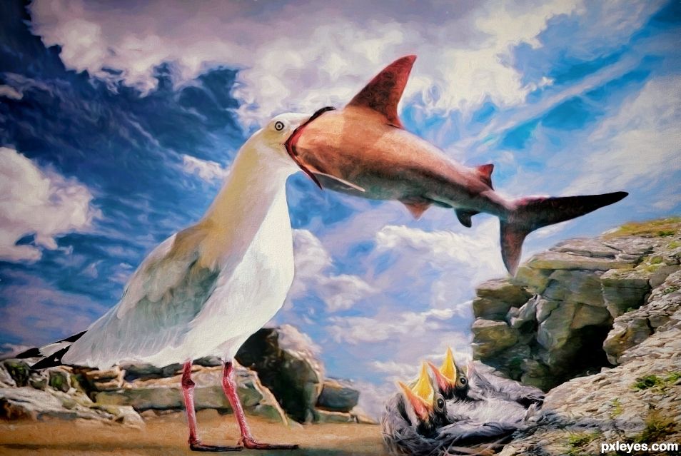
(5 years and 1239 days ago)
- 1: Baby birds
- 2: Clouds
- 3: Rocks
- 4: Ground
- 5: Shark
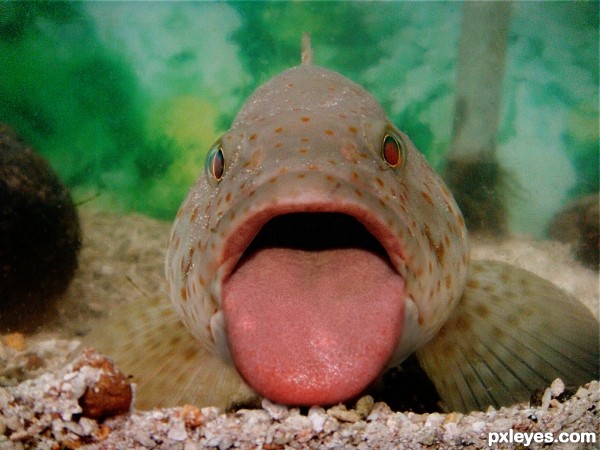
(5 years and 3036 days ago)
cool idea
Thanks 
hehe very nice 
LOL...best one yet! 
Love it!
Pretty funny!..
High marks!! and fav..
Awesome!
Congratulations.
Congrats on the well deserved win. Great imagination and a quality chop. Well done!!!
Congratulations!
Congrats!! 
Congrats.... so funny love it 
Howdie stranger!
If you want to rate this picture or participate in this contest, just:
LOGIN HERE or REGISTER FOR FREE
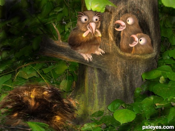
Mother owl brings glowing worms for her babies.
Background image is one of my own. (5 years and 3543 days ago)
very cute
very very nice!
cute work author,i like what u did with the source image...best of luck
great work !
Nice work. Some suggestions, if you have time to fixed them. The size of babies are equal to her mother. Some scaling of babies will make it great. Shadow on branch under mother and some on babies. Why there is black spot on left side of image? Finally get rid of nest on ground because babies are already living in the hole of tree. Good Luck 
Thanks for the suggestions nasirkhan. I' m afraid I have no time to fix them. I did put some shadow under the branch but it didn't come out well. The black spot is shading but the monitor I was working on didn't have a good contrast, so I thought the shading came out well (which obviously it didn;t) .
The nest on the ground is just the hideout for the glowworms.
Very cute... GL, author! 
Howdie stranger!
If you want to rate this picture or participate in this contest, just:
LOGIN HERE or REGISTER FOR FREE
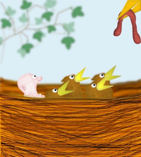
Can you tell me which one doesn't belong? (5 years and 3754 days ago)
Nice idea 
funny image but you could go with real pictures i think. It would of looked a lot better. Good luck
this is a nice drawing but it's supposed to look as realistic as possible
nice 
Howdie stranger!
If you want to rate this picture or participate in this contest, just:
LOGIN HERE or REGISTER FOR FREE
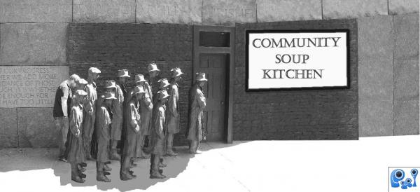
(5 years and 3801 days ago)
I hope you dont mind a little feedback for improvement-remember it is just my opinion: explore the shadows on the extra people you have created. maybe shadows on the ground- use light source and shadow from building as reference. also explore the shadows around the feet. On the UP SIDE this is a nice entry and meets the theme very well. A TIP: How to create shadows: create a brush from your people. using TRANSFORM & Warp to position shadow on ground... you may like to check with other commenters to see if my opinion is on track. GL
I completely agree with Scratzilla.
No I'm glad for feedback Thanks I Tried to adjust it I'm not sure if its better or not?
these changes are HEAPS better author. GOOD Luck with the SON N LAW 
it's really too bright
Howdie stranger!
If you want to rate this picture or participate in this contest, just:
LOGIN HERE or REGISTER FOR FREE
Looks like chicken...err umm.. shark tonight
Will you fillet it for me?
Congratulations.
Congrats!
Thanks guys
Congrats Skyangel.
Congrats Angel!!
Congrats!
Thank you everyone.
Howdie stranger!
If you want to rate this picture or participate in this contest, just:
LOGIN HERE or REGISTER FOR FREE