(5 years and 3524 days ago)
(5 years and 3611 days ago)
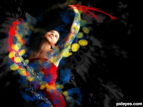
Not seeing the source in this one...at all...SBS plz?
Edit: I actually did look at it in hi res before I said anything and didn't see it. Thanks for the SBS...nice technique and a nice image
I agree with Irse; you can or explain in Author Description how you used the source, or post a sbs... I'll hold my vote for a while. 
this is because you don't look highresolution... all the yellow, blue and white "fluid things" are made with the source image... I gonna post a sbs soon.. but pls before vote or saiyng something look at the full image tnks
GL to you
lovely ...........all the best ................ 
gud luck
It's a little on the CBR'd side. The SBS explains and actually I see it better now so good luck. The idea in itself is very unique. GL!
Howdie stranger!
If you want to rate this picture or participate in this contest, just:
LOGIN HERE or REGISTER FOR FREE
i was just fooling around in Photoshop and in the end i liked the mood of this one so i decided to post it...no matter if most people here like it or not
[no external sources used, i just cropped the red light and then changed its HLS values] (5 years and 3623 days ago)
it is very nice, but if you don't use external sources, you must post an SBS
Good luck 
GL
nice
Howdie stranger!
If you want to rate this picture or participate in this contest, just:
LOGIN HERE or REGISTER FOR FREE
source (5 years and 3651 days ago)
Dunno what's a Gut, but it looks pretty good  . Good luck!
yes it looks good.. but I feel its a bit too noisy and heavy.. Its just my opinion.. good luck.. 
Gut is a Stomach 
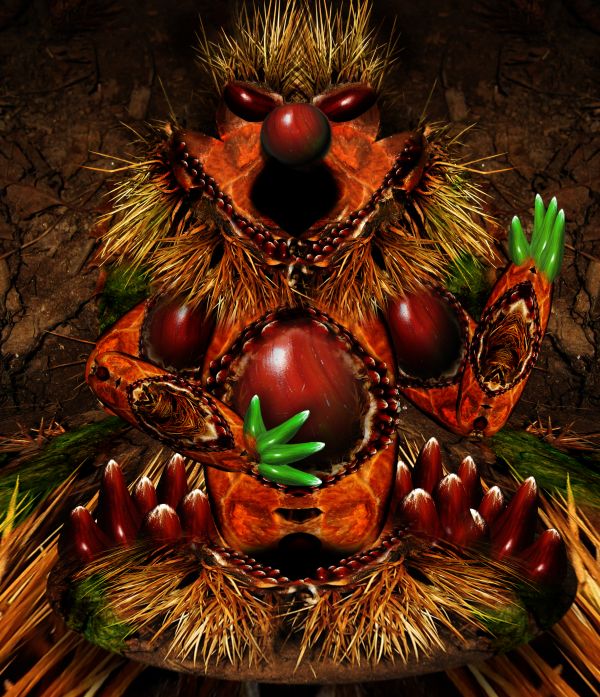
This is pretty interesting, but it's REALLY busy. My eye doesn't know where to look, except at the green hands, which stand out more than anything else. There is great imagination here, but over all there are parts that are way too dark, doesn't make sense, and kind of hurts the eye.
there are two faces in the image, if you crop the image at the throat you will see a whole other being, the arm muscles become eyes, and the belly becomes a nose and the lower belly dimple becomes a mouth
this is a piece of art ...hard work and very well done ...good luck author
great, stunning work ! 
Great work and unique style.
result of patience and skill..... very well done author... Good luck
amazing work author =)
very good work
I like the vivid colors here.
nice chop Author  good luck Sunday
It's unique, nobody can deny! 
i can always guess your work author.. gl...
gl...
perfect nose author and great overall job...good luck
Interesting entry, good work and best of luck
Really special! Great job.
Ridiculous.
Howdie stranger!
If you want to rate this picture or participate in this contest, just:
LOGIN HERE or REGISTER FOR FREE
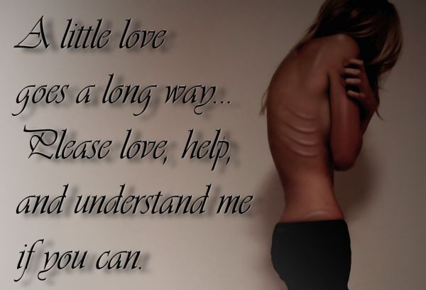
(5 years and 3670 days ago)
was hoping we might get an entry like this... well done author
Great job, hits home !
Good job, well done..
I know a lot of ppl did not like this chop, But this is a positive spin on a disease affecting so many people..We need to bring more awareness and watch for the signs and symptoms. Good Job
This is just amazing, you show that a lot can be done for helping others, very well done author, amazing work and message.
good pose on the model for this image. goodluck.
NICE MESSAGE ... WELL DONE  !!
!!
Good job....and a nice message as well....
*confused*
But good work tho! (god, I hate that enter button)
very nice message
Wlado, have you tried the edit button? Or better yet the delete button? For some reason I saw this and I thought of the movie "The Ruins"
Well done. congrats
Congrats for your second place, Razor!
Congrats!
thanks!
congrats
Howdie stranger!
If you want to rate this picture or participate in this contest, just:
LOGIN HERE or REGISTER FOR FREE
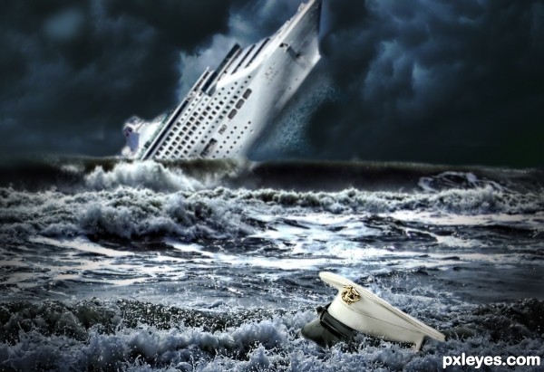
very nice idea...i have few nit picks,hat is to close to ship to be big like this,with sky like this u cannot have lighting on ship and on sea like yours...try to fix that author because your work have potential...i will hold my vote...good luck
nice..
Yes, the ship should be farther away and smaller, but good idea.
i like it ! g l
At this point the ship is run aground; it must be added behind the last wave, resized smaller and got some blur for DOF. Idea is good, just needs these adjusts.
Thanks all for your comments and advice. Changes made..
nooo it's too blurry now! and the vignette is too strong.
Thanks elficho I wasn't sure about that. Think it looks right now.
Funny...this used to be alot better! You still have time author...change it back a few steps. Everything is still too blurry and the hat used to be alot sharper.
Howdie stranger!
If you want to rate this picture or participate in this contest, just:
LOGIN HERE or REGISTER FOR FREE