Just source (5 years and 3698 days ago)

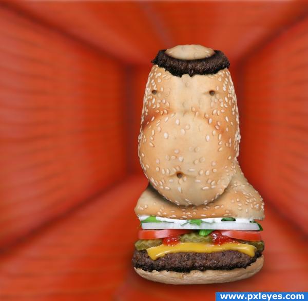
round face or fat belly?
no external image (5 years and 3941 days ago)
kinda looks like friar Tuck  .. good luck author
good work
nice work!! Good luck!
At first I thought it was a belly but now I see a face, nice work 
lol


nice
I like the use of the meat for the hair. Reminds me of a burger monk. Not sure if the background fits the image, though. I'd rework it a bit, maybe including sesame seeds or some other recognizable element from the burger. Funny, and nice job!
leonid brezhnev... 
Howdie stranger!
If you want to rate this picture or participate in this contest, just:
LOGIN HERE or REGISTER FOR FREE

only source used (5 years and 3954 days ago)
NATOR LIKES TO PARTY.. this really reminds me of the Basement Retreats that are so popular... great use of source and fun subject
good work
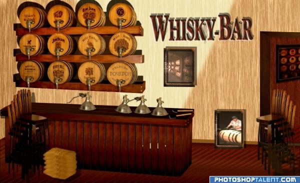
Maybe if u fix the perspective of other furnitures automaticaly fix the barels
great idea looks real good
good work author!  GL
GL 
great
good idea. the font whisky bar spoils the look a bit
This is a great idea. There a couple of issues. The perspective is off. The vanishing point for the ends of the barrel shelves is at the picture on the wall, but the vanishing point for the bar is way off to the right. Another thing is that the shadows coming from the barrel shelves should not have a gap where the shelf joins the wall. if the light source is below. This has a lot of potential, but the perspective issues are difficult.
thanks for all comments and helpful advices. I changed the font and I've tried to change parts of the perspective.
nice 
Howdie stranger!
If you want to rate this picture or participate in this contest, just:
LOGIN HERE or REGISTER FOR FREE
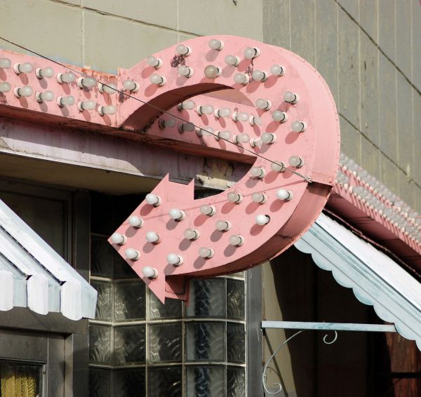
Good upgrade of the original! Now...if you're going back in time, the colors would probably not be as faded, and there might be a bit more contrast, if ya take my hint... I'll wait to vote as usual.-)
Up the sauration of the colour -- paint not so faded now -- much thanks for the suggestion CMYK
nice restauration work...good luck
some shadows are pinkish and some are dark...
You should restore the wall too. And I think you missed just a spot or two on the back of the arrow.
great work! never could have guessed this was photoshoped if i've seen this elsewhere
nice work...good luck
Nice restoration Good luck today Author
Howdie stranger!
If you want to rate this picture or participate in this contest, just:
LOGIN HERE or REGISTER FOR FREE