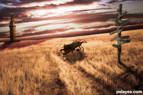
(5 years and 3044 days ago)
- 1: Sky
- 2: Road
- 3: Bob jagendorf - Cart

Use of the photo filters and practice with layer masks and lighting, gave me the bright and very colorful outcome.
I also did a lot of brush painting for vivid details. (5 years and 3088 days ago)
Good color, but the foreground mushroom is too blurry...the focus should be as sharp as the butterfly.
Some effect do not match..but a good peace of thinking. 
Howdie stranger!
If you want to rate this picture or participate in this contest, just:
LOGIN HERE or REGISTER FOR FREE
(5 years and 3130 days ago)
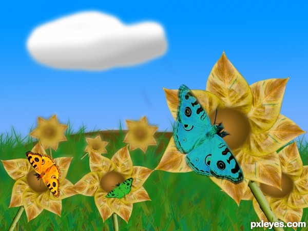
The half-blurry flowers look weird. They should either be all blurry or all in focus. Just having the top half blurry is visually confusing.
thanks for the tip
good author but u can do better 
what do you suggest mounirupa?
nice entry author... suggestions: get rid of the bevel on the cloud. you can try playing with a white painted blob and add FILTER>BLUR> G"BLUR . If you want grey areas either paint on the same layer and add Blur or softly paint grey on a new layer and play with blur. Mossy B has provided some help with the flowers. GL
suggestions: i think you can use custom shapes than u can get currect cloud shape & put butterflies or childrens something like that than image should be better than this. 
This is MUCH better than the original upload. Great improvement on that "hard" cloud!
The butterflies are a bit too color saturated and monochromatic (ever notice that even solid color butterflies have different shades with highlights?) but overall, it's a good composition and execution.
thanks mossyB
Lovely
Howdie stranger!
If you want to rate this picture or participate in this contest, just:
LOGIN HERE or REGISTER FOR FREE

(5 years and 3131 days ago)
how about an sbs?
Nicely done! Best of luck!
Howdie stranger!
If you want to rate this picture or participate in this contest, just:
LOGIN HERE or REGISTER FOR FREE
(5 years and 3249 days ago)
SBS ??????????????????
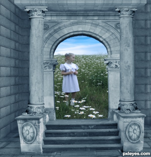
Is the leaning left corner post intentional? It appears as if it is falling.
The asymmetry is disturbing, and the girl is distorted.
The girl is still distorted and so is the left corner post.
Howdie stranger!
If you want to rate this picture or participate in this contest, just:
LOGIN HERE or REGISTER FOR FREE
Love this image , high score, just one lil thing.. the shadow from the tower is not consistent with the other shades
Good mood, but imo the objects are a bit too softly masked. Good luck!
Congrats for the 3rd place!
Gratz, I thought for sure you where gonna be first lol
Congrats!!
Howdie stranger!
If you want to rate this picture or participate in this contest, just:
LOGIN HERE or REGISTER FOR FREE