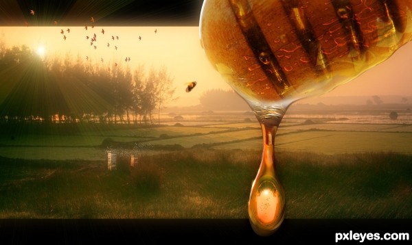
(5 years and 2775 days ago)
- 1: background
- 2: bee hives
- 3: bee
- 4: drip
- 5: dipper
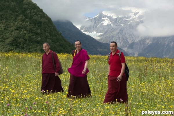
own photos
1. monks
2. field
3.mountains (5 years and 2968 days ago)
The HILLS ARE ALIVEEEEEEEEEEEEEE!!!! with sound of MONKS!!! hehehe
super great masking, and the little flowers are fantastic at the base of their robes
AWESOME!!!!
Yes - agree with drivenslush. This is gorgeous! I love how the colour of the litte pink flowers is picked up in the robes.
Thank you both.  I really like that photo of the monks, but the background was just so boring.
They seem so happy!! 
That what I liked about them when I took the photo.
Wow, great photos! Good masking of all, author. 
thanks
really thought this would place so much higher, it is absolutely brilliant with great detail work.. Still okay, but kind of a burn in my eyes, but who am I? giggle snort.. Great work, you should be very proud of a job super well done!!!
Thank you, your encouraging words will keep me trying. Would have loved to at least get a place.
Yes Friiskiwi - sorry this didn't get a place as I loved it. Please keep doing more of this delightful work. 
thank you
Howdie stranger!
If you want to rate this picture or participate in this contest, just:
LOGIN HERE or REGISTER FOR FREE
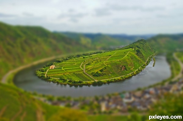
Thanks to Giulia for the video tutorial.
Thanks to Pittoresk for the wonderful picture of the Moselschleife river in germany. (5 years and 3466 days ago)
It looks beautiful, like a little maquette, but how come you didn't focus on the small village instead of the island?
i personally like landscapes much more than actual buildings. plus the 'astro turf' look wasnt easy to achieve. the hue and saturation's i played around with till it came out as such. other reason was to far in the corner of the image, and i didnt want the focul point to be a corner of a picture, but in the middle. even if i had cropped it. the image woulda been smaller as to which i didnt think would be a great 'tilt shift' image.
thanks for your comment's tho
i like it very much, good luck!
Howdie stranger!
If you want to rate this picture or participate in this contest, just:
LOGIN HERE or REGISTER FOR FREE
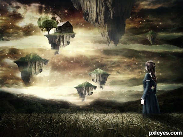
thanks to:
night-fate-stock & faestock @deviantart.com.
Rokatesh for Shiprock. (5 years and 3486 days ago)
Stop it....please, please, please...just stop it! Aaaarrrggghhhh!
Edit: Author, my comment has little to do with you personally except that you've obviously seen a lot of flying island pics, and "slightly desaturated child on a slightly desaturated background" pics and others with "A tree growing out of something to make it look vaguely surrealistic" pics, and so here you are with your version of this stuff. I expect you'll want to have people think you're a genius, instead of just another unimaginative imitator. Others have done the same in other ways, and seem to get good votes in spite of being obvious imitators. Now you've made yet another derivative work. I expect more from this site. I hope others do as well. I hope I can expect more from you in future.
At least you could have gotten your light source right on all the flying islands.
Umm, well I really like the image you created. Its familiar yes, but in a good way. It reminds me of paintings by Boris Vallejeo, sorry spelled that wrong I'm sure. Anyway, I'm no expert but I think you did a nice job.
oh, well,..well,.... you created a stunning work here even though your idea is not really fresh, and to me ( and maybe many other too ) the idea of flying islands or floating objects are always the ones that are so tempting to create,....GL
> CMYK,.....yes ,...I expect something more that I can learn from this site and I've got many so far.....and oh well,...why is it not you giving us and the author the fresh new work as the example of the " expectation" you hope for.....? 
Nice image. CMYK46, i agree with you, we do see a lot of this kind of stuff and it does get a bit 'boring' (to say the least). But this is a nice image and it is in the Dream Art catergory so it fits and it works well. 
Well done author & GL 
Edit: I do agree (language barrier) with CMYK about that last part: "At least you could have gotten your light source right on all the flying islands."
I think it's really conflicting, since light is coming from behind the islands - as I can figure from the shadow cast of the girl.
Tell you what. You can make some cubes in a 3d program ( even google sketch up which is free), add a light source and take the render as reference.
Or you can just swich all island to the same position and change their shapes so thei won't look the same.
Errr you really need to fix these lights >.< and by the way her hand is completed white o.o
Thanks everyone for giving your time for comments. For some people this art is unimaginative. But I want to say..I always try to create that is in my imagination.
Thanks to all for your positive and negative comments.
Specially Mr.Dekwid for your support.
I'll avoid controversial discussions, author, but if I may, I would suggest using your clone stamp to alter elements of your picture that are repeated such as sky/cloud/star patterns and rock strata. IMO, it really adds to a piece's realism when objects can be"randomized" and given identity as unique entities. With a little practice, you can achieve good results that way, and relatively quickly. There are some light issues as mentioned, but I do like your mood and composition. Happy chopping!
Author I like this chop. Very creative .gl
Original or not, I like this one... art is freedom anyways...
I guess its one of those things, alot think it, but dont say it... gotta agree I`ve started voting lower on the unoriginal entries..not based on the execution but on concept. Its really not your fault author, I guess some of us are just a little bored of this style.
Ive always wanted to make an image like this but feel it has been done numerous times and it would stop me from standing out in a contest (when I find time to enter one).
I do like your image though 
We are all learning and when we see an image we like, we tend to try and remake it ourselves, but that is how we learn 
Goodluck author.
May be a common idea but it isn't bad. You did a good job with your sources and should be proud of it 
WOW a lot comments about the style...First thing that i will do is to comment on your entry author...This is very nice work with cool mood and colors...love the mystic sky and u also did great job with the grass field...Now about other things...I totally agreed with the to much repetition in entry's...Lately we had tons of rain in entry's, before that surrealism was dominant and before that who knows what...But the floating islands, we have them all the time...grrrrrrr....I am trying to be objective and to vote on how the entry is made, but i don't know how long i will stay objective...I will give u general advice author, don't fall in the trap of good score entry's...u will see here some authors that always have nice final score at the end, but if u look at their portfolios u will notice tons of similar entry's...and u don't need that...its ok to create some entry's that reminds on some thing that u did before, but there is limit to there...And finally sorry for my comment that turns into the novel but other guys gives me the inspiration...Best of luck
Love this magic world 
Howdie stranger!
If you want to rate this picture or participate in this contest, just:
LOGIN HERE or REGISTER FOR FREE
(5 years and 3503 days ago)
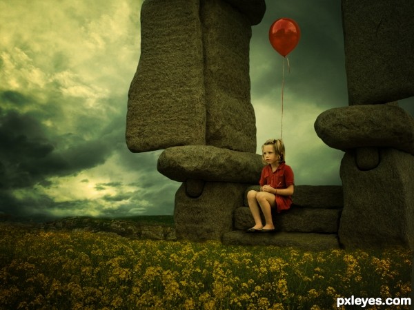
This is a nice image, but when I first saw it, my eyes were directed to the clouds, as they have a sharper highlight. If your main focus is the girl, just add some highlights to the yellow flowers on the left side, in the direction of the bright clouds, and this will bring the image together. Hope this helps.
this is so sweet! 
Great image! 
So beautiful and inspiring 
very nice mood author...is that just me but the little girls with the balloon's always creeping me off...
Is that a red balloon?! 
Great image author! Very sweet and very well made 
Howdie stranger!
If you want to rate this picture or participate in this contest, just:
LOGIN HERE or REGISTER FOR FREE
I'd crop out the needless black bars at top & bottom of the source pic. Otherwise it's not a bad image, although on second look I'm not sure the image in the drop would be inverted.
I thought I would crop but then I kinda liked it. I looked at many ref pics and they all were inverted. Maby with the great distance it would'nt be...?
I like the bubbles in the honey ... gl author
thanks
Congrats, oziipop! Lovely entry.
Congratulations.
Congrats!!
Howdie stranger!
If you want to rate this picture or participate in this contest, just:
LOGIN HERE or REGISTER FOR FREE