(5 years and 2908 days ago)
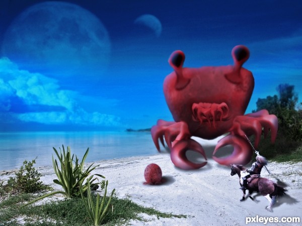
- 1: Knight by Eirian Stock
- 2: Beach
- 3: Moon
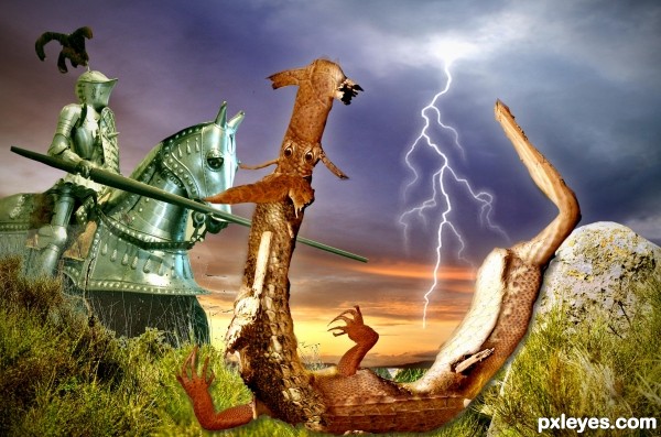
The image of St. George and the dragon has been recreated in many ways, but I believe it is the first time that the dragon was designed from a dead tree ...
GL4U (5 years and 2937 days ago)
It's a nice idea and the execution is pretty well done. Personally I'd skip the PS generated texture though, imo it's a bit distracting from the actual image. If you chose for it to give the image an older look, I'd recommend to use a photo of an old paper/fabric texture. More subtle and perhaps with better "old" result. Good luck!
I took the texture completely, wazowski, what did you think? thanks for your help 
I think this way the image is way better to see, author  . Good luck!
The stark highlight on the knight suggests that maybe the tree 'dragon' might have a more pronounced highlight on it's face and front. Nice job!
let's say that the lighting in the armor of the horse is a reflection of lightning illuminating the belly of the dragon 
Howdie stranger!
If you want to rate this picture or participate in this contest, just:
LOGIN HERE or REGISTER FOR FREE
(5 years and 3073 days ago)
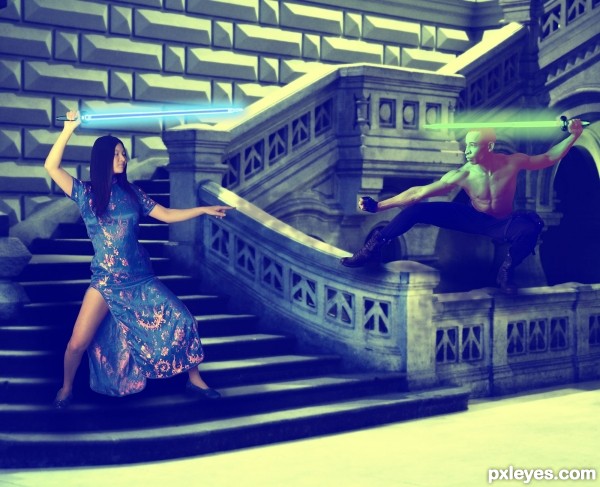
The glows should only be on the weapon end of the swords, which would glow from the insides and not have shadows. You've made the background too dark to let the figures pop. This could be great with some tweaks. GL author. 
You were absolutely right did some changes, based on your comments. Thanks! 
Much improved! 

The image looks a little flat on my monitor and i guess it will improve when you increase the contrast with levels or curves. Also, the background is lit by strong directed light, but the figures (esp. the girl) are more evenly lit.
On the happy side, it is a well composed image and the relative propertions seems to be ok. So, i'll be happy to see you can make it even better.
The lights are all different... 
Too much green for me. Too many distractions IMO.
But a nice idea. Good luck 
Howdie stranger!
If you want to rate this picture or participate in this contest, just:
LOGIN HERE or REGISTER FOR FREE
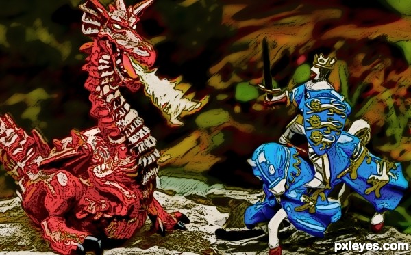
brush filter (5 years and 3081 days ago)
vivid colors, nice effect, the darker background sets of the action nicely
Howdie stranger!
If you want to rate this picture or participate in this contest, just:
LOGIN HERE or REGISTER FOR FREE
(5 years and 3165 days ago)
Very nice!!!
thanks
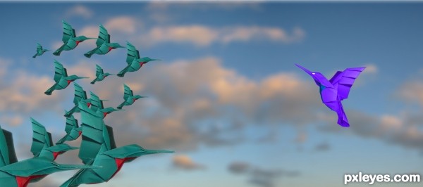
if possible, vary the birds by distorting the wings.
in flight, they will not have the same-thing like wings all upwards 
should fade (blur) some birds to create a notion of distance (far n near( 
Howdie stranger!
If you want to rate this picture or participate in this contest, just:
LOGIN HERE or REGISTER FOR FREE
cool...
cool...
Would be much better without the knight. He looks like a toy compared to the vegetation. Nice monster, though.
Perhaps lighten the furthest area of shadow behind the creature...this will help imo. Nice job, author!
Howdie stranger!
If you want to rate this picture or participate in this contest, just:
LOGIN HERE or REGISTER FOR FREE