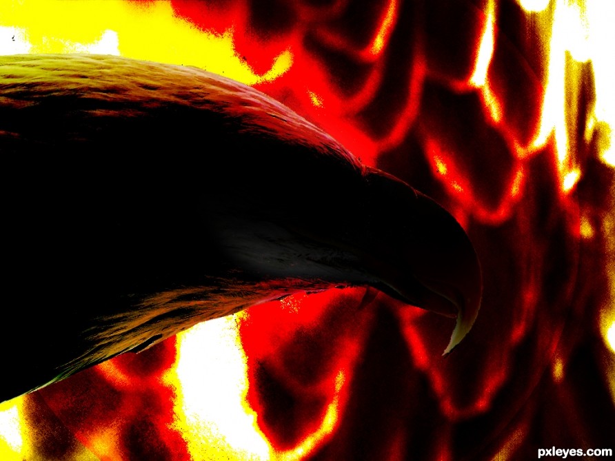
Eagle, the fire fighter. (5 years and 2474 days ago)
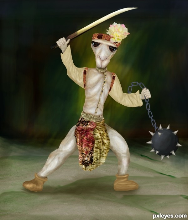
Only source (5 years and 3198 days ago)
good work.... 
That's the emotional fighter with big eyes  . The gestures of his arms look not convincing to me, they lack of elbow and the left hand which is holding the chain doesn't have palm, so it doesn't look natural. However, making hands are always troublesome to many people so I can understand that. You did a great job on overall, and best of luck to you.
I'm glad that you're back ^^
EDIT: Yes, it's much better!
Thanks Minh for your time for observation and suggestion. You are right, hands are always difficult for me. I need more practice and learning human anatomy 
the entry is well done, except the hands.., use your own hand reference to get rid of this..., good luck 
Thanks anoop. Tonight I will try to fix hands. 
EDIT: Have made some changes to his hand.
shade and highlights are not contrasting enough, to make the picture stand out.
(now alittle flat feel)... no offence 
lots of hard work here author.. you should be happy with your completed piece...
this would have taken alot of skill to create.. I struggle with human structure also so i understand how hard you must have worked ..
learning how to shade will help develop your works...
explore how to use the dodge and burn tools... they will become your best friends....
start with settings around 17-19% adjusting from shadow to highlights... starti working with a soft brush is best as it will soften shadow application.
to apply to your works...... explore where a light source would come from and look where shadows would fall..
applying to your creation here: Burn the UNDER ARMS - along the sleave area. INNER LEGS ... from top to bottom of leg area..
Remeber shadow would not only be created where your man stands...
HOPE this will help you for future entries.. GL.
Thank you scratzilla1 for your detail comment and tip.  I will take care of highlight and shadow in my future entries.
hey THIRD!!!!! FANTASTIC..... well done
bad-ass ninja camel  Congrats!
Howdie stranger!
If you want to rate this picture or participate in this contest, just:
LOGIN HERE or REGISTER FOR FREE
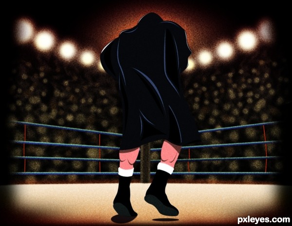
Illustrated in Photoshop CS5 (5 years and 3264 days ago)
amazing work
This has a real 'DC comics' look to it. Very nicely done! Love the grain look...especially in the lights and orangish light in front of him. 
What can i say about this..mmmm....STUNNING!!!! GL
super!
One for the book...Great work! GL author!
Howdie stranger!
If you want to rate this picture or participate in this contest, just:
LOGIN HERE or REGISTER FOR FREE
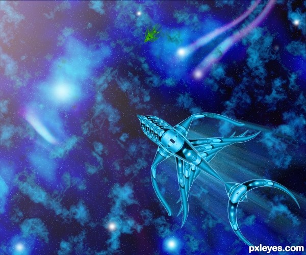
Only source image and default photoshop brush and filters are used to create this effect.
Please see in high resolution. (5 years and 3497 days ago)
nicely constructed plane 
Not bad, but why the same color as the background?
good work, but background is shouting too much. adjust it.
I agree with Bob on this one,it would be way more effective if u used some other color for the background...still,this is great entry...good luck
Howdie stranger!
If you want to rate this picture or participate in this contest, just:
LOGIN HERE or REGISTER FOR FREE
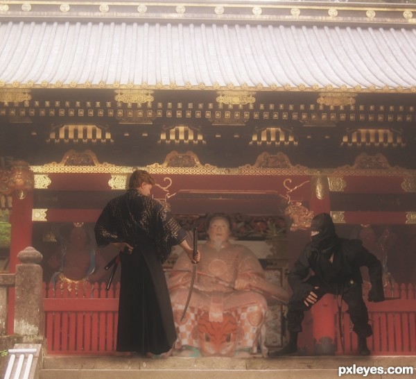
Thanks to mjranum-stock.deviantart.com and renfield (5 years and 3608 days ago)
good luck
nice one ........... all the best .......... 
Howdie stranger!
If you want to rate this picture or participate in this contest, just:
LOGIN HERE or REGISTER FOR FREE
Howdie stranger!
If you want to rate this picture or participate in this contest, just:
LOGIN HERE or REGISTER FOR FREE