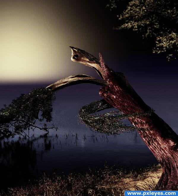
Thanks missy, tapiona and sxc for images...Image was reworked to enlarge the subjects and mute the color for a vintage look. (5 years and 3822 days ago)

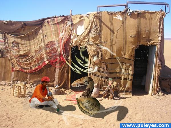
I putted a great effort in this image... I think the part i am proud of is the piper... I have be working hard to clone out the snakes so i would be glad if you would pay attention to it... Thx (5 years and 3864 days ago)
Snake is much too big, shadow is reversed...
I think the snake is a little too big and the man is a little too small... good luck!
I wanted to make the snake bigger than the man... That is why the image is called the final tribute... She wants to eat him when he stops playing... 
Howdie stranger!
If you want to rate this picture or participate in this contest, just:
LOGIN HERE or REGISTER FOR FREE

(5 years and 3944 days ago)
gl
Quite a lot happens here, but hard to see the actual connection with the ste, especially when this will be in the final measures. Good luck!
Could not read it scaled down, sorry 
i think your design it's fine put the square attracts the eye more to them than to the anme and the colors are to expresive...you should trry and google some COLOR THEORY see how that can help you good l;uck
Good luck!  Nice!
Nice!
Looks like something from Windows '85 - sorry. I think it's the bright green and bright blue - a no no.
Howdie stranger!
If you want to rate this picture or participate in this contest, just:
LOGIN HERE or REGISTER FOR FREE

(5 years and 3944 days ago)
realy nice author!
I really like this one.. good luck
Cool and usable. I wish the big version were completely below the little, as-it-will-be-used version so it would be easier to evaluate how this logo will work in real life.
haha awsome idea, love the effect
Ow well, maybe not in this color combination, butthose dots arent bad. I like it that it's open but still a whole. Wouldnt you like to write ".com"? Good luck!
Too much lighting for me.. Good Luck!!
Thats pretty cool 
This is very strong entry !!! I do like it very much 

nice
Kinda weird, but I like it 
GL!
Not sure about the treatment
Howdie stranger!
If you want to rate this picture or participate in this contest, just:
LOGIN HERE or REGISTER FOR FREE
Nice transformation from main source. Beautiful job, author!
llooks like the trees here after the BIG storm the other day.. love this entry.. nice colours. great transformation from the original source and love the over all feel of the final image. GL
I've seen the former version and this one with the new colours looks so much better! I like this calm feeling you achieved with your new colour choice. Good luck!
way better
Howdie stranger!
If you want to rate this picture or participate in this contest, just:
LOGIN HERE or REGISTER FOR FREE